< Back to Work
CHURCH 52
Brand Identity
2023
FROM PROBLEM
TO DESIGN
Our Process
After 17 years of steady growth, Church 52 was entering a new season of expansion and visibility.
-
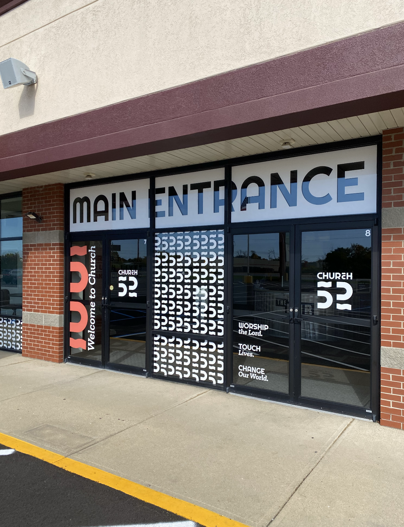
What began as a small group of 14 people—once meeting in a van, then a college library, and later rented spaces—had grown into a thriving congregation with a permanent home on the east side of Indianapolis. As the church prepared to broaden its outreach in 2022 and 2023, its visual identity no longer reflected the vitality, maturity, or momentum of the community it had become. Leadership hoped to reach more young families while remaining welcoming and familiar to longtime members, a balance the existing brand struggled to hold. The church’s mission—“Worship the Lord. Touch lives. Change our world.”—and the layered meaning behind its name called for a clearer, more intentional expression. In addition, the physical building needed to feel like a true church home rather than a temporary stop along the journey. Church 52 invited Marion Design Co. to help translate its story, spirit, and sense of permanence into a cohesive brand identity that could support both growth and belonging.
-
Marion Design Co. began by spending time on site at Church 52 in Indianapolis, listening, asking questions, and observing how the church community gathered and worshiped. What stood out immediately was the warmth, sincerity, and expectation present in the space. As one staff member shared, Church 52 is a place where people are invited to encounter Jesus every time the doors are open—to feel God’s presence, be challenged in their faith, and find new life. Back in Marion, our team translated these insights into a moodboard and began sketching early concepts for the new identity. Because the church’s name carries both historical and spiritual significance, we focused our explorations on the number 52 as a central visual element. This process resulted in 29 initial logo sketches, which were shared with the Church 52 team for feedback. From there, we worked through multiple rounds of refinement, shaping the final mark to meet the project’s core objectives: creating a welcoming presence for newcomers, reflecting the movement of the Holy Spirit, and establishing a visual sense of permanence for the church’s home and future.
-
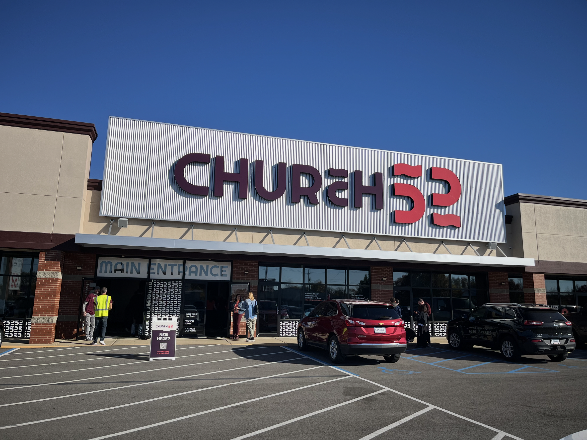
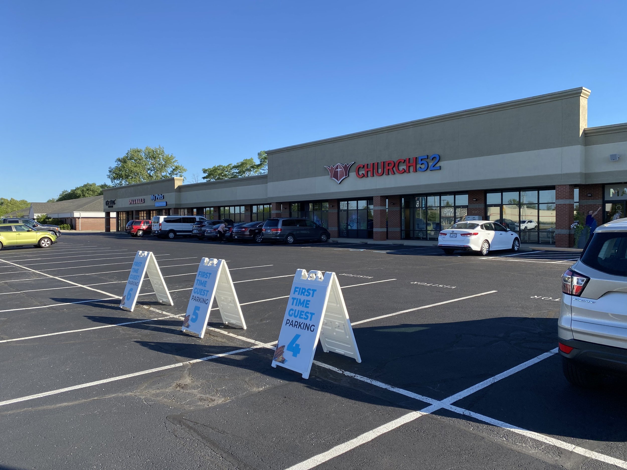
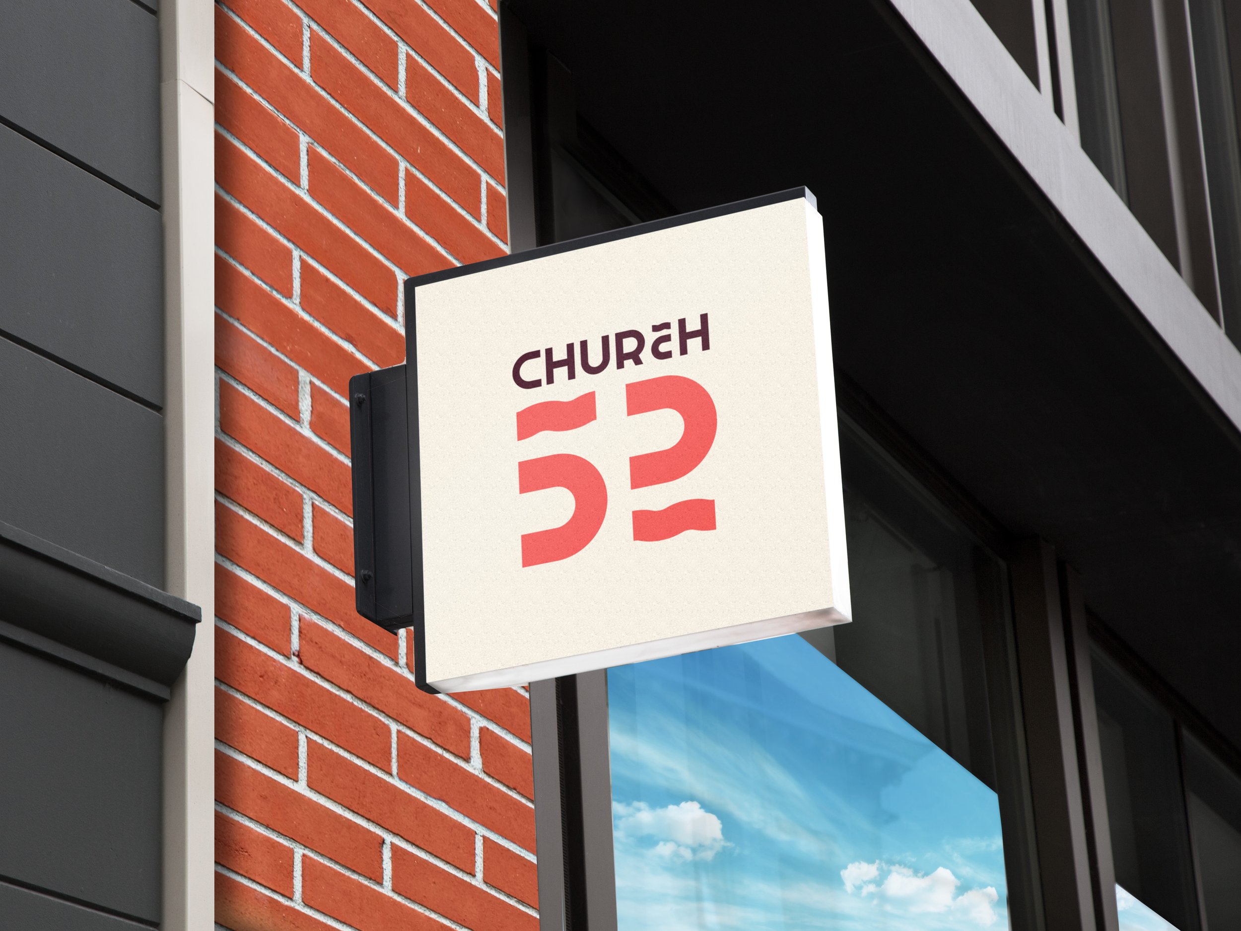
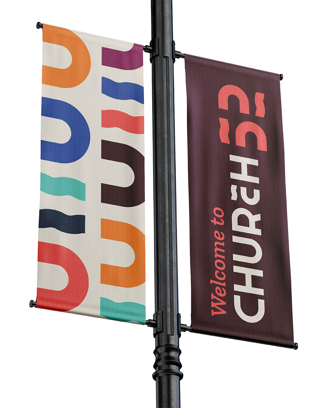
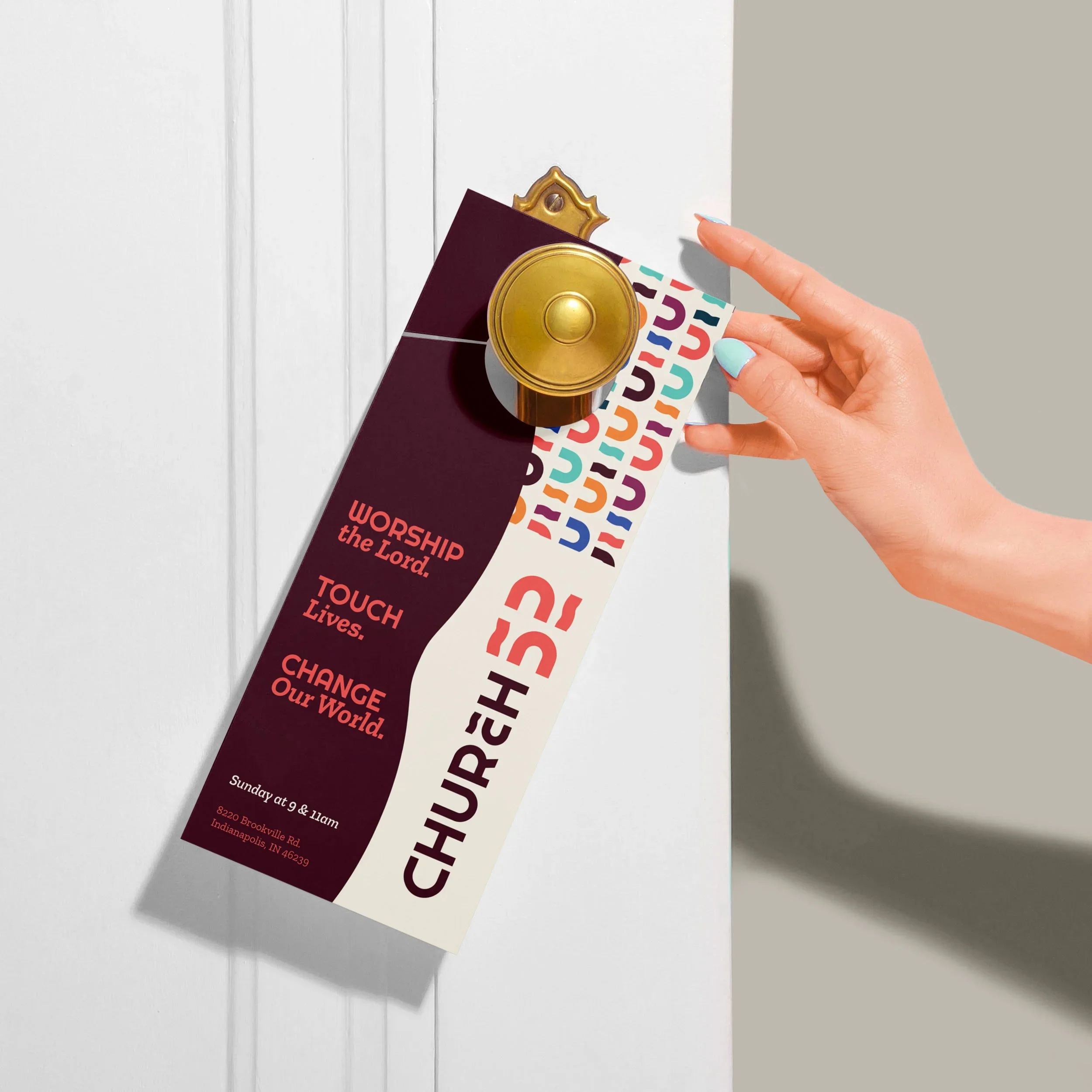
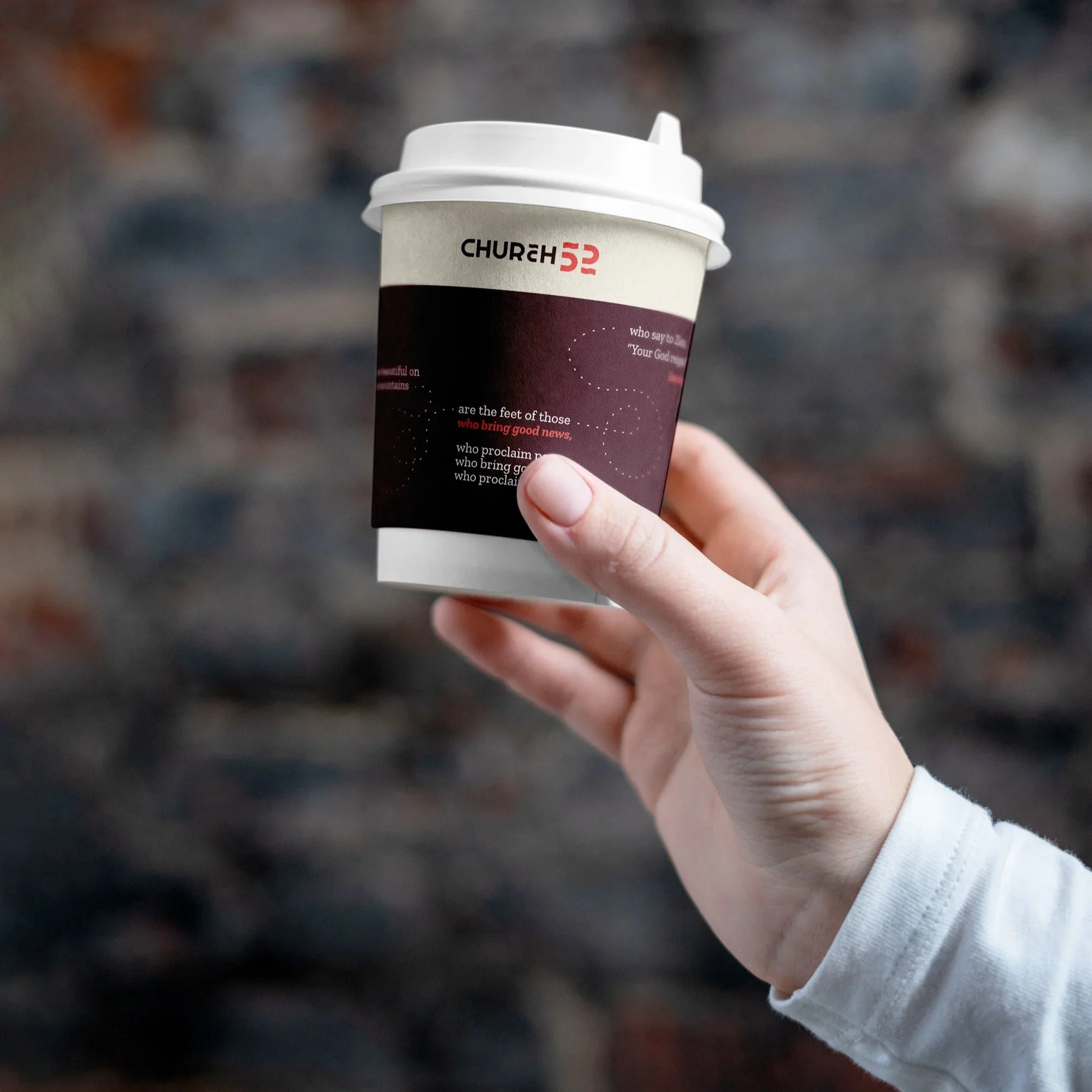
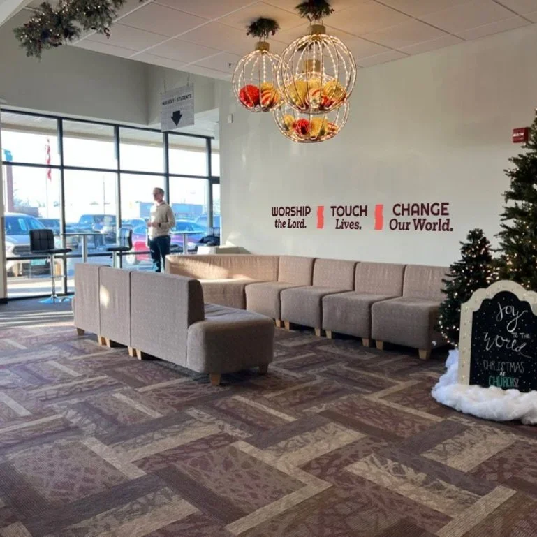
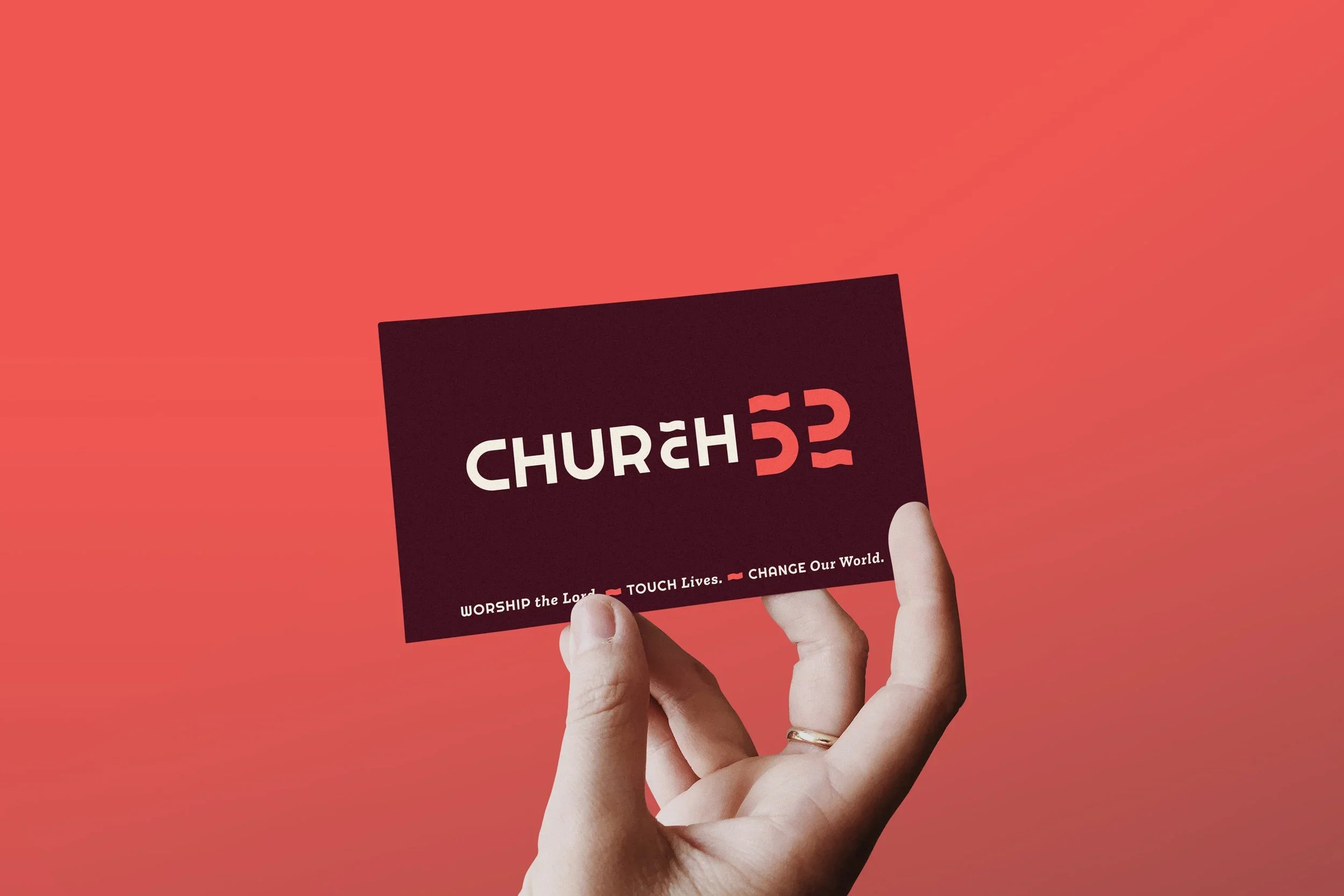
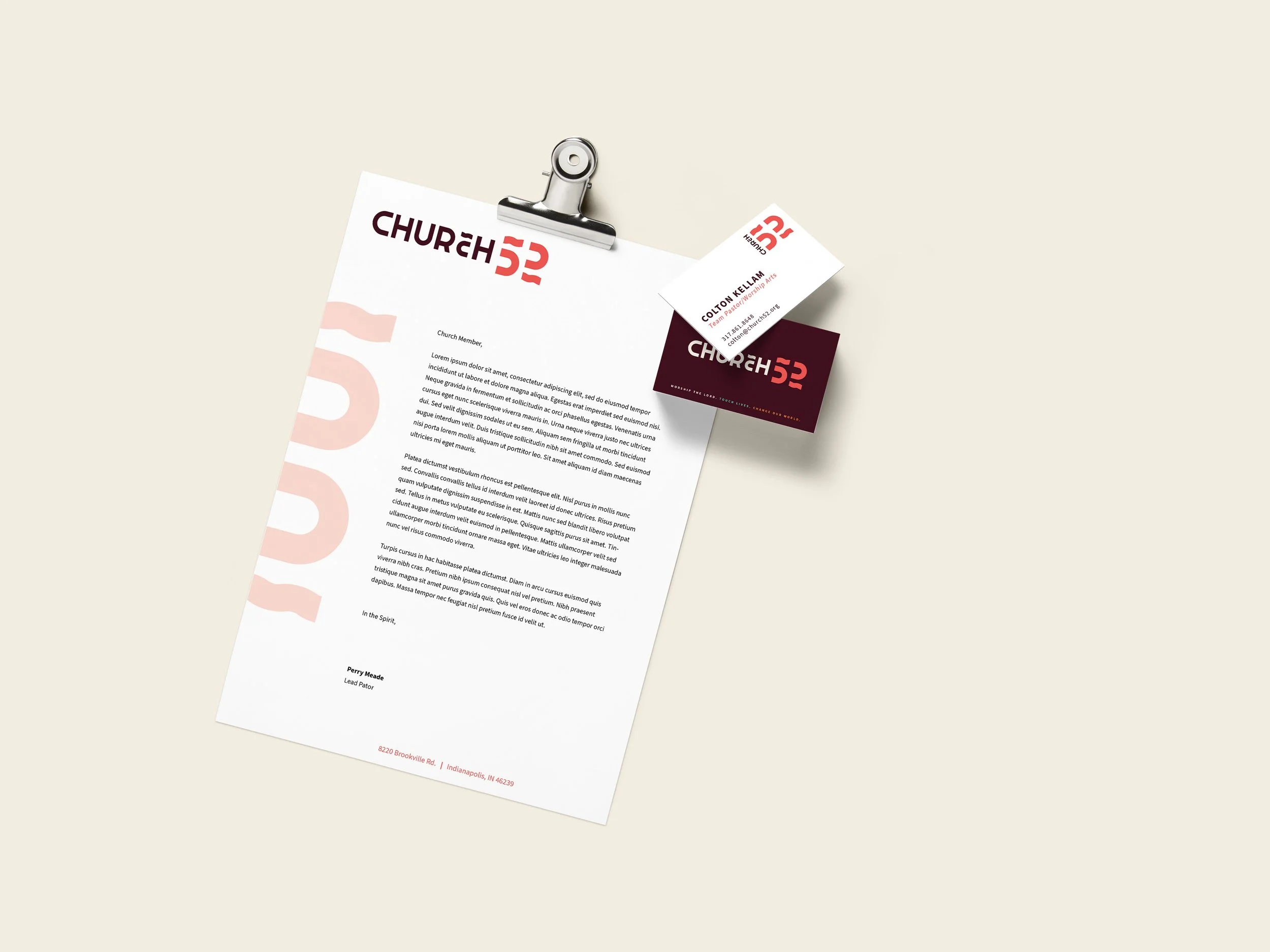
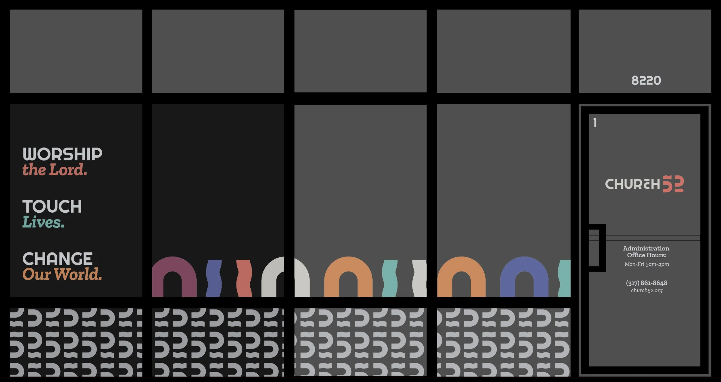
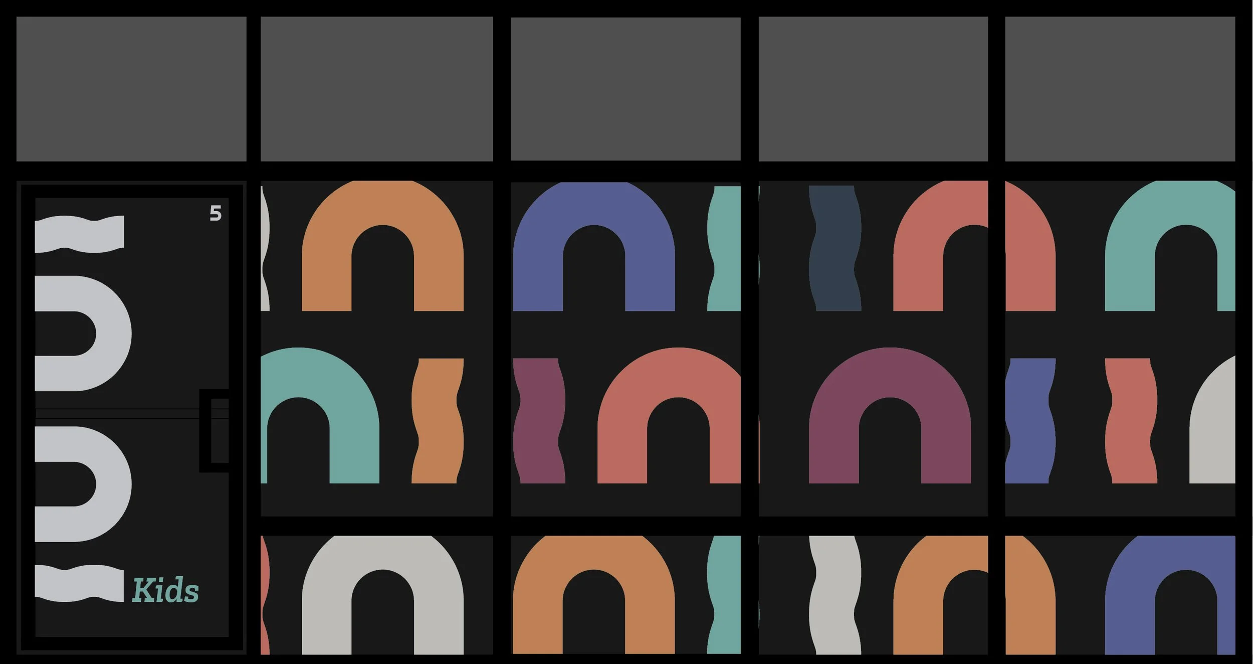
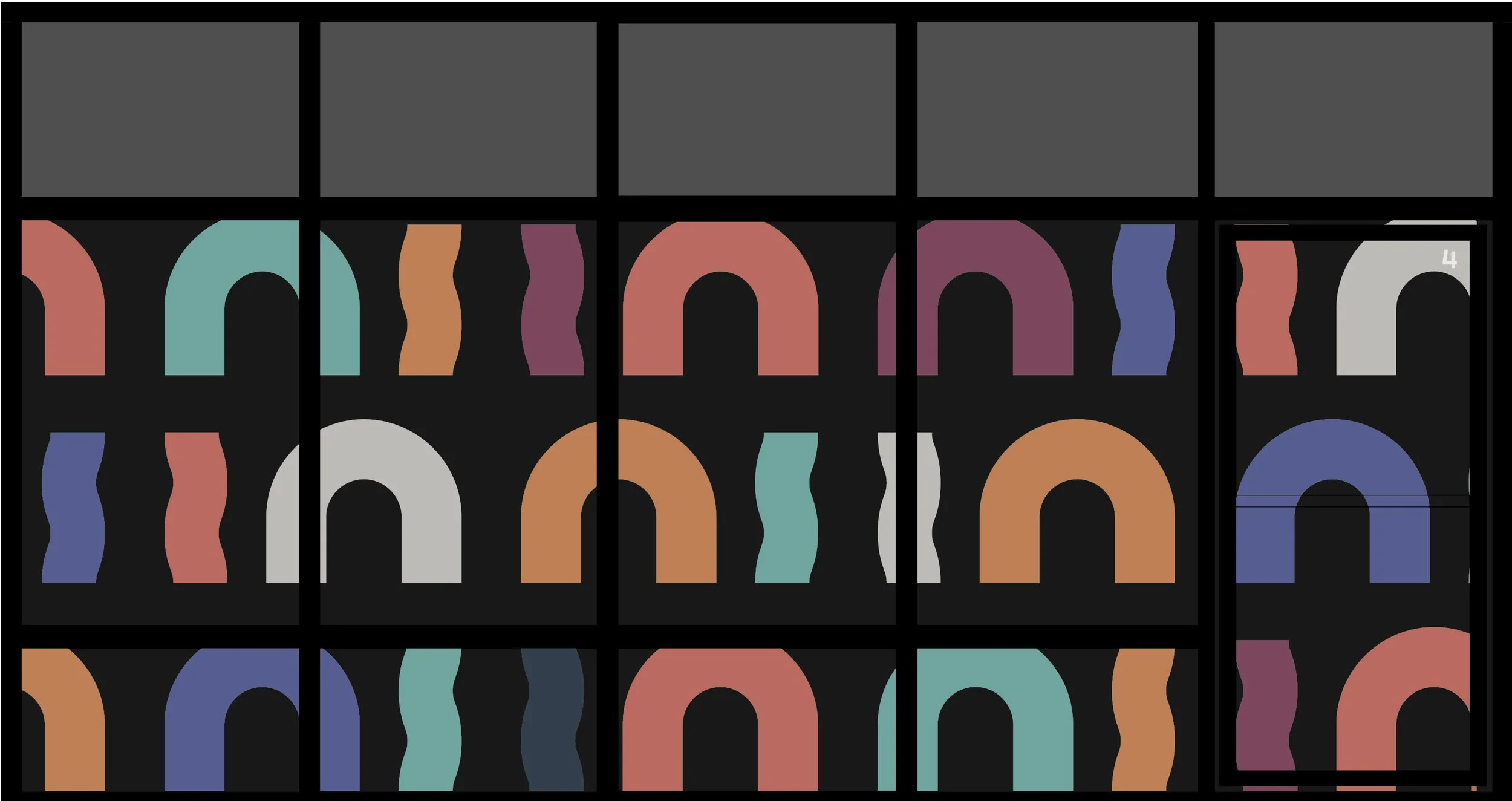
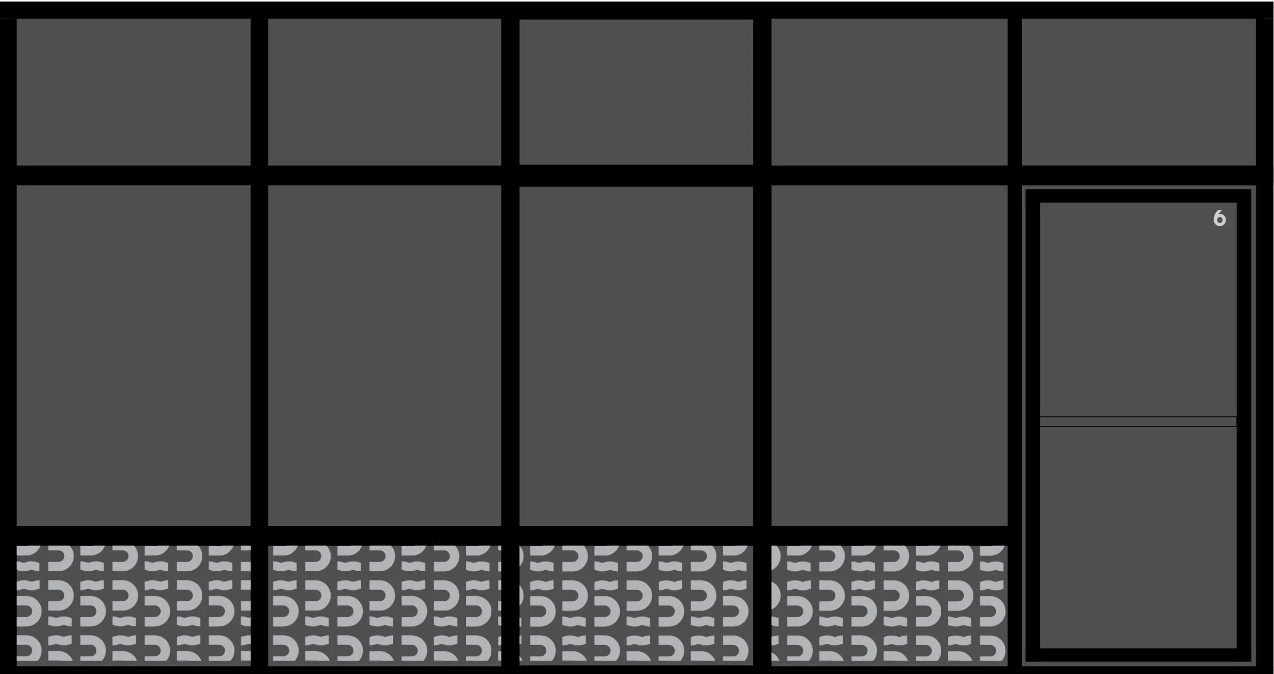
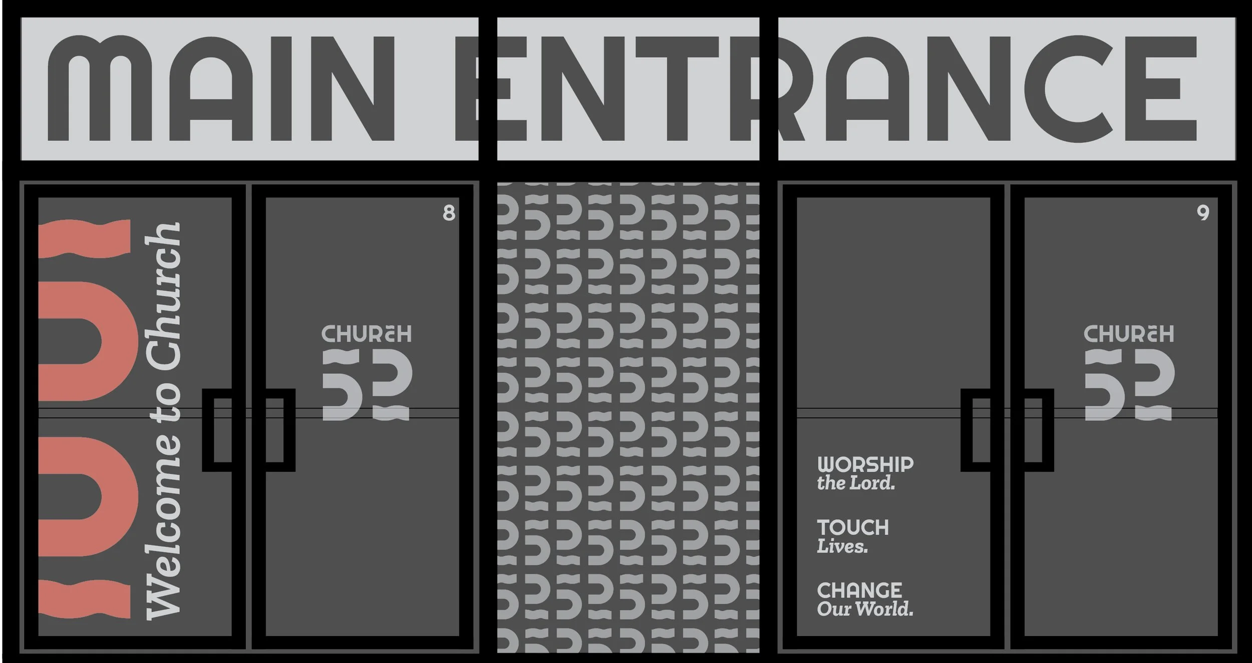
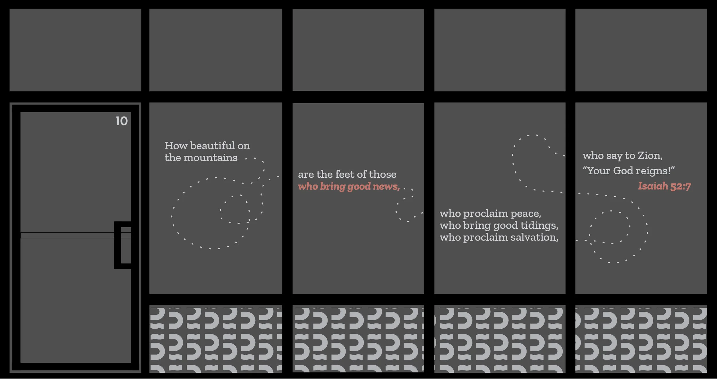
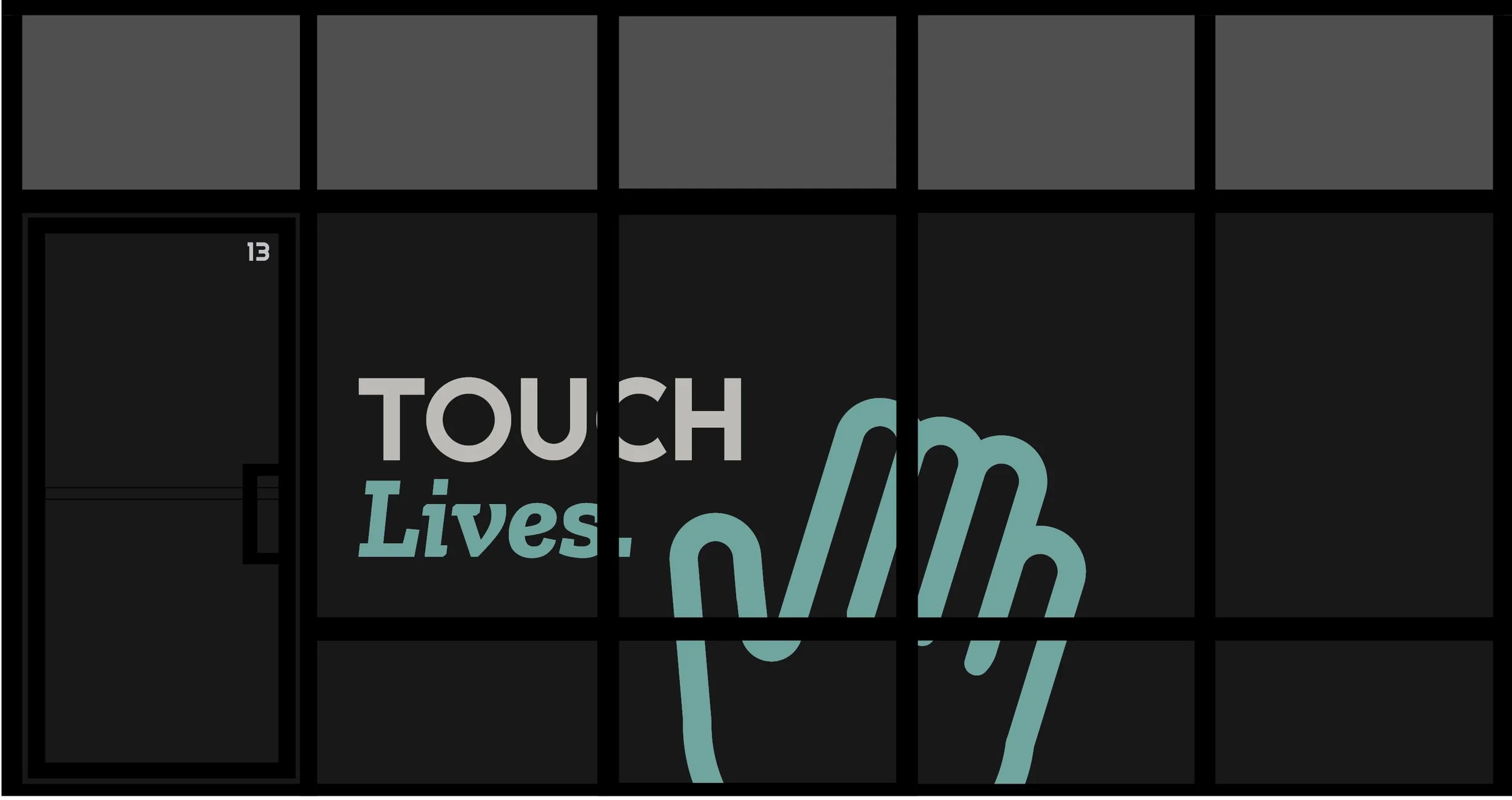
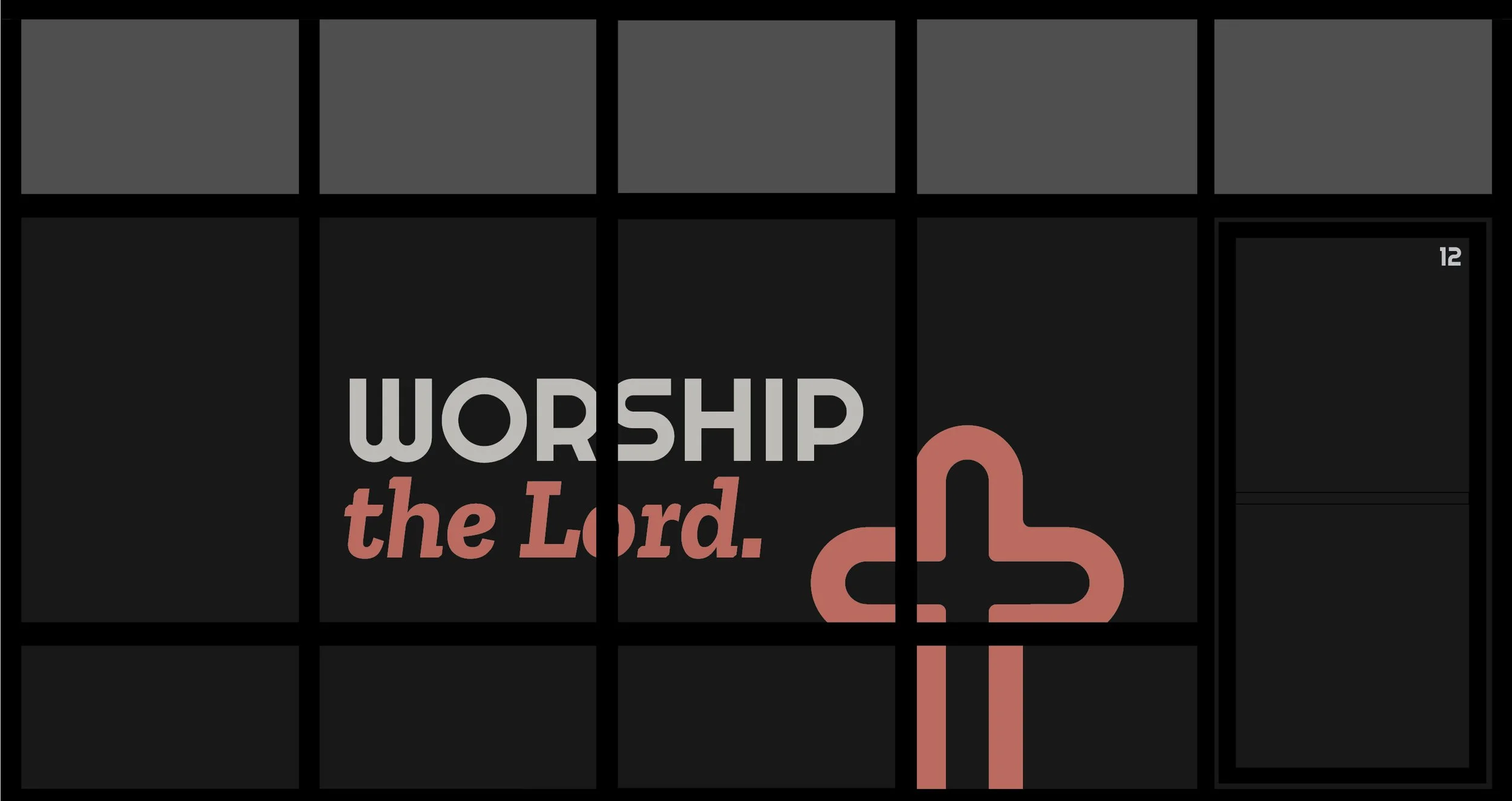
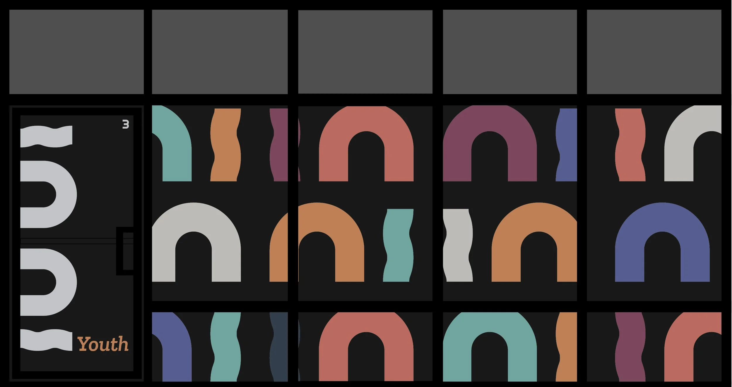
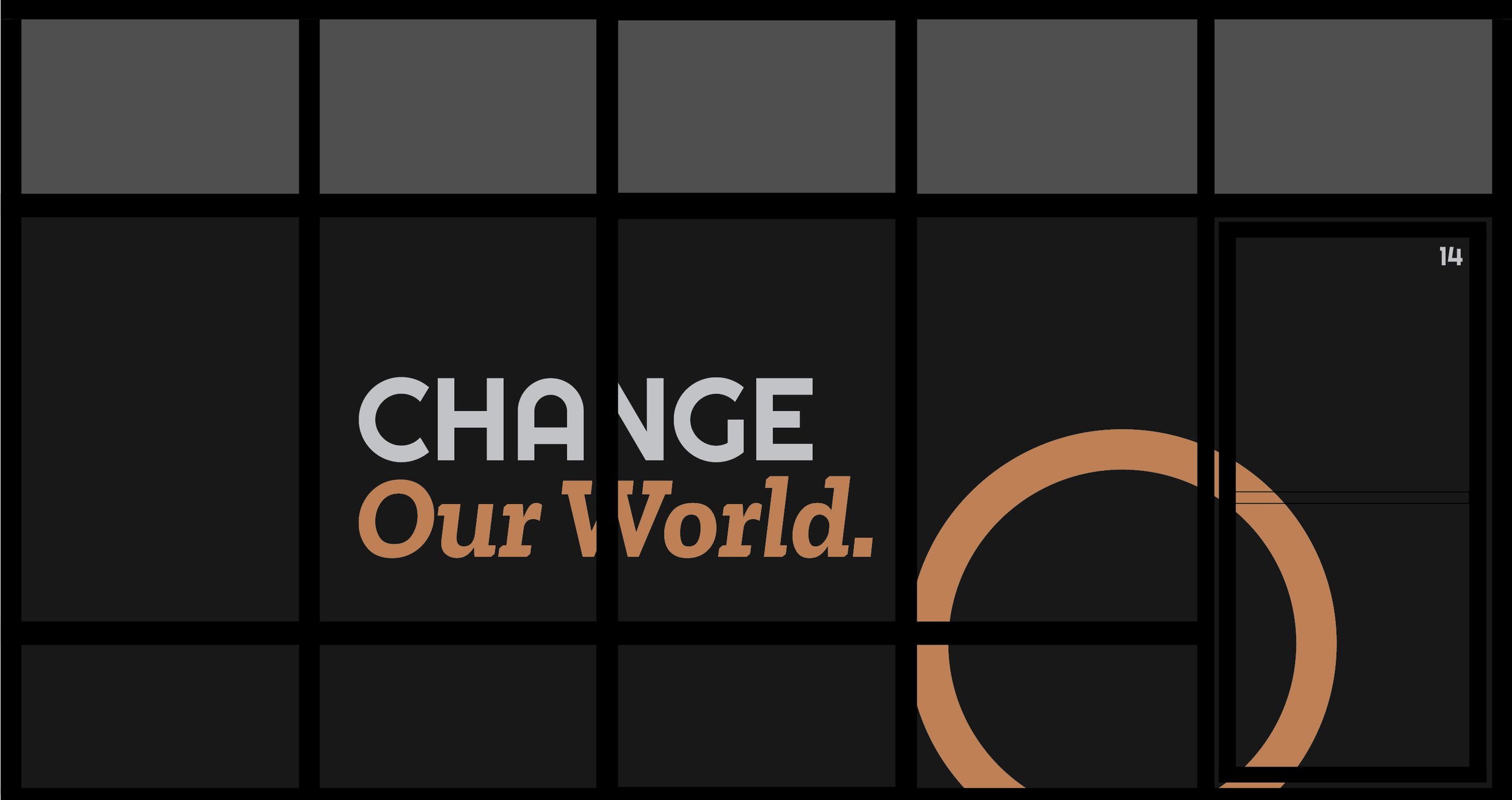
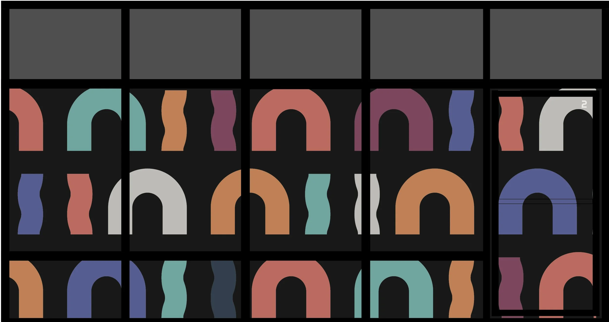
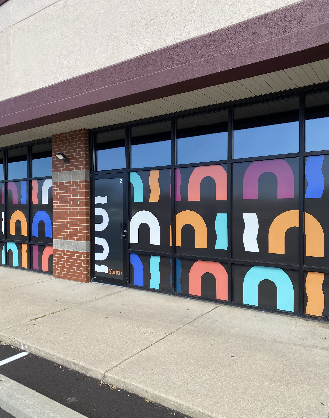
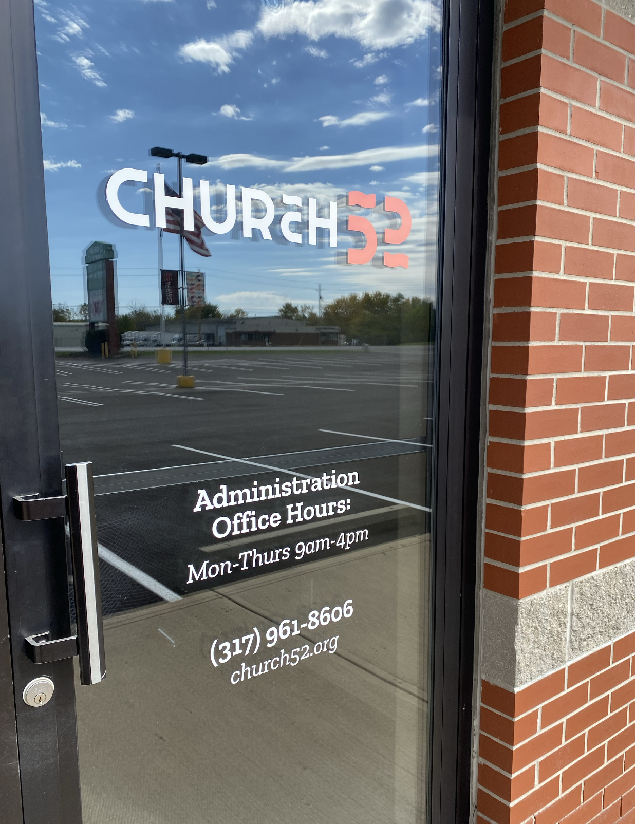
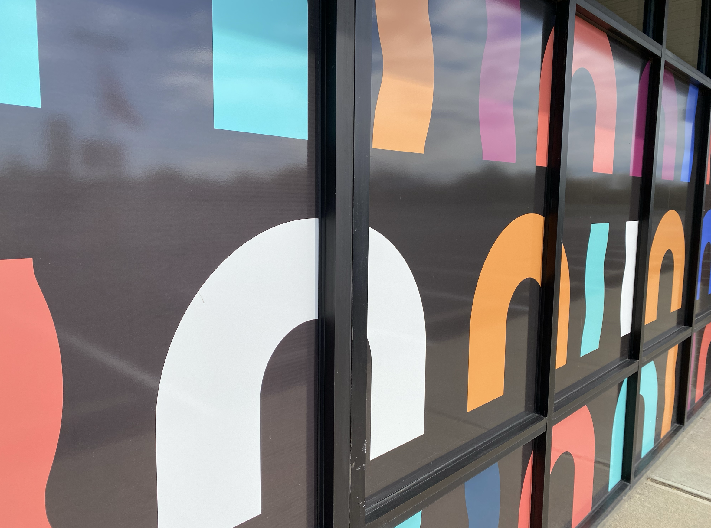
The final identity presents Church 52 as a church expectant—rooted in the Spirit’s leading and energized by its calling to share good news. The custom typography carries layered meaning, with flowing lines above the “C” and within the numbers 5 and 2 referencing the tongues of fire at Pentecost and a flag lifted in the wind, echoing Isaiah 52. These same forms suggest movement, worship, and proclamation. The number 2 can also be interpreted as a figure kneeling in worship, while the pairing of 5 and 2 recalls the miracle of the loaves and fish—an image of multiplication that mirrors Church 52’s vision for expanding impact and outreach. To ensure flexibility, Marion Design Co. developed four logo variations alongside supporting icons, secondary marks, and patterns. A bold color palette anchors the system, with red and burgundy expressing passion and spiritual energy, balanced by cooler secondary tones that convey welcome and calm guidance. The brand was applied across digital and print materials and extended into interior and exterior wayfinding and facade design, helping establish Church 52’s building as a permanent, recognizable home for its growing community.


Before & After