< Back to Work
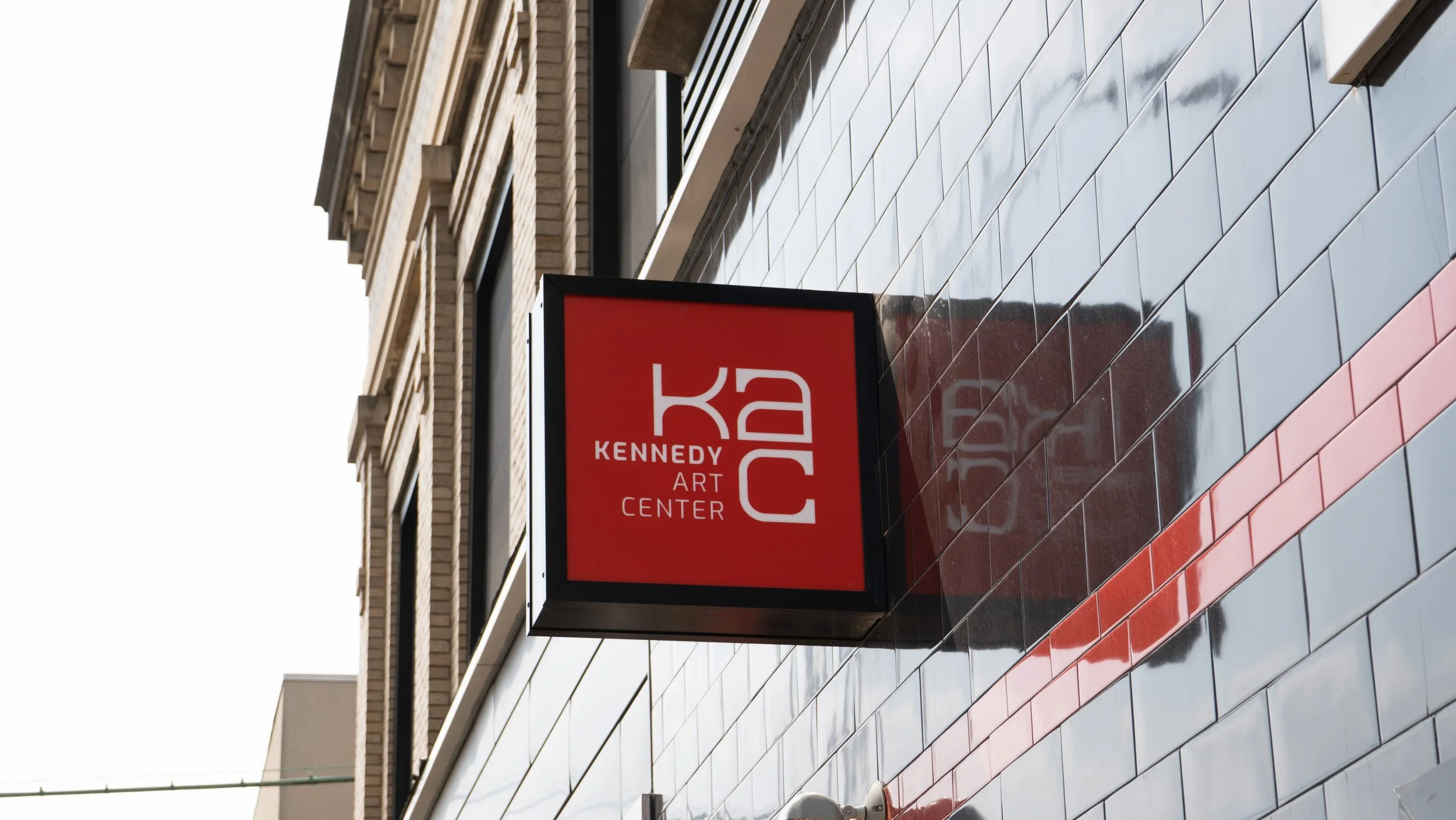
KENNEDY ART CENTER
Brand Identity
2023
Our Process
FROM PROBLEM
TO DESIGN
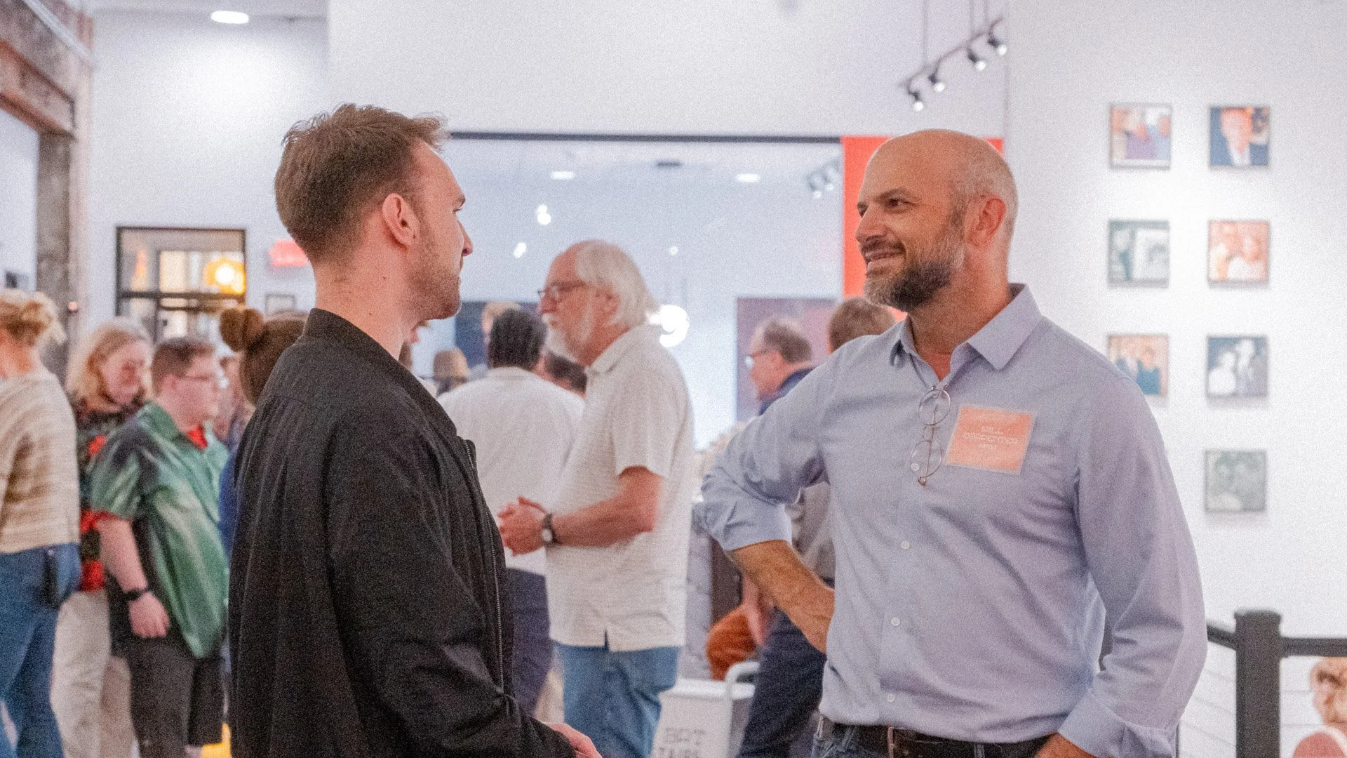
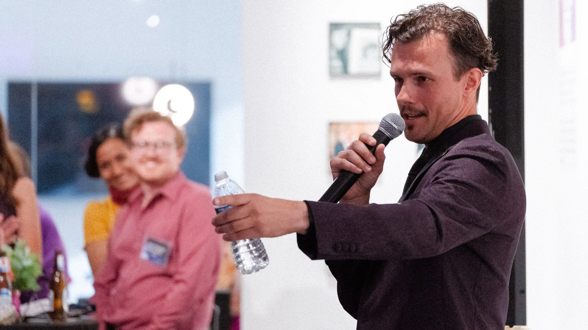
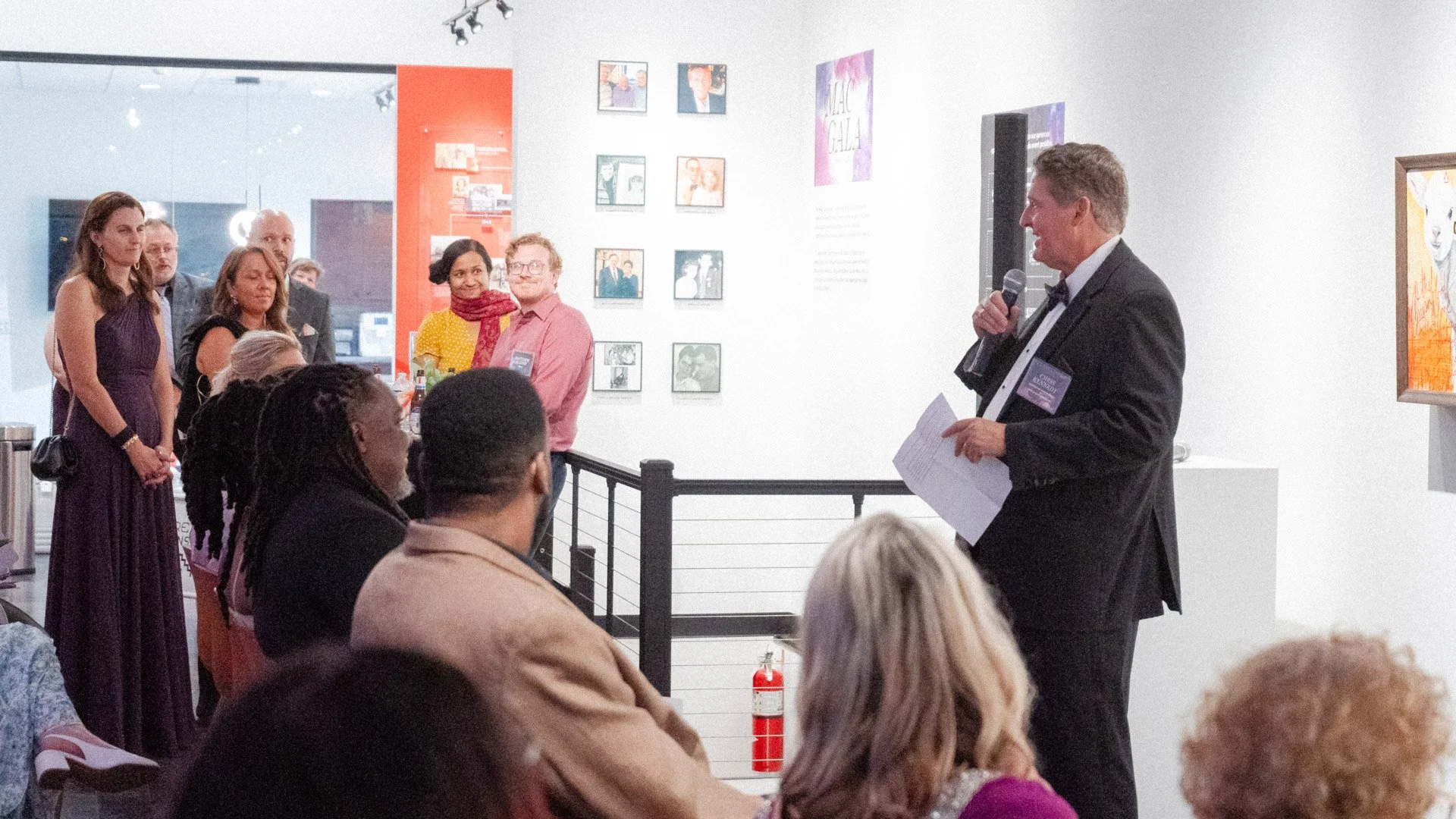
As the Kennedy Art Center prepared to open its doors in downtown Marion, the space needed an identity that could carry both its future vision and its deep roots in the community.
-
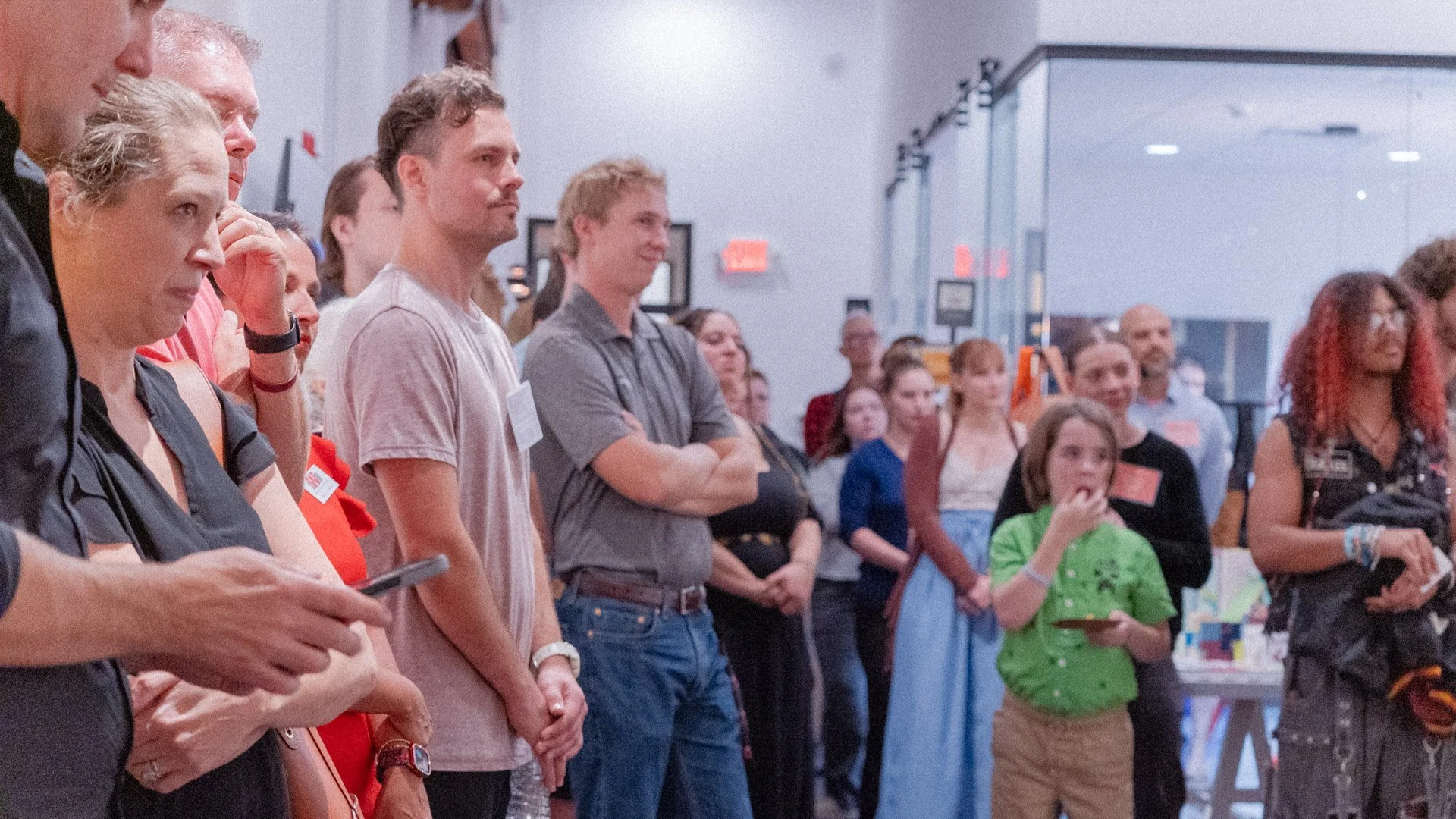
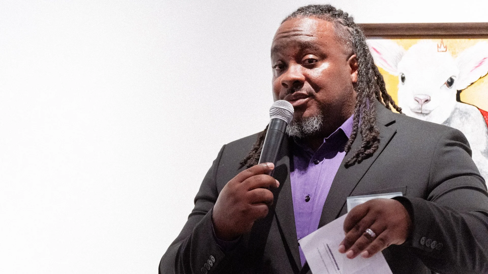
Born from a long-standing partnership between Marion Design Co. and Chris Kennedy, the center was envisioned as more than a gallery—it would be a place for artists to gather, ideas to surface, and the community to engage in creative exchange. At the same time, the Kennedy Art Center needed to honor the legacy of the Kennedy family, whose investment in Marion and the arts spans generations, from the success of Hartson-Kennedy Cabinet Top Co. to a wide range of artistic pursuits across the family. The challenge was to create a visual identity that felt timeless rather than trendy, energetic without being overwhelming, and rooted in heritage while inviting collaboration and new voices. Without a cohesive brand system, the center risked missing the opportunity to establish itself as a cultural anchor at launch. Marion Design Co. was invited to translate legacy, creativity, and community into a brand that could inspire artists, welcome the public, and set the tone for a vibrant future.
-
Marion Design Co. began by meeting with the client and conducting research to clarify goals, audience, and positioning. We completed a competitor brand audit and synthesized the center’s core values, asking key questions about purpose, differentiation, and the experience the Kennedy Art Center should create for its guests. From this work, a clear mission emerged: to celebrate and empower Grant County artists through exhibitions and events that inspire the broader community. With this foundation in place, we moved into visualization. Our team developed a moodboard informed by museums, galleries, and academic creative institutions, then explored multiple directions through sketching and concept development. After refining our ideas, we presented three logo concepts to the client. Once a direction was selected, we built a flexible brand system, developing multiple logo variations and guidelines to support consistent use across a range of applications. The result was a clear, intentional process that balanced strategic clarity with creative exploration.
-
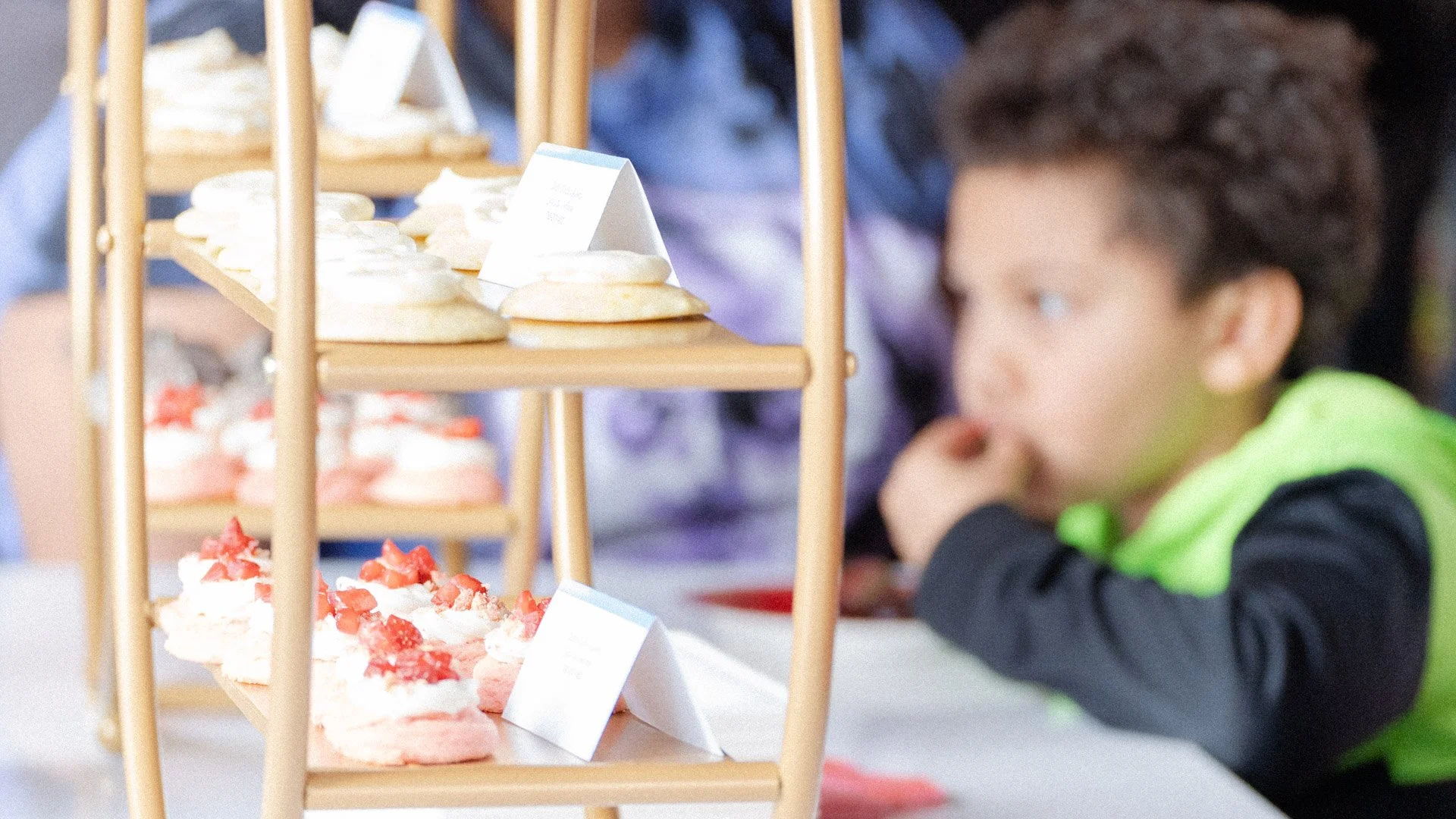
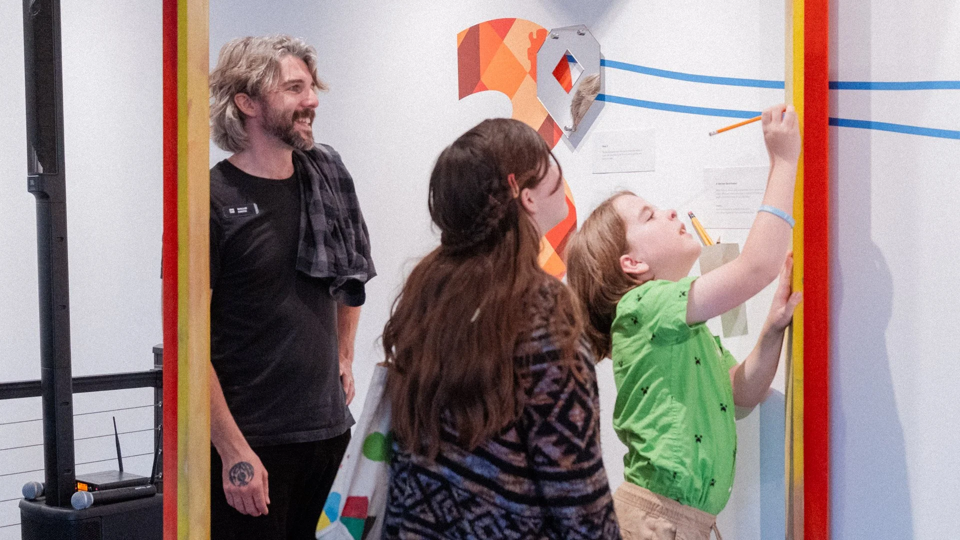
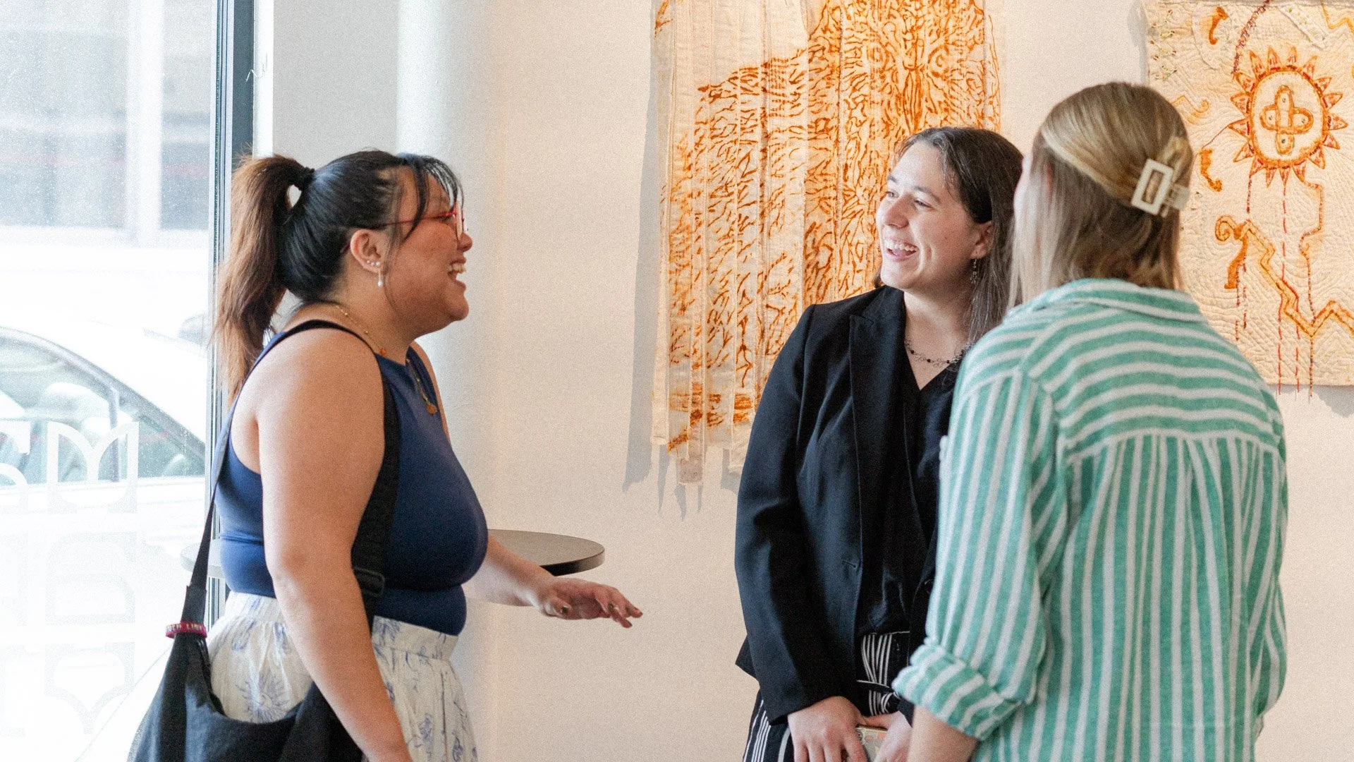
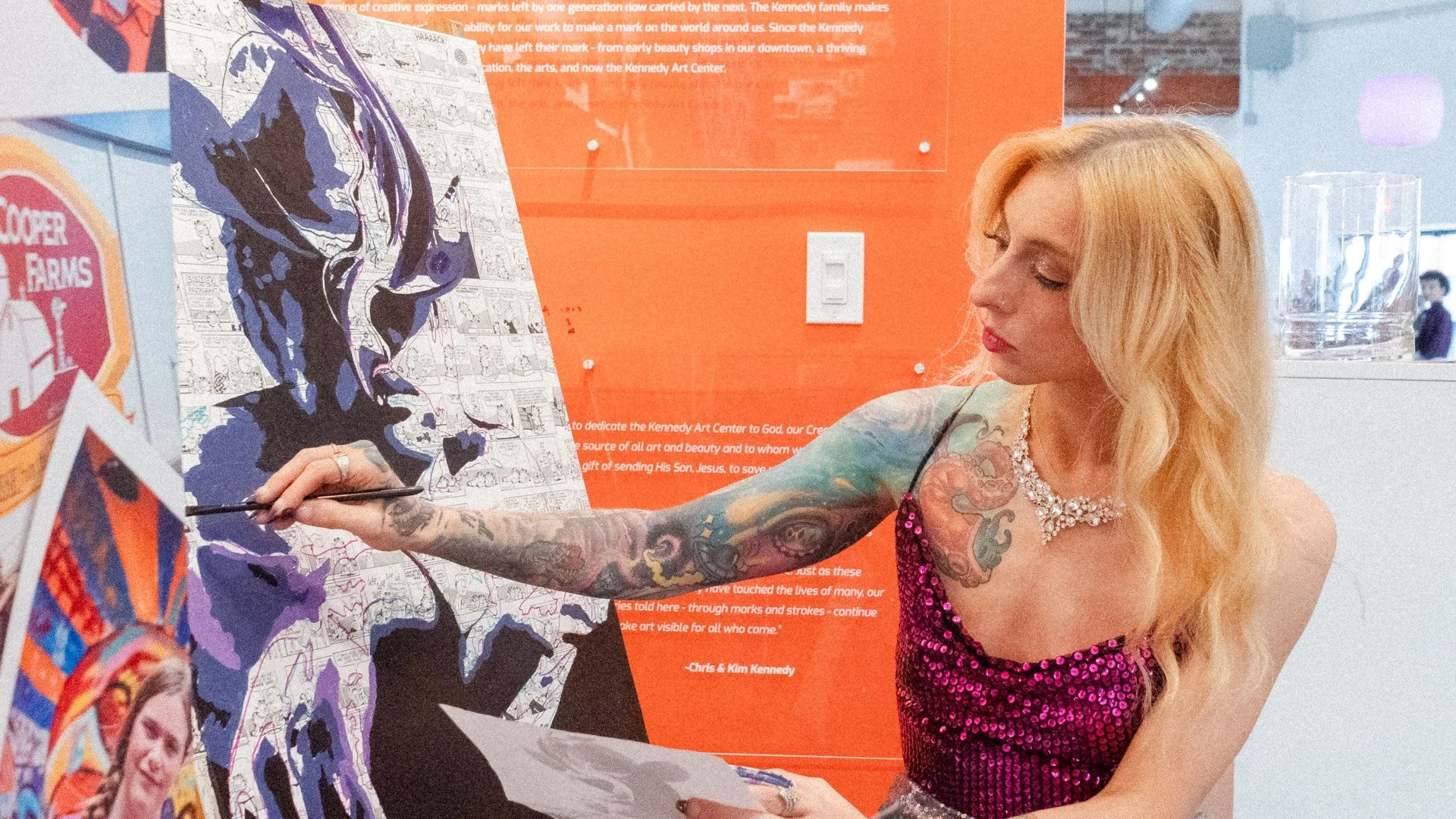
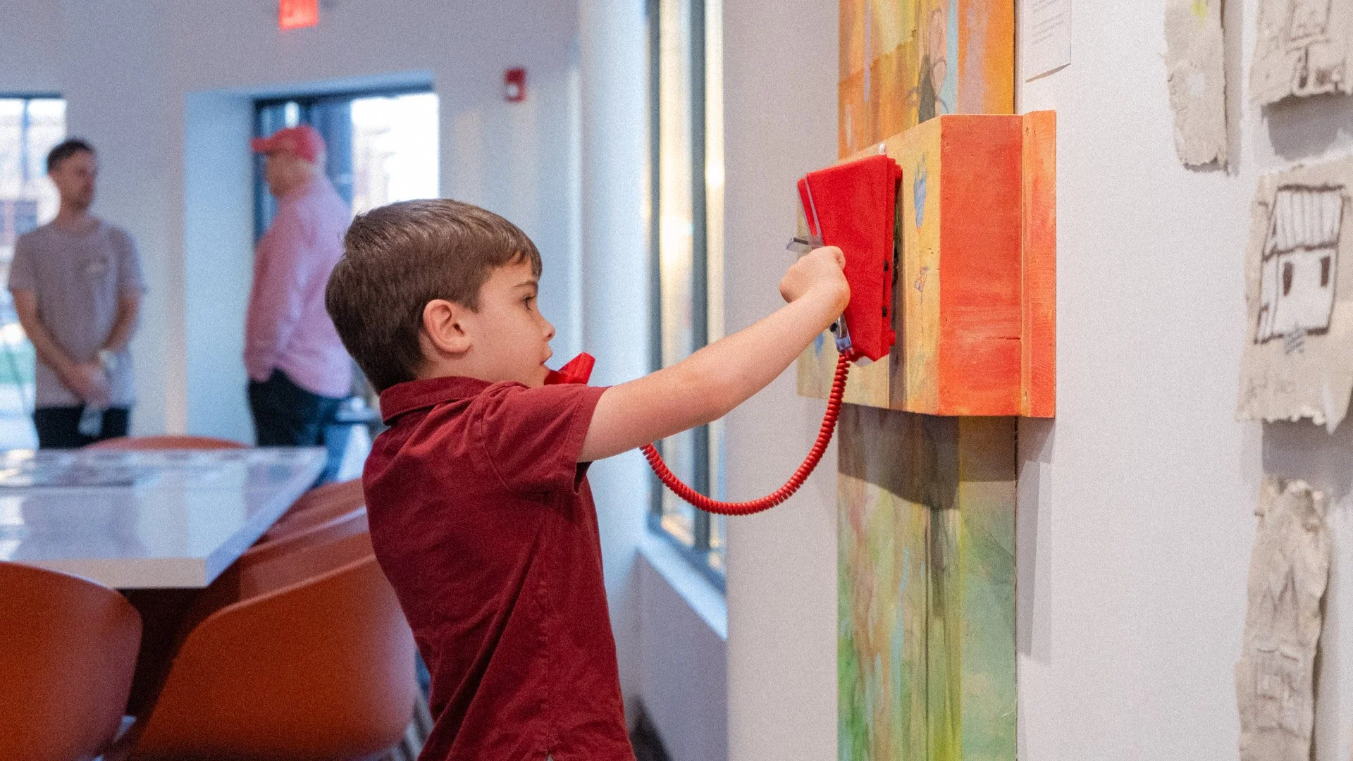
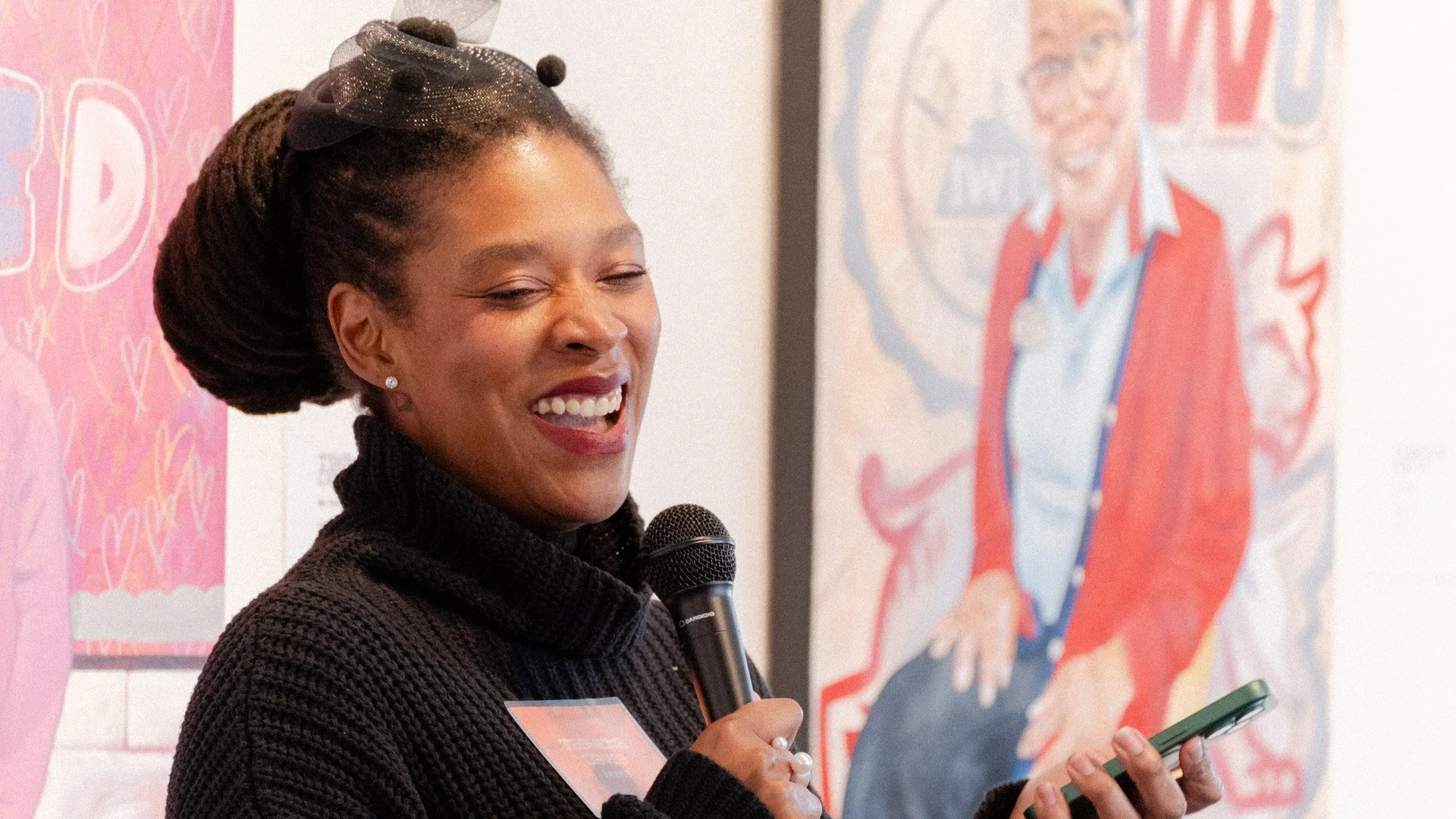
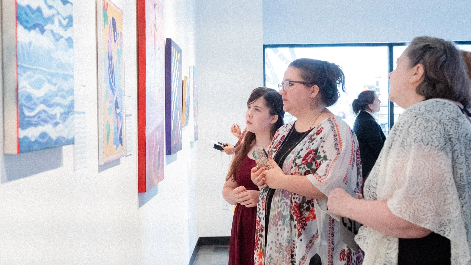
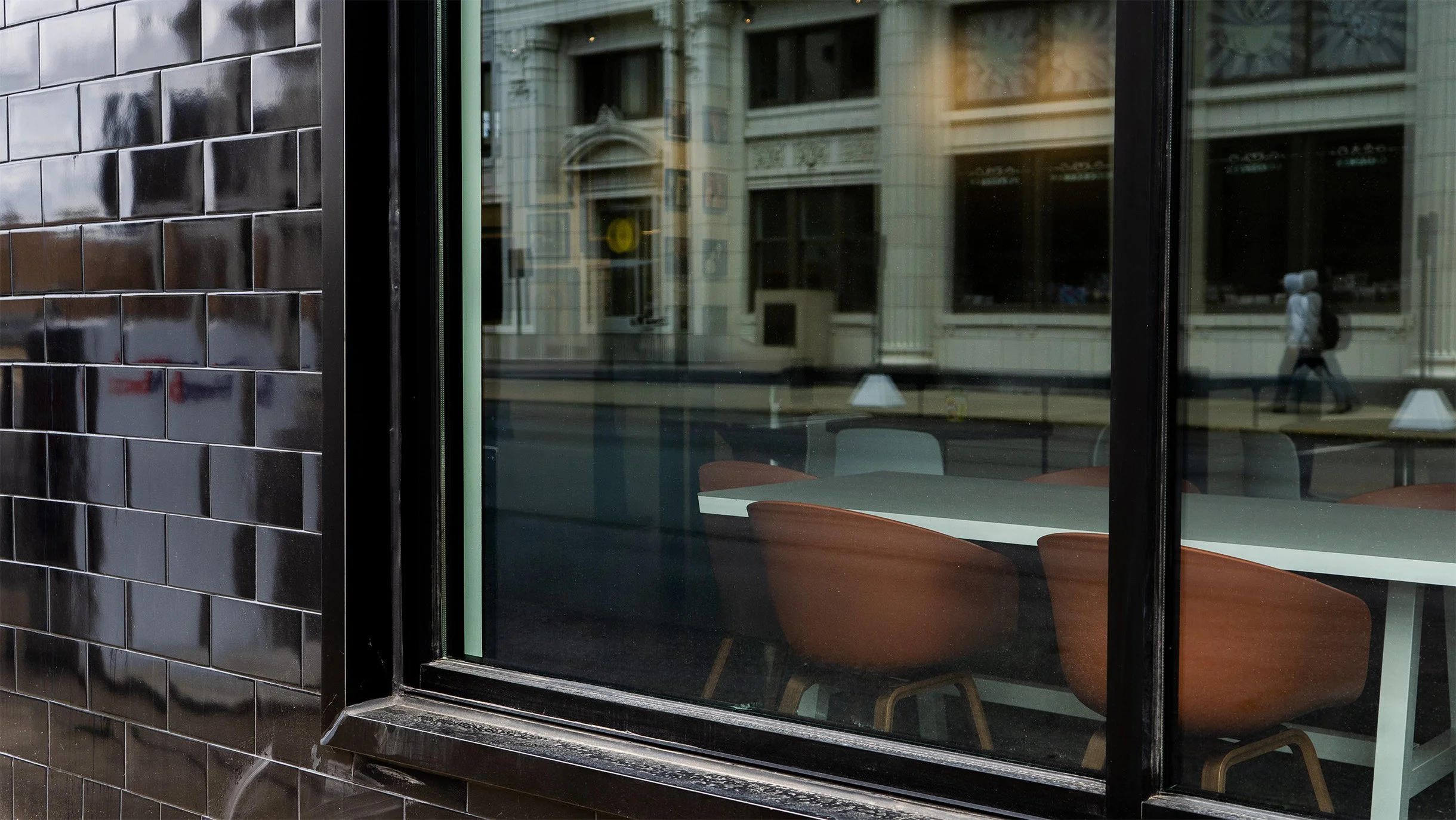
The final visual identity for the Kennedy Art Center captures the energy of creative expression while honoring the Kennedy family’s artistic legacy and inviting the community into the work. The selected “Strokes” concept centers on a warm, vibrant palette anchored by an invigorating orange, signaling creativity and momentum. A custom typeface, Kennedy Neue, was developed to give the brand a distinctive voice—bold enough to stand on its own while elevating the artists it represents. Arts-inspired design elements woven throughout the system reference multiple creative disciplines: brushstrokes, drawn lines, and charcoal marks nod to visual art; staff lines echo music; and poetic annotations reflect literary expression. Together, these layered forms communicate that the Kennedy Art Center is shaped by many creative voices across generations. The identity was designed to be expansive rather than prescriptive, allowing new artists to bring their own marks into the system while remaining cohesive. Applied across the physical space and digital platforms, the brand establishes the Kennedy Art Center as a vibrant cultural anchor—rooted in heritage, alive with creativity, and open to what comes next.