
Double-click to edit...
THIS IS OUR NEWSLETTER
BEYOND THE BRIEF
We're always fascinated by how often we get to deliver beyond the original brief. As with any relationship grounded in curiosity, we learn more about our clients' vision than we anticipate. As we dream and imagine with them how to expand their business or organization to better reach their audience, we delight in carrying out creative solutions beyond expectations.
Read on to learn more about the relationships and stories we've had the privilege to expand this quarter!
PROJECT HIGHLIGHT | 07.26.26
LIGHTS, CAMERA, ACTION!
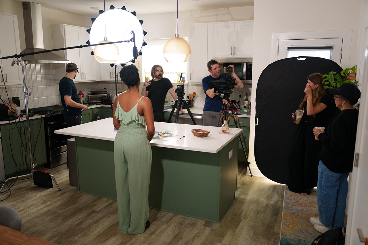
What We're Made Of, developed by Karis Parenting, guides meaningful family conversations and aligns with core values. This portable card game uses scenarios in categories like Family, Finance, and Education to resolve dilemmas and build parenting confidence. But sometimes reading instructions isn't enough to engage players. Karis needed visual guides spoken and demonstrated by real people to help participants understand the potential of meaningful conversation and relationship insight. That's where we came in.
We led a team of photographers and filmmakers to capture instructions and demonstrate how to play the game using scenarios. With instructions curated by Sam Rogers, Director of Karis Parenting, Willie Smith, Chief Design Officer, directed the team to capture the most engaging scenes to tell the story of how What We're Made Of could be played. We hope you'll check out this product and the many other books and activities we've had the privilege of designing for Karis Parenting.
If you have a story you want to share with your audience, reach out and we’ll meet to see if a partnership would help you achieve your goals.
PROJECT HIGHLIGHT | 05.20.26
COLLECTIVE DATA
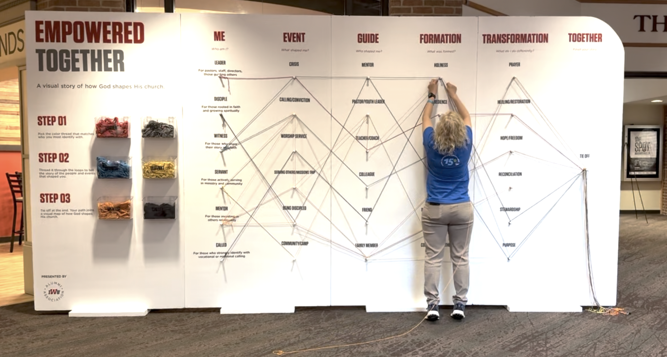
Data collection can be fun! IWU's Marketing Department asked us to design and build a life-sized interactive display for the Wesleyan General Conference, engaging enough to hold up in front of more than a thousand attendees, as a prototype for a future permanent display on campus.
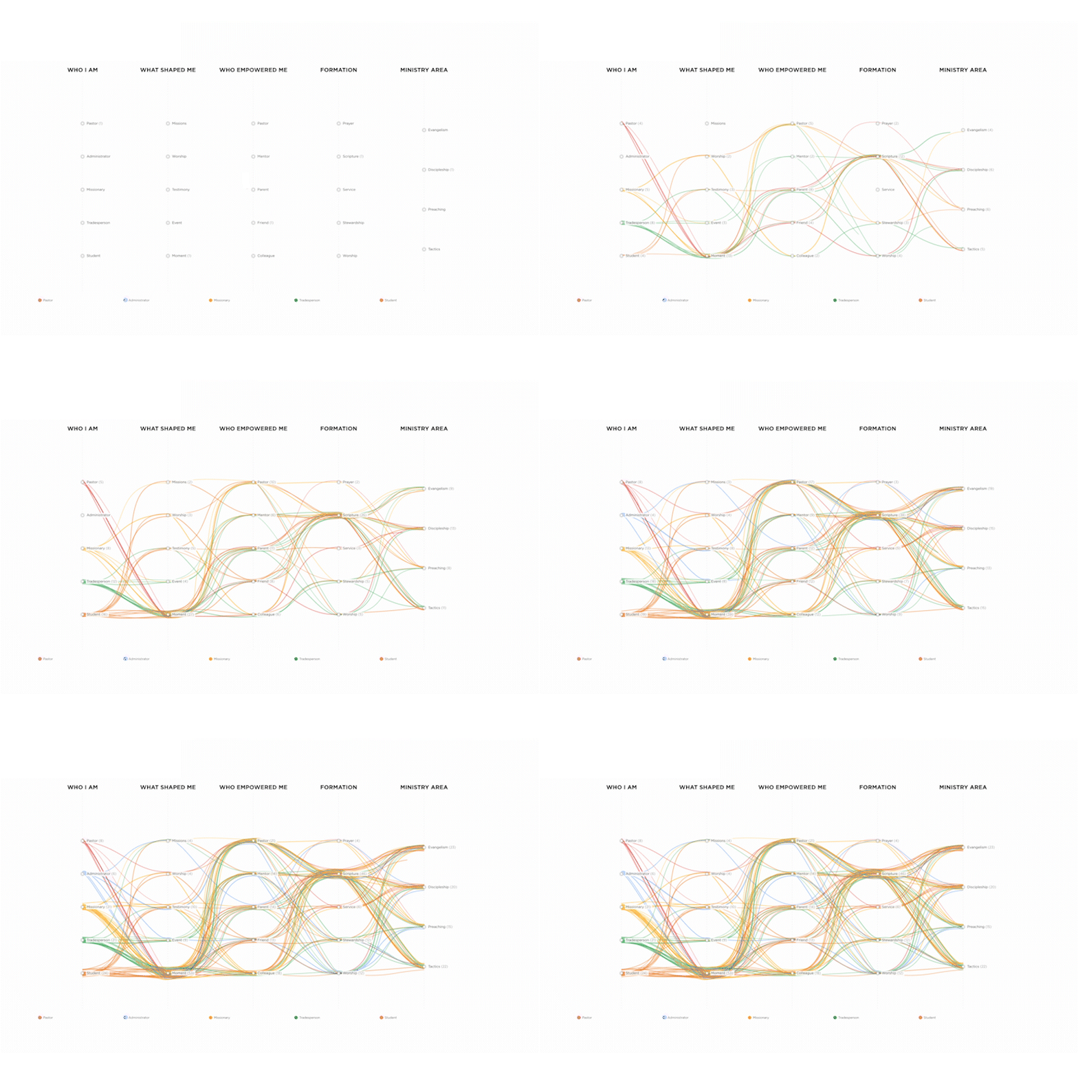
We started with research, proposing three possible directions before IWU chose where to go. From there, we designed three distinct display variations for them to choose between, each handling the same core idea, a colored thread, a personal path, a shared result, in a different form. Because it's hard to picture how a design decision plays out at scale, we also built a simulated animation showing how hundreds of virtual threads would accumulate, letting IWU see where patterns would cluster and where paths would diverge before a single attendee touched the board.
To the participants, the display felt like public art, a chance to see their own story become part of something larger. To IWU, it was a readable instrument ready for future data collection processes.
BRAND IDENTITY PROJECT HIGHLIGHT | 07.1.26
BOOKKEEPER BRAND
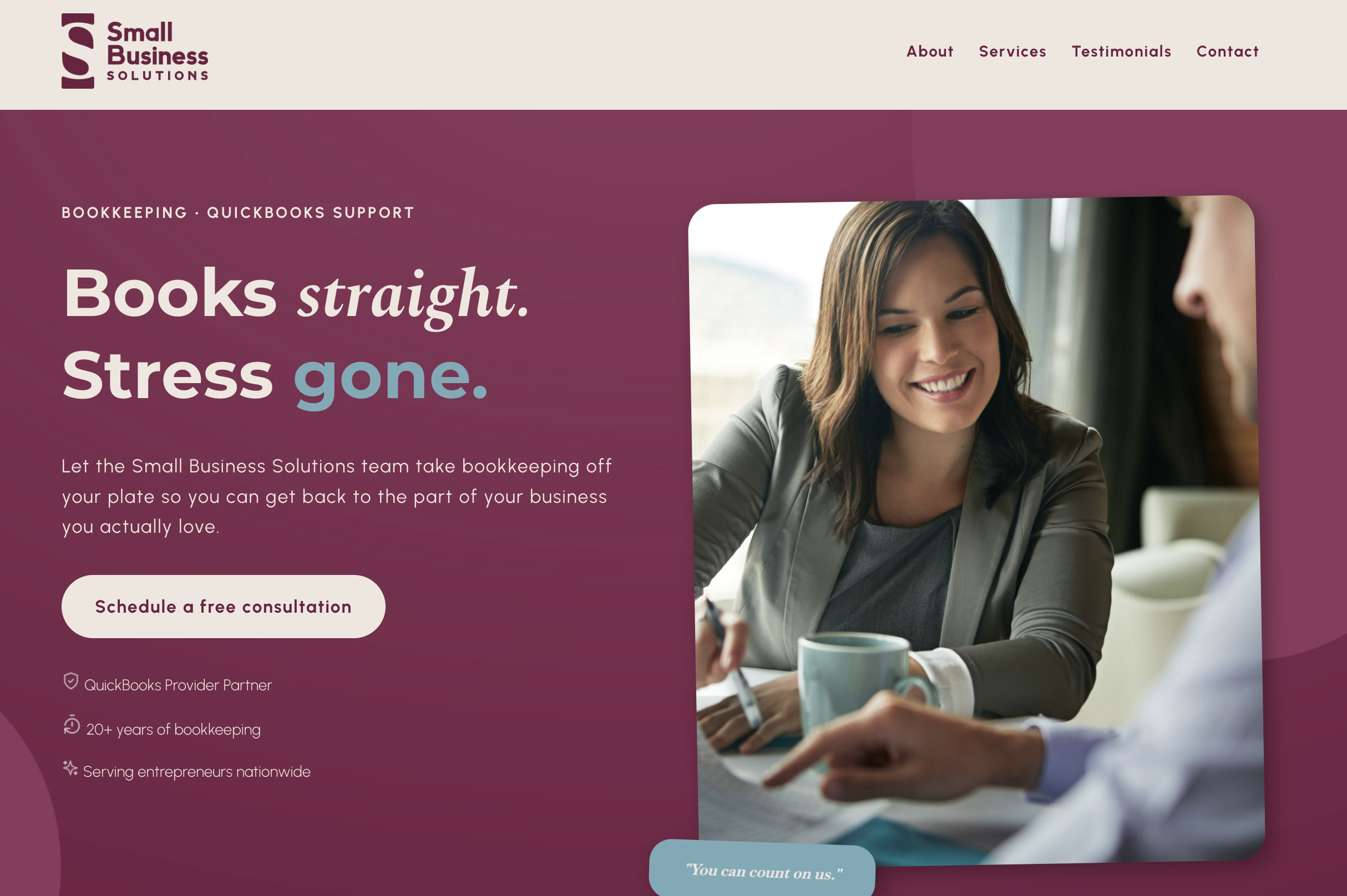
JoAnn Adams has spent twenty years keeping other people's books straight and has a big vision for growing her business. She’s built Small Business Solutions while running her own coffee house, but the brand wasn't telling the whole story. Its safe blues and greens looked like every other bookkeeping firm. The relationship she's built with her clients was the real story. Every time she posted a photo of herself instead of a stock graphic, her engagement increased.
When she hired us to rebrand her business, we started by listening and auditing the brand, communications, and website to see what was working before deciding what to build. From there, we developed four logo directions and let each one carry a different piece of who SBS is: professional, approachable, structured, bold. It was also important that the brand colors play well with QuickBooks’ brand. What came out the other side was a brand that hints at the dollar symbol while leveraging the letterforms in their names. Moving to an elevated professional visual presence in their brand and on their new website looks and sounds like the person who built this business so nobody else would have to tackle their books alone.
A DESIGN ECONOMY OF GENEROSITY | 08.12.26
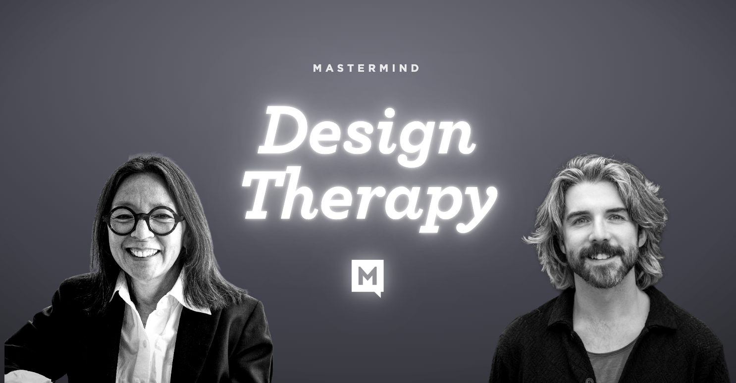
WHAT’S BLOCKING YOUR BRAND?
Many clients come to us because 1] potential clients are asking them for services they don’t provide, 2] people aren’t thinking of them first, or 3] they’re not sure how to reach their ideal customer. What creates this disconnect?
That’s what Design Therapy is geared toward answering. Bring your design messaging problem to the group, and we’ll tackle it in real time.
Whether it’s a brand, social media, website, or graphics problem, Design Therapy is for you! Bring your design challenge or just join in and listen. We know you’ll gain insight you can use!
It meets every second Wednesday through the end of the year, 10 am EST.
The next session is September 9th.
Register below to receive a link to join us!
GOT AN IDEA? CONNECT WITH US!
If you’ve been carrying around an idea—big or small—and you’re wondering what it might look like brought to life through design, we’d love to hear about it. We believe design is about bringing the soul of your vision to the surface and shaping it into something that moves people.
Whether you’re at the spark stage or halfway there, our process is built to listen deeply, uncover what matters most, and accelerate your idea into something tangible, meaningful, and ready to make an impact. Let’s start the conversation. Contact us at hello@mariondesign.co!
