City of Marion Branding.
Overview.
The city of Marion is rooted in a deep sense of story. We command pride by sharing stories of championed triumphs and successes, heart warming and pain, we tell stories that line our history book pages and stories that tell about our identity; whether spoken or written, the many stories that make up Marion come in all shapes and sizes. Telling the story of the past is one thing and fostering the story of tomorrow is another. How do we begin to do this? By developing a new found identity rooted in the people of Marion, our goal was to rejuvenate our amazing community with a renewed sense of pride, hope, and energy that pairs with the new vision of our Mayor Jess Alumbaugh. Marion Design Co. created a strategic campaign that utilized refreshed colors, type treatments, new logo development and standards, and overarching branding that reinforces our story of tomorrow; the story of champions.

Objectives.
The city of Marion was a fragmented community, but those pieces were of a variety of shapes and sizes that contained all that was needed to bring the community back together and move forward. However, before Marion could come together and move forward as a whole community, we needed the people of Marion to see the bigger picture and realize that Marion was not broken, but merely separated, holding them back from their potential. This would not be an easy feat, but rather a long process of spreading awareness of the potential that is in Marion and giving the community a tangible goal to work towards. In order to do this it was important to create a brand for the people of Marion to identify with. In order for this to be successful it was vital that the brand was built up from the existing attributes of the community rather than creating an arbitrary idea that seemed to simply cover up the past. This brand had to come from the people, meaning we need to truly know the community on a close and personal level.

Process.
Because creating this new brand for Marion required us to know the people of Marion, we had to do just that: get to know the people. Before the branding was even started, an entire summer was spent on talking to members of the community and taking surveys of how they truly felt. Through this, it became clear that Marion is home to a full and capable community that is misperceived, segmented, and under-realized. Despite the fragmentation of the community of Marion, the people share a common identity that exhibits deliberate care and vibrant life, and is propelled forward by focused action through overflowing tenacious hope. These are the values of the community that were necessary in progressing forward together towards a brighter future.
Our mission was to bring the positive energy required to grow the Marion community through a proactive approach based on honesty, collaboration, and accountability. This approach meant that the community of Marion needed to share their personal stories with each other in order to realize each of their uniqueness that could benefit the community when combined so that each member plays an important and active role in the growth of Marion. Only the people of Marion can create for themselves a healthy and thriving environment full of opportunity for all citizens and visitors alike. It is important that an individual welcomes a sense of belonging to a community as it creates a foundation for discovery and understanding. This convergence of the individual and the community is vital for that community to thrive.
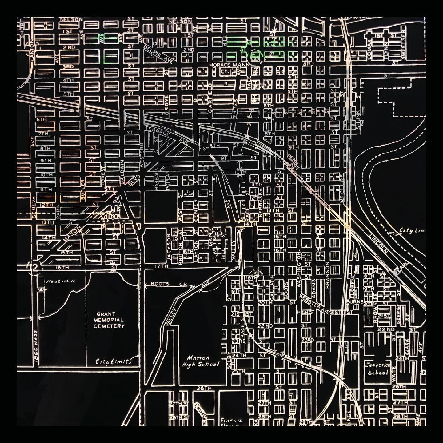
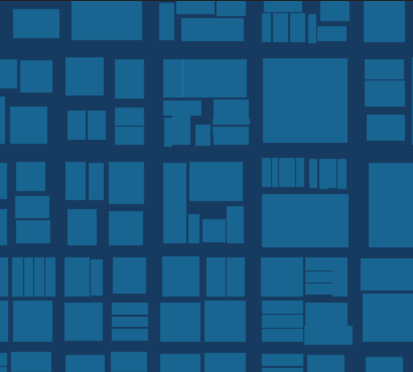
Once we understood the community to the point of becoming a part of it ourselves, we were then able to create a mark that truly exemplified that community. The mark was derived from the layout of the city. When looking at the city from above you can see that it is made of up of a grid: pieces of a variety of shapes and sizes that help make up the whole. Understanding the whole is important, but it only truly makes a difference if you understand each of the pieces. To accomplish this, an extensive, on-foot study of the buildings throughout the Jeffersonian grid of Marion was performed. Patterns and shapes began to emerge through repeating textures and shapes. From these ideas, we decided that the key visual elements to creating a mark were figure and ground, proximity, closure, containment, foundation, and harmony.
Result.
After multiple visits to the 7th floor of the Regions Bank building (now Ridley Tower), we became consumed with the infatuating views of Marion. From North to South, East to West, we saw Marion from a whole new point of view. From where we stood, struggle seemed inconceivable; it was harder to see the broken and the blocks that kept us from thriving. We knew that the community of Marion, in all its shapes and sizes, made up all the right pieces needed to move forward, but did Marion as a whole understand this?
When we change our view-point and perspective, we gain a new focus that fosters remembrance to the bigger reason of why we are all here. Our uniqueness is in the people that exist here, it is who they are, what they are, what they do, and how they call Marion their home. There’s a certain truth in the saying, “home is where the heart is”; if we could only realize our hearts look the same from above.
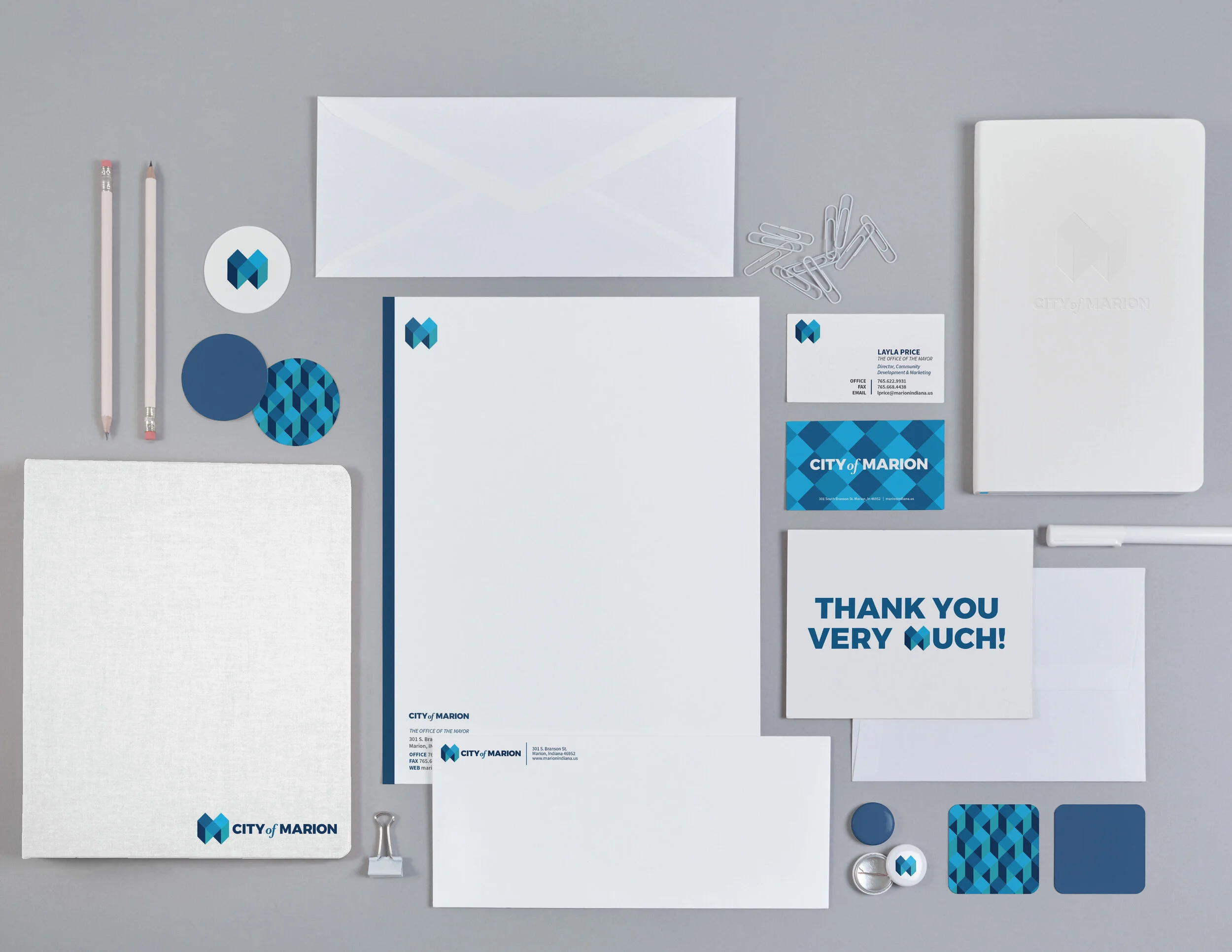
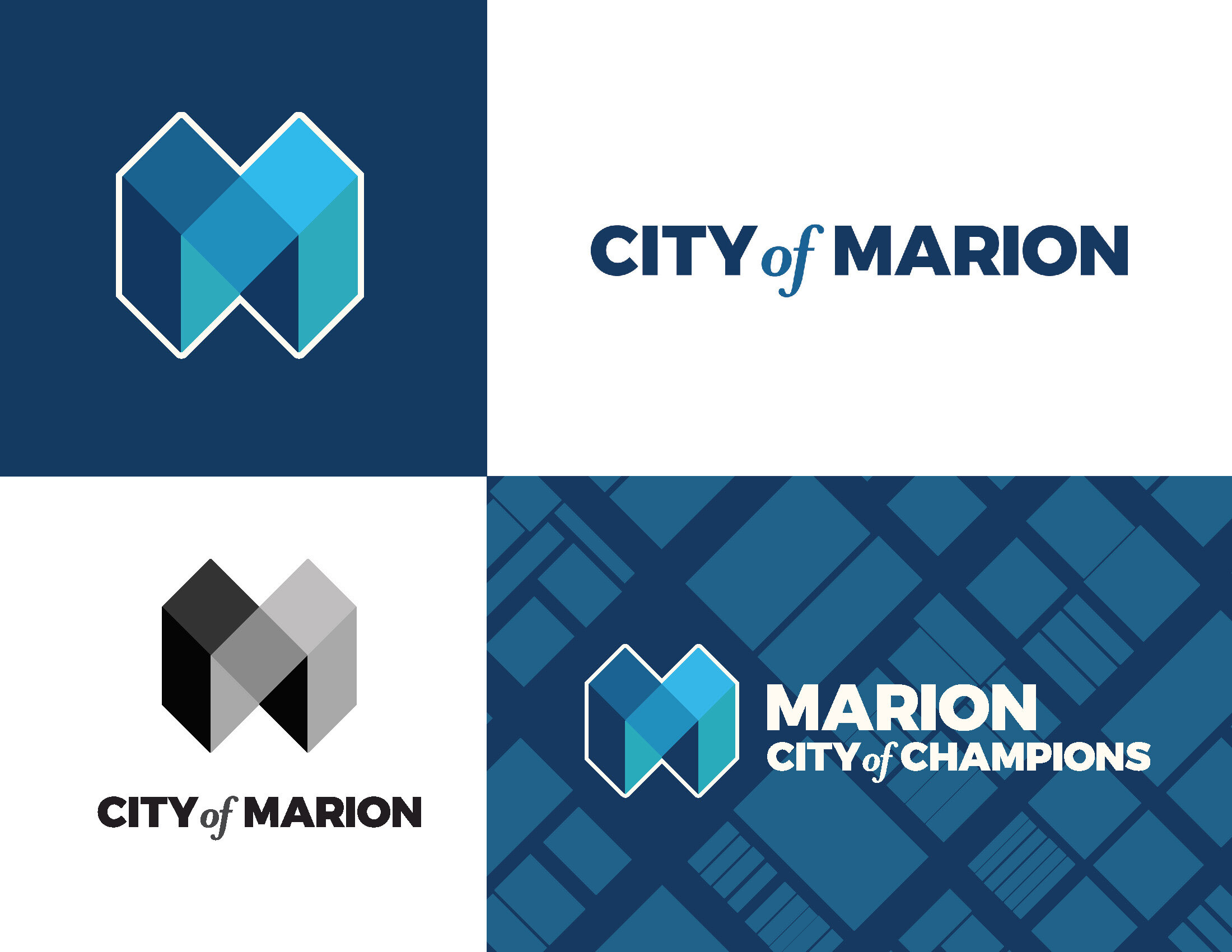
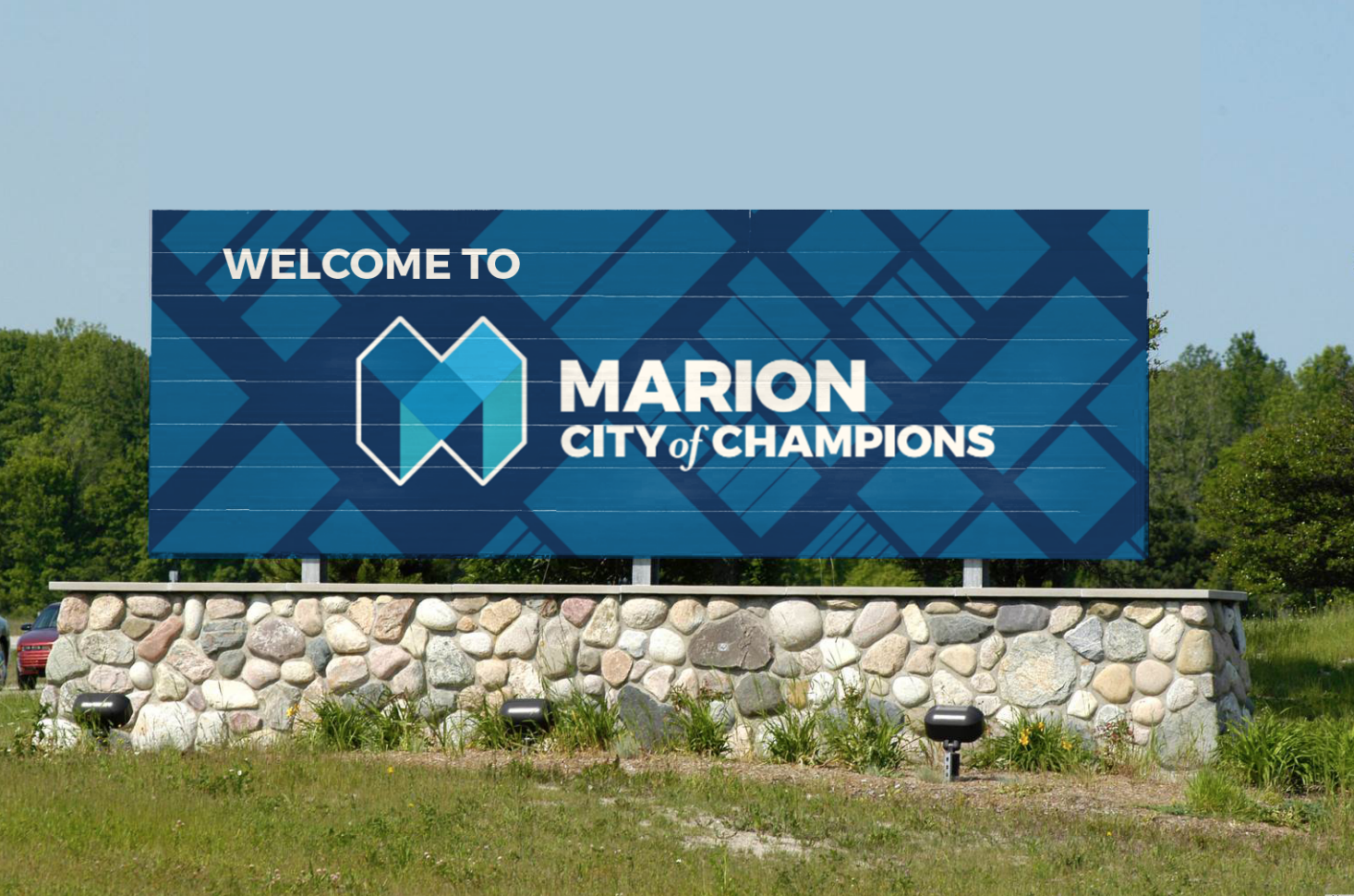
After an extensive study of the people and layout of Marion, we were able to come up with the new brand for the city. This is primarily identified by the mark, a geometric “M” that derived from the repeating patterns and textures seen throughout the city of Marion, the center of the “M” being directly proportional to the center square of Marion where the Grant County Court House sits. The squares that make up the “M” exhibit the coming together of the fragmented pieces of the community to make a whole, unified identity.
The colors chosen were variations of blues and teal alongside white. Blue is known to be trustworthy and dependable. It is reliable, responsive, and mentally soothing. For that reason alone, blue is one of the most liked colors across the entire world and can bring a sense of calmness and trust when building relationships. White is a color that is complete and pure, making it a perfect example of purity, innocence, cleanliness, and peace. White can also represent new beginnings, providing a blank slate, and gives refreshment for new ideas. The color teal, a mix between blue and green, represents open communication and clarity of thought. According to color psychology, the color blue expresses calm, gentle, and serene feelings, while green symbolizes growth, strength and spirit. These colors were chosen while also keeping in mind the existing colors within other brands of Marion and Grant County so that when the mark appears along side marks of smaller identities within the city, there appears a sense of cohesion.
The typography also plays an important part in the brand. The typefaces chosen are open-source, meaning that they are free for public use, ensuring ease of use in all applications. The primary typeface, Montserrat, is a modern sans-serif typeface of which its bold appearance embodies the strength of the city of Marion to overcome hardships. The secondary typeface, Source Sans Pro, is a gothic typeface chosen for its legibility at low resolutions and comfort when reading long passages of text. There is also a third typeface that should only be used in the mark. It is the “of” in the title, city of Marion. A separate typeface is used here to highlight the fact that it is the city of Marion to denote ownership and belonging, reinforcing the brand’s intentionality of ownership, confidence, and pride for Marion residents allowing Marion residents to tell, own, and preserve their story.
A clear, compelling, and unique brand is the foundation that helps to make a place desirable as a business location, visitor destination, or a place to call home. Development of brand strategy for a city leverages the features of that place to provide a relevant and compelling promise to a target audience. It is not an ad campaign or a tag line. Rather, the branding strategy is a deeper, more emotionally shared vision that influences all actions.