Marion Health Branding.


Overview.
In Fall 2020, we began collaborating with Marion General Hospital as they initiated a rebranding project to become Marion Health. We created a brand for Marion Health to represent this new name and unified presence.
Background.
Marion General Hospital has had a long-standing legacy within Marion and its broader Grant County community. As they have cared for community members for over a century, they have grown from a single care facility to a network of over 19 facilities to better serve their ever-expanding community. In response to this growth, they noticed the need to establish a consistent presence across their growing footprint. To accomplish this, they decided to rename themselves Marion Health, and enlisted Marion Design Co. to create a brand that embodied their positive legacy of care and unified their many healthcare offerings under one brand.

Objectives.
Accurate
The brand should accurately represent Marion Health’s mission and values, as well as remain true to its history within the Marion and Grant County communities.
Approachable
The brand should be approachable for healthcare professionals, patients, and the broader community.
Consistent
The brand should exemplify Marion Health’s consistent presence in the community, as well as communicate unity between Marion Health’s various campuses.
Relational
The brand should reflect the relational, patient-centered care that exists at the core of Marion Health’s work.


Process.
Before we began creating branding material for Marion Health, we sought an understanding of the company’s history, values, and presence to ensure we were designing with empathy. To accomplish this, we began by performing an internal audit in which we interviewed and surveyed MGH employees, patients, and community leaders. As we learned more about MGH, forming relationships with the people that daily shape MGH into what it is, we came to understand the attitudes, visions, and experiences of MGH’s own community.
Designing for a healthcare network in 2020 also revealed the resilience and strength of MGH. Our design process took place as MGH’s teams became front-line workers amidst an unfolding pandemic, reinforcing the idea that human need is ever-changing while our caretakers are adaptable and devoted. As an employee of 30 years shared with us, “[MGH] desires to serve the community well by being proactive with the services they provide to meet the changing needs of healthcare...They are committed to making the patient the focus for the decisions they make.”
In addition to an internal audit, we also performed a competitor audit of healthcare networks offering services similar to Marion Health to better understand the industry itself. We visited Marion Health’s various facilities, grounding ourselves in the place we would represent. We witnessed Marion Health’s values--quality, patient service excellence, effective communication, resource management, teamwork, and community-driven--come to life around us as we intentionally incorporated these values into our design process.
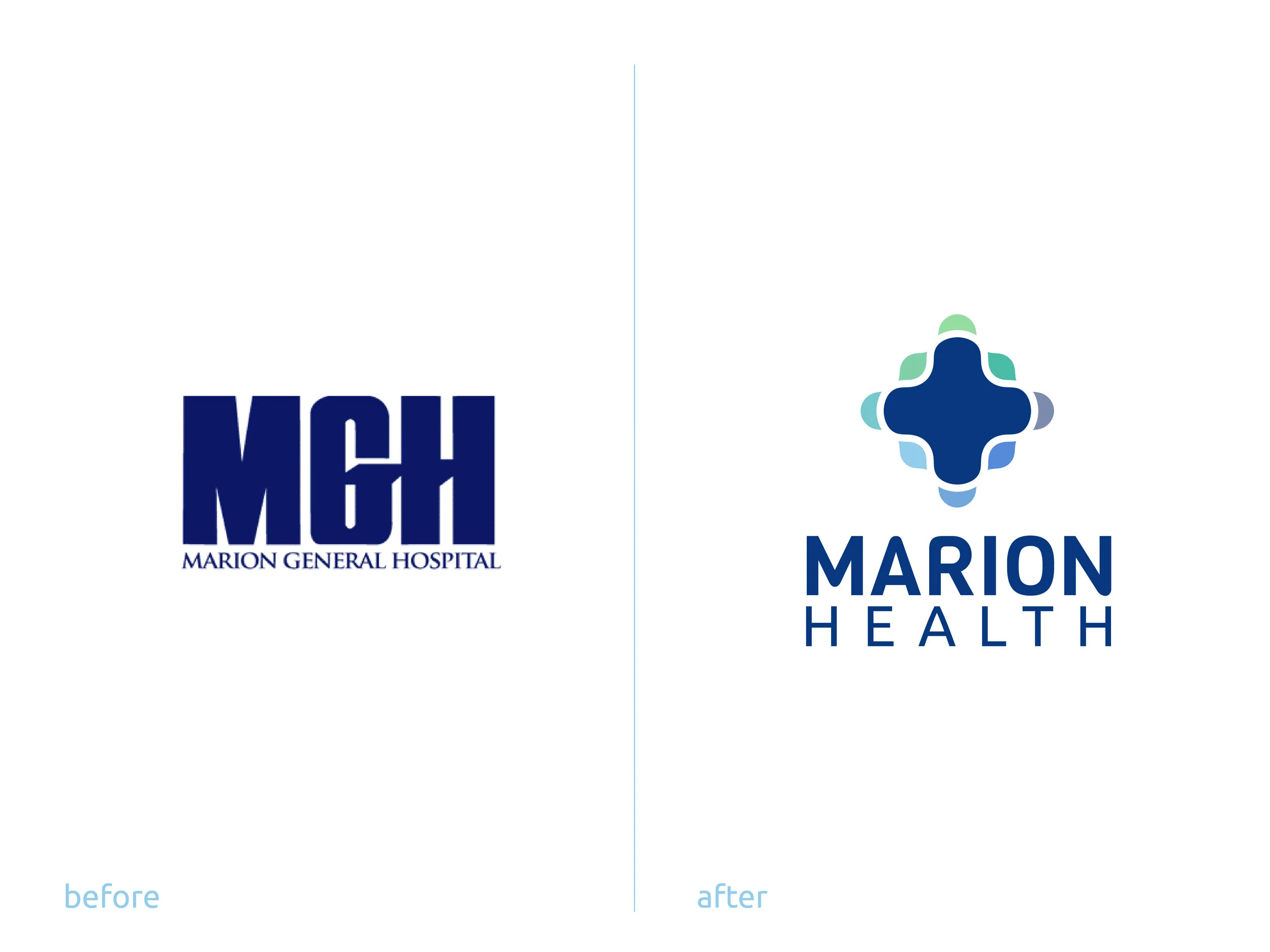
After developing a thorough understanding of Marion General Hospital, we began sketching potential marks for the brand. Inspired by healthcare symbolism, organic patterns, and soft shapes, we created various iterations of what the brand could be. After proposing three focused designs, we worked with MGH to finalize the mark.

Results.
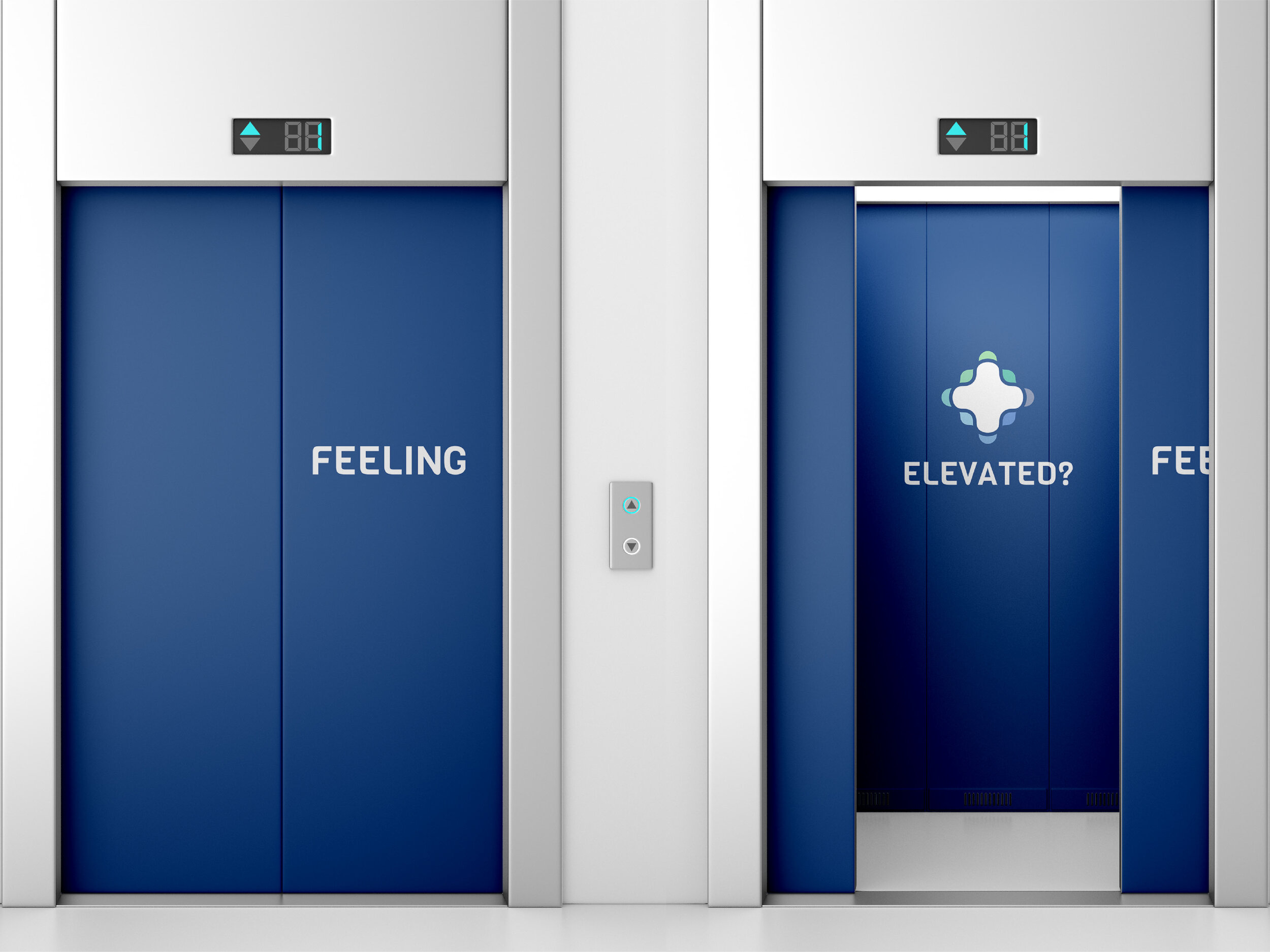
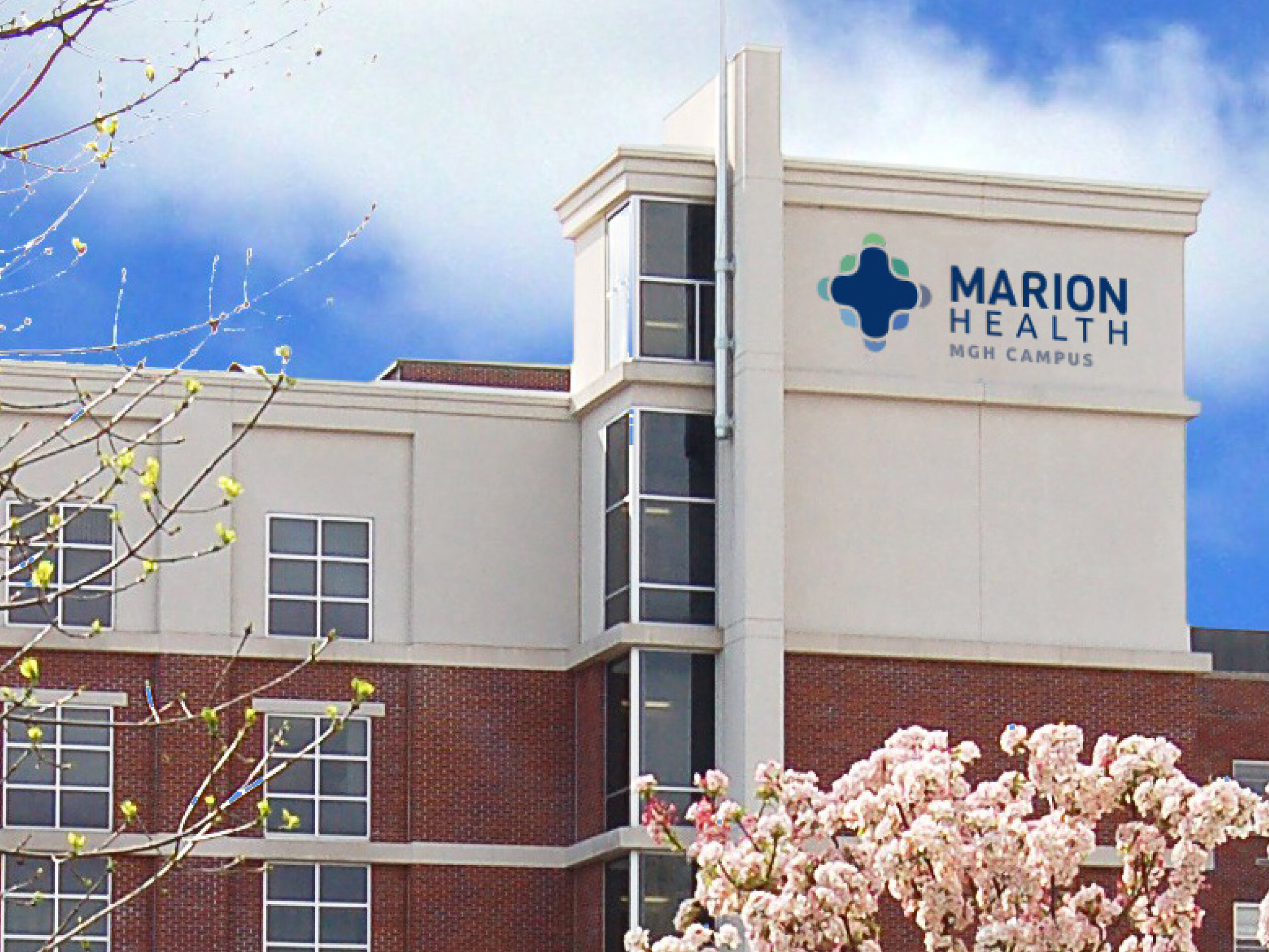
The final mark, The Pulse, maintains a steady embrace around the center and welcomes patients into a similar embrace. Forming a compassionate network of growth, it remains rooted in Marion Health’s integrity, innovation, and holistic care as it reaches more patients and their communities. At its core, the Pulse alludes to the foundational legacy of the Red Cross as an icon of quality care, and the strong blue color is reminiscent of MGH’s long-standing history throughout the region. Like the undulation of an ambulance siren, the Pulse’s ripple-like movement embodies Marion Health’s ever-expanding influence on the community.
The Pulse’s colors imply tranquility, agricultural roots, and innovation. Blues and greens are often associated with health, growth, innovation, care, and community. We selected these colors to embody Marion Health’s pride in its community, reflecting its hard-working, rural setting. Colored with blues and greens, The Pulse welcomes in and provides comfort to the community.
We paired The Pulse with a typeface selected to reflect its soft edges, ensuring its approachability as a brand. The typeface is open, gently drawing Marion Health’s community in. Its rounded curves make the brand more human and reflect the curves of the mark itself, while the typeface’s sharp points represent Marion Health’s strict standard of excellence. Specifically, the ‘N’ in “Marion” ends on a curve, leaving the viewer with an open invitation to become a part of the Marion Health community.
Using shapes from the Pulse, we also designed icons to represent Marion Health’s values, signify wayfinding in their facilities, and form a common language throughout the brand itself.
Ultimately, The Pulse transforms Marion General Hospital into Marion Health, and transforms the company from a rural hospital to a rural health network. The new brand not only allows Marion Health to expand its identity within the community but it also showcases their identity more accurately, revealing all they are capable of as a health network.
Marion Health began implementing this new brand identity in October 2021.