Ministry Incubators.

Overview.
Marion Design Co. developed an updated visual brand and brand identity for Ministry Incubators, a company that coaches churches as they launch creative ideas. The new visual brand we created allows Ministry Incubators’ promotional materials to be more cohesive across their programs and more true to their mission.
Background.
Ministry Incubators exists to prove that creativity and the church are not mutually exclusive, walking alongside faith-minded entrepreneurs as they innovate and create new streams of income for their church communities. With this in mind, they felt that their current brand was inconsistent and lacked connection to their audience and programs. To combat this, Ministry Incubators sought a new brand identity.
Objectives.
In reflection of Ministry Incubators’ mission, we sought to create a brand that would succeed in the following areas:

Align Needs
Align the needs of Ministry Incubators with the needs of their audience in order to maintain brand integrity and match their core mission and values.
Cohesive Identity
Create a brand that carries a sense of consistency across Ministry Incubators’ different services and programs.
Honest Representation
Develop a visual brand identity that would tell the story of Ministry Incubators honestly and represent their identity sincerely.
Process.

Our design process began with months of research. First, we explored every facet of Ministry Incubators’ online presence. Analyzing their website, YouTube, social media, blogs, and more, we became knowledgeable on their current brand presence. Ministry Incubators also provided us with a copy of every piece of branded material they typically use in their consulting meetings and workshops. Paired with our online research, we developed a thorough understanding of the current brand.
We then expanded our research to complete a competitor audit of companies with similar goals, and took note of their brand identity and online presences.
Using the knowledge we discovered from both our internal and external research, we began forming moodboards and collaging images, words, and more that we believed embodied the mission and identity of Ministry Incubators. We pinpointed the spaces of opportunity for the brand to hatch.
We also noticed the following values emerging: adaptable, flexible, empowering, cohesive, fun, invested, spontaneous, calculated, courageous, and Christ-centered. With these values at the forefront, we began sketching iterations of the new mark.
Results.
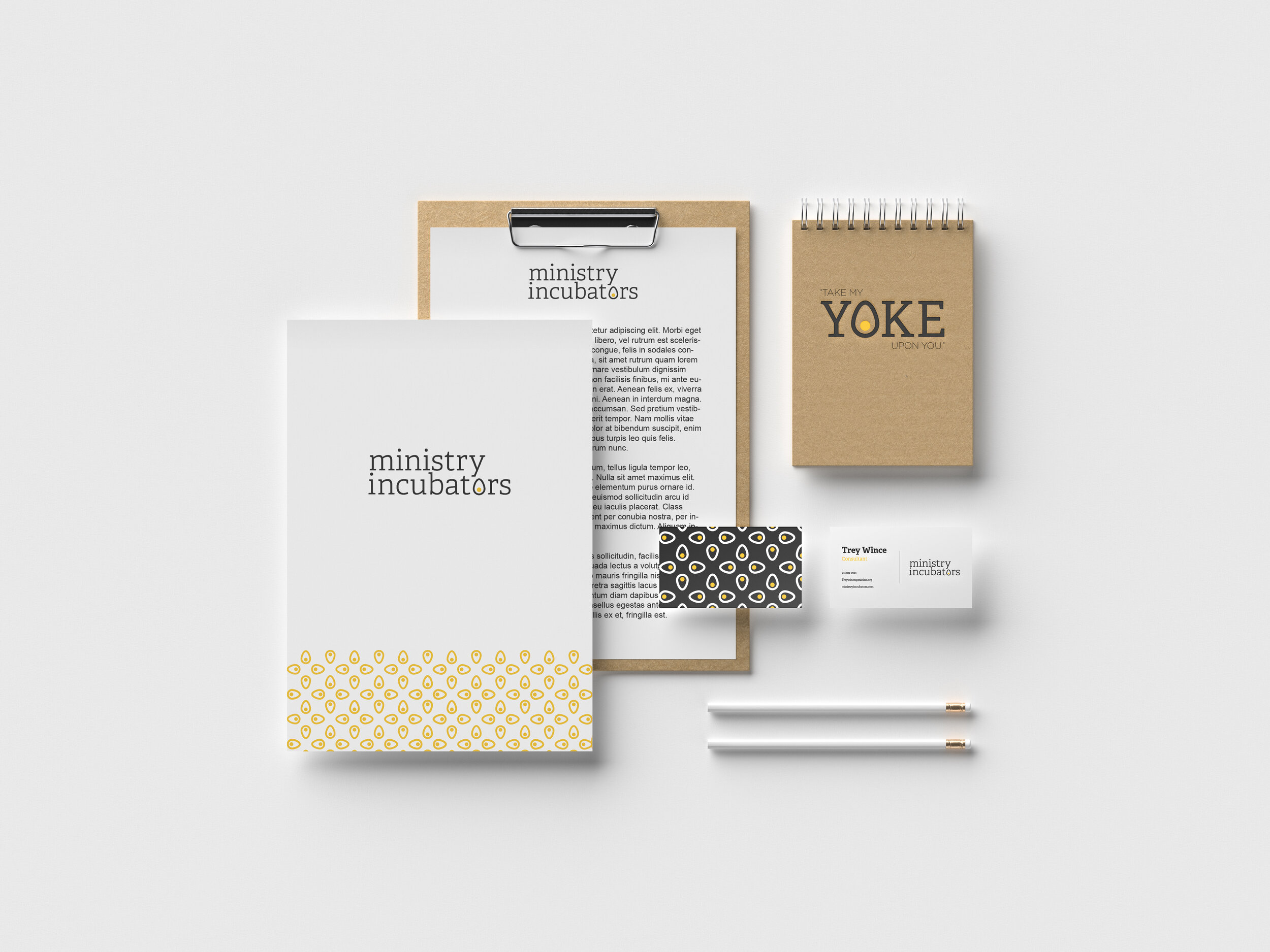
The project culminated in a refreshed brand identity for Ministry Incubators, complete with a new mark, color scheme, typeface,
and brand language.
The new mark for the brand identity embodies a theme of playful excellence. Playing off of the term “incubators” and considering their “Hatchathon” events, we designed a simple yet eye-catching egg to reference the growth and development fueled by Ministry Incubators. Because of the deep connotations prevalent throughout the design, the mark provides Ministry Incubators with plenty of opportunities for unique brand language and marketing strategies. We also designed the mark to stand alone as an icon and to represent the
“o” in “incubators.”
We also applied the new design to a collection of branded materials for their programs, such as spinners and tote bags.