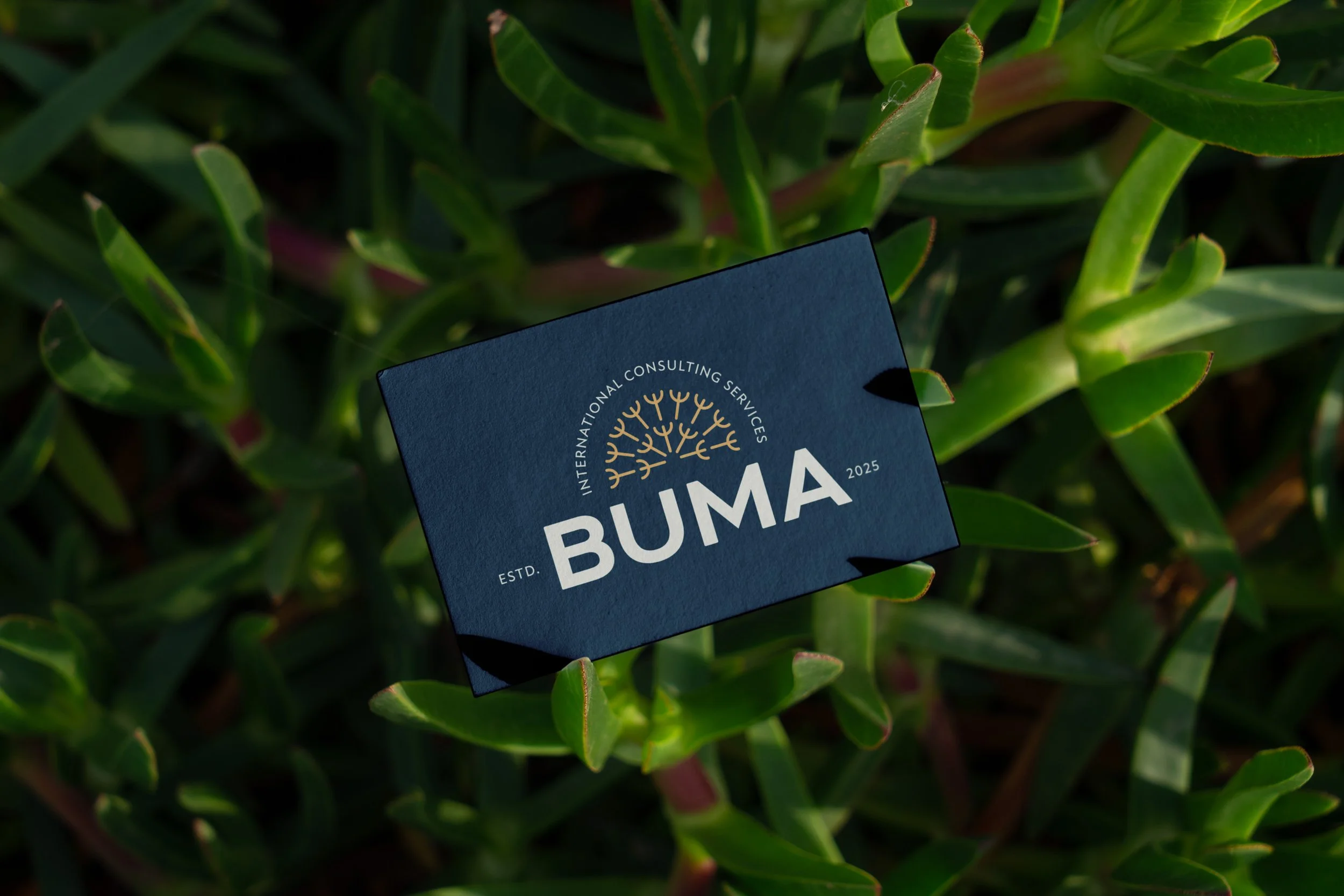
BUMA
< Back to Work

Graphic Design & Brand
2025

FROM PROBLEM
TO DESIGN
Our Process
BUMA International Consulting is dedicated to empowering communities and fostering growth within faith-based organizations and nonprofit circles. Through coaching, home care services, and employment opportunities, BUMA works to equip individuals and organizations with the resources, guidance, and support they need to thrive. With a focus on building meaningful relationships, encouraging innovation, and creating lasting impact, BUMA seeks to strengthen communities and help people reach their full potential.
-
BUMA International Consulting needed a brand identity that better communicated the values and mission of the business. They sought a visual identity that authentically represented who they are while allowing the brand to grow alongside them. The goal was to create an identity that feels grounded and forward-thinking, evoking a sense of freedom, possibility, and strength.
-
Marion Design Co. approached this project by reimagining BUMA’s brand identity from the ground up. The process included developing a new logo, supporting brand assets, color palette, and typography to create a cohesive visual system that reflects the heart, mission, and values of BUMA. The goal was to inspire organizations to look beyond their setbacks and embrace a future filled with greater freedom, possibility, and growth. With BUMA as a trusted partner along the way.
Look + Feel
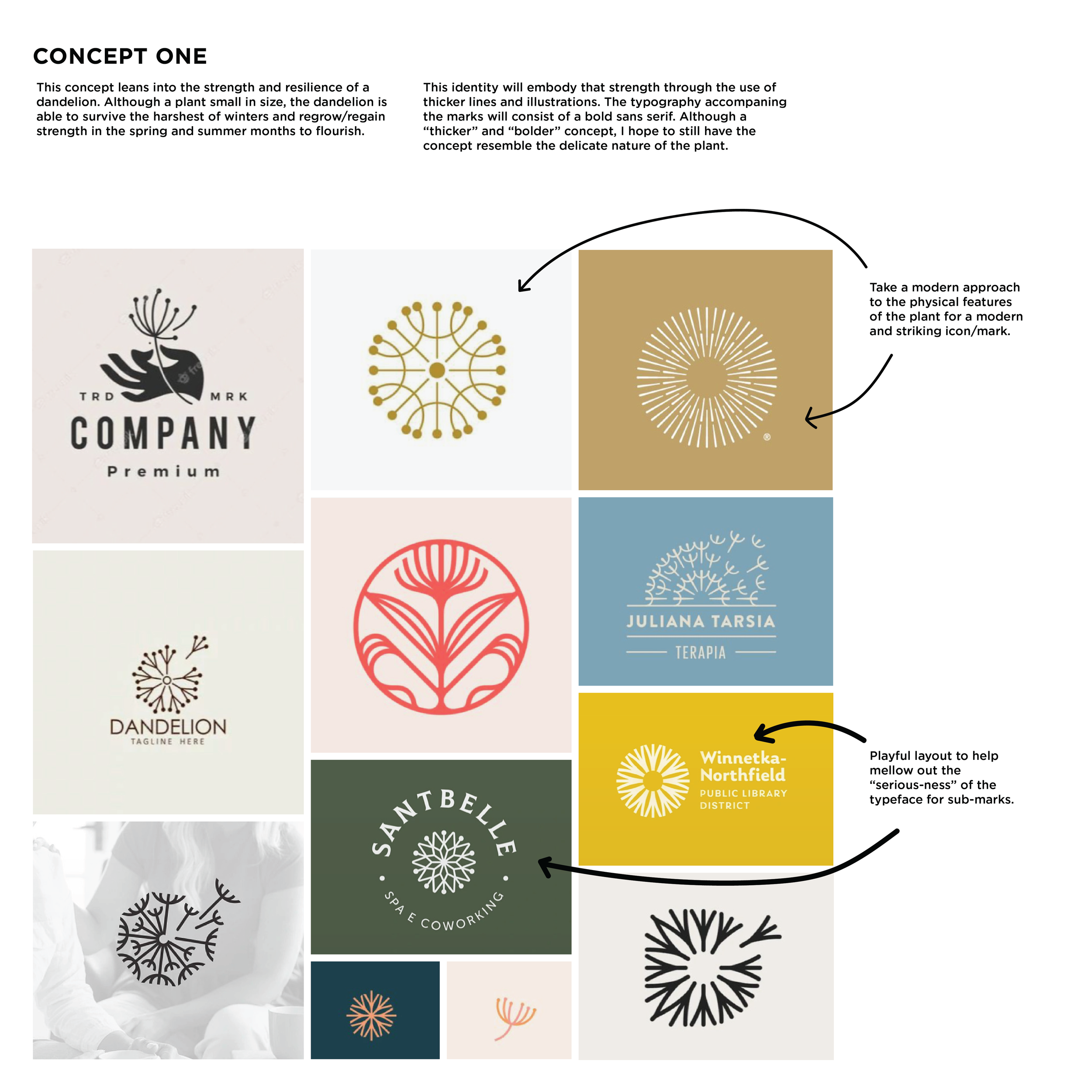
BUMA requested that a dandelion be incorporated into the primary logo and thoughtfully carried throughout the supporting brand elements. Symbolizing adaptability, organic beauty, and the ability to spread seeds far and wide, the dandelion reflects BUMA’s mission to cultivate growth and create lasting impact across communities. Though delicate by nature, the design needed to convey a sense of strength and boldness, balancing the dandelion’s natural fluidity with a confident, forward-thinking presence.
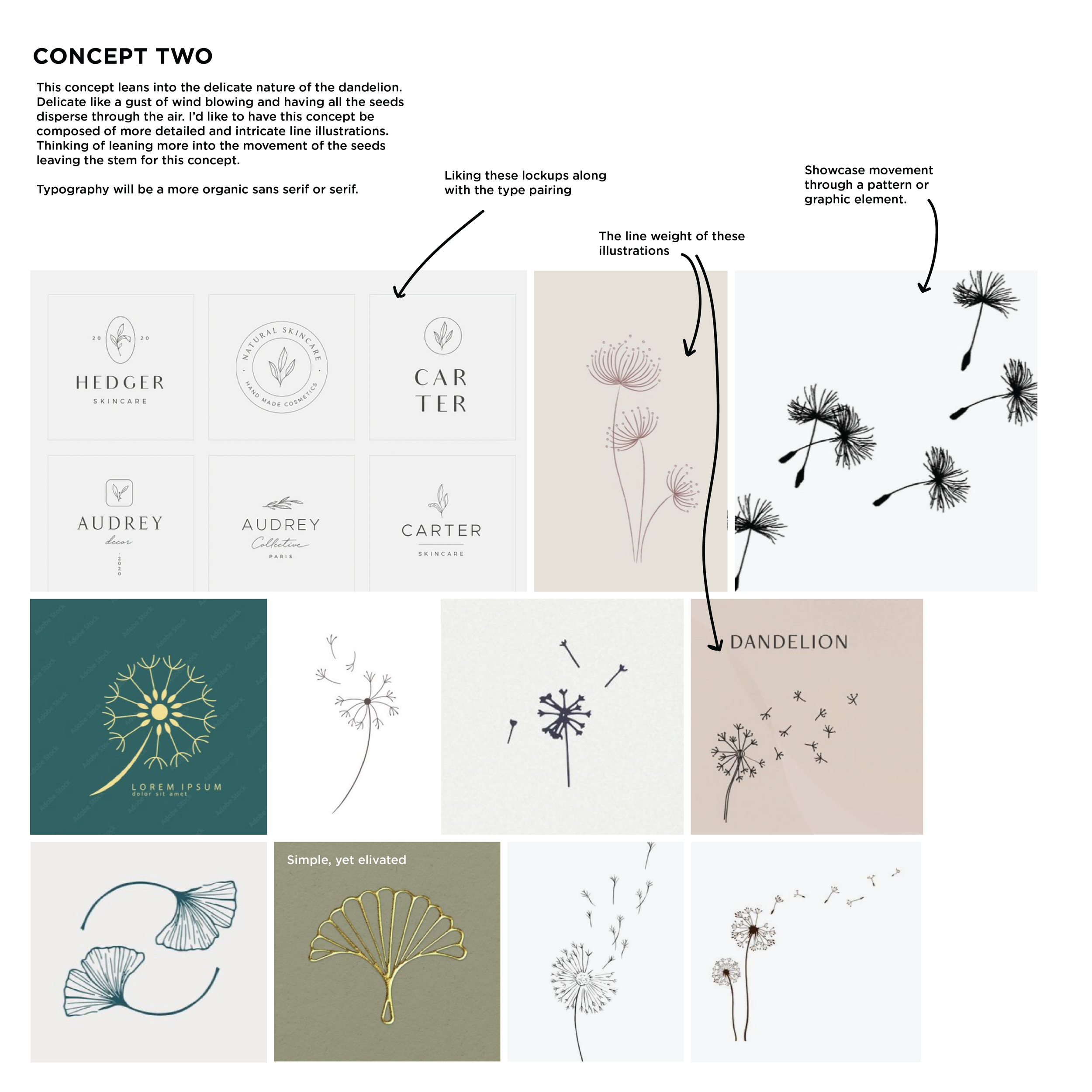
After meeting with the client, Marion Design Co. began brainstorming, moodboarding, and sketching to explore the overall look and feel of the brand. Drawing inspiration from the dandelion and its natural life cycle, we studied the unique forms and line weights of its stem, leaves, florets, and seeds. These organic details became a key source of inspiration, guiding the visual direction of the identity and leading us to explore several creative possibilities that reflected BUMA’s values of growth, adaptability, and lasting impact.
-
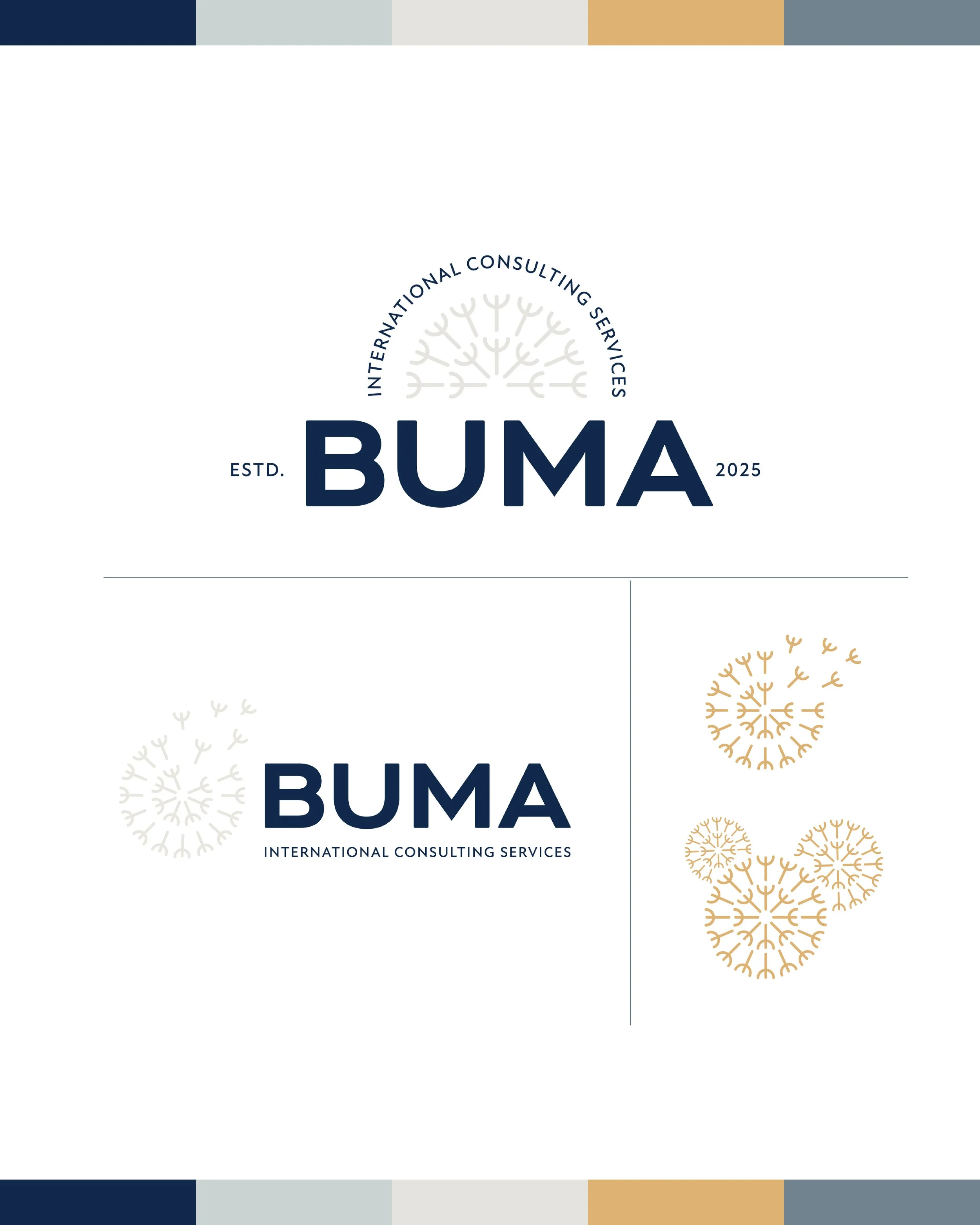
The final brand identity brings the original objectives to life, incorporating the dandelion as a symbol of organic beauty, freedom, boldness, and possibility. The complete visual system includes a primary and secondary logo, along with two supporting graphic assets: a dandelion blowing in the wind with seeds drifting outward and a grouping of three dandelion florets. Together, these elements create a cohesive identity that feels both grounded and full of movement.
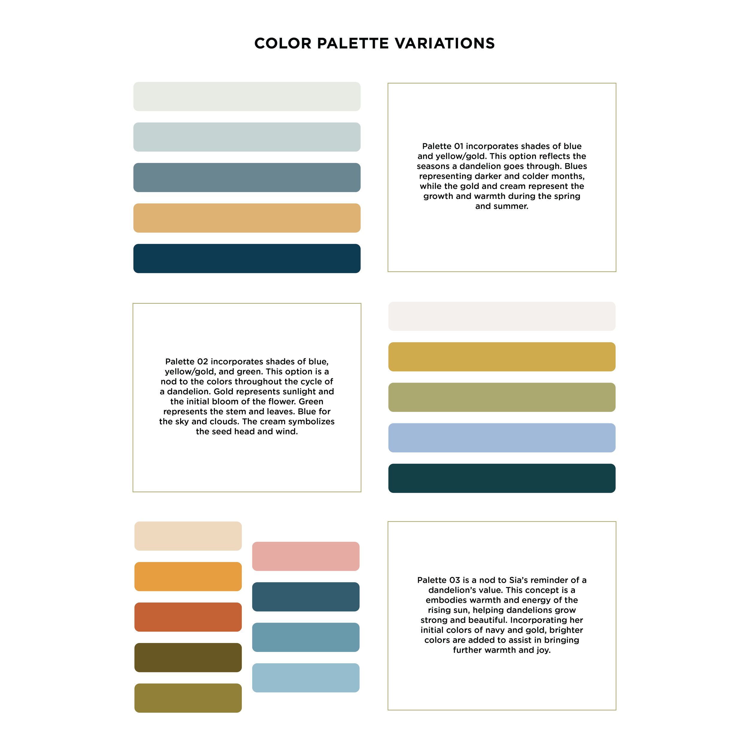
The typography balances strength with approachability, reflecting BUMA’s confident yet people-centered mission. The color palette draws inspiration from the natural hues of the dandelion and its surrounding environment, incorporating blues, yellows, golds, and creams. These colors represent the changing seasons of growth and transformation, with the blues evoking the colder months and the warmer golds and creams reflecting the renewal, warmth, and possibility of spring and summer. The result is a versatile brand identity that captures BUMA’s commitment to cultivating growth and creating meaningful, lasting transformation.
Ideation


Application