CITY OF MARION

< Back to Work

Brand Identity

Illustration of a cleaning sponge with a sparkle next to a large letter A.

2023

Graphic showing a staircase with an upward arrow, a yellow dot, and a black 'X' symbol, representing success or growth.

FROM PROBLEM
TO DESIGN

Our Process

Marion is a city shaped by story—stories of pride and pain, triumph and resilience, written into its history and carried by its people. While honoring the past is essential, the greater challenge was fostering a shared vision for what comes next.

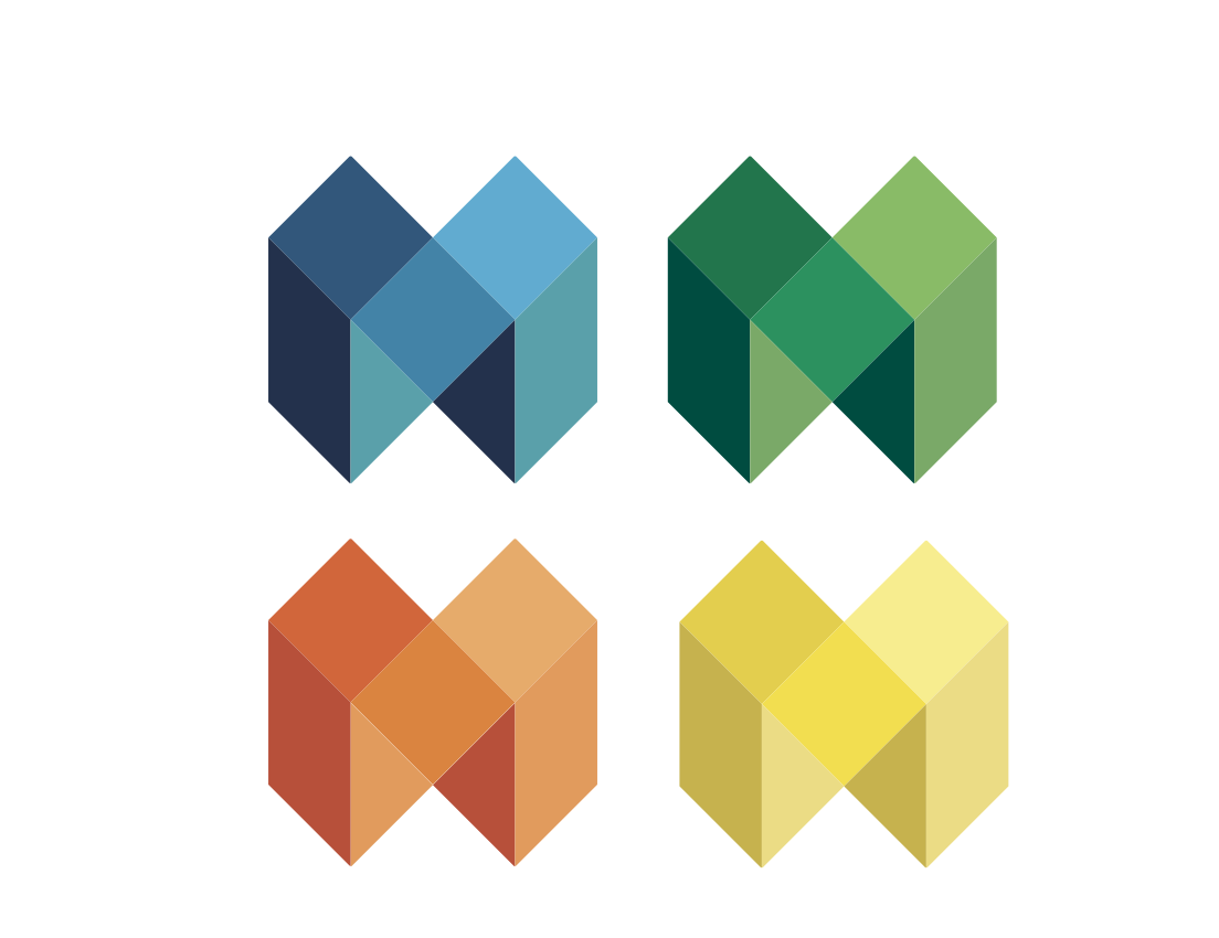
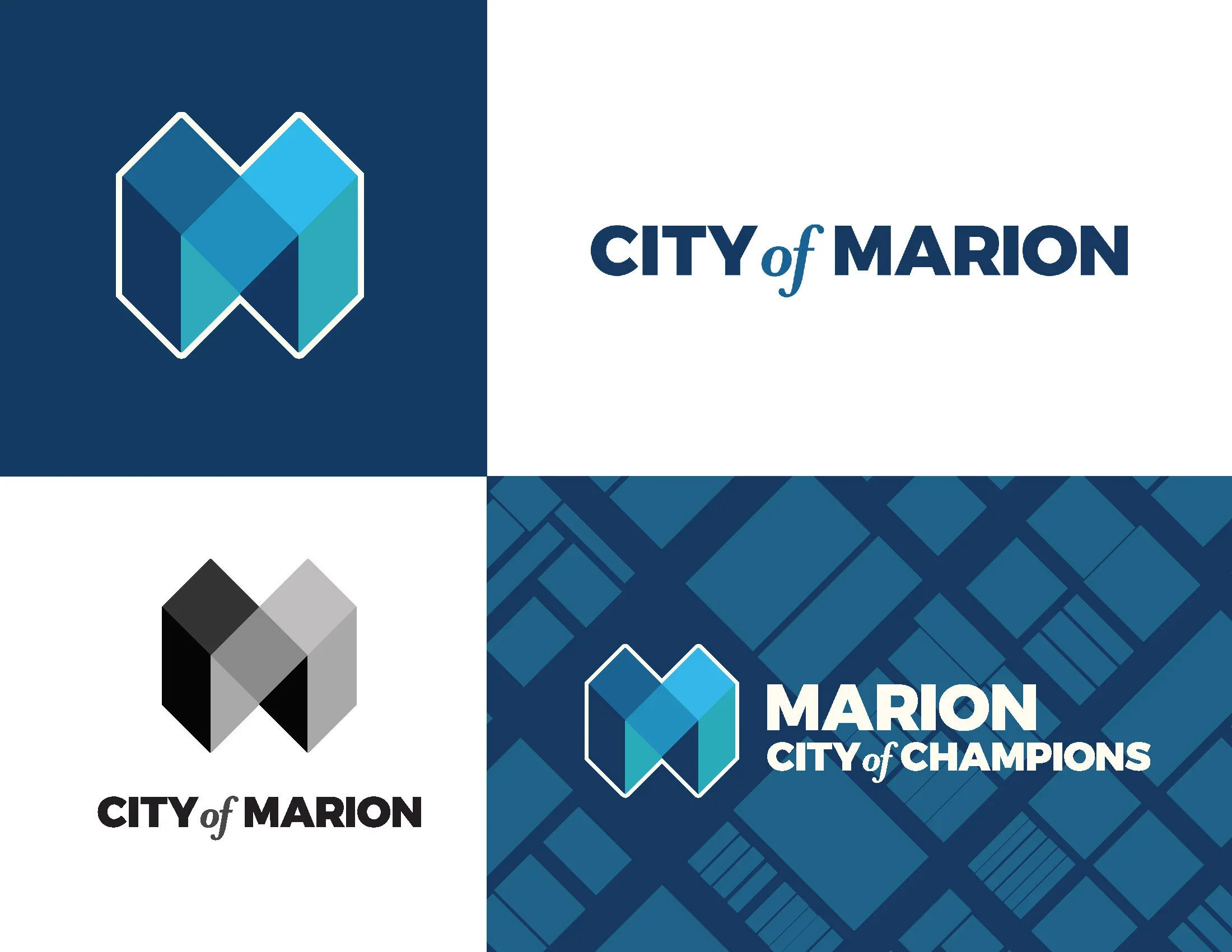
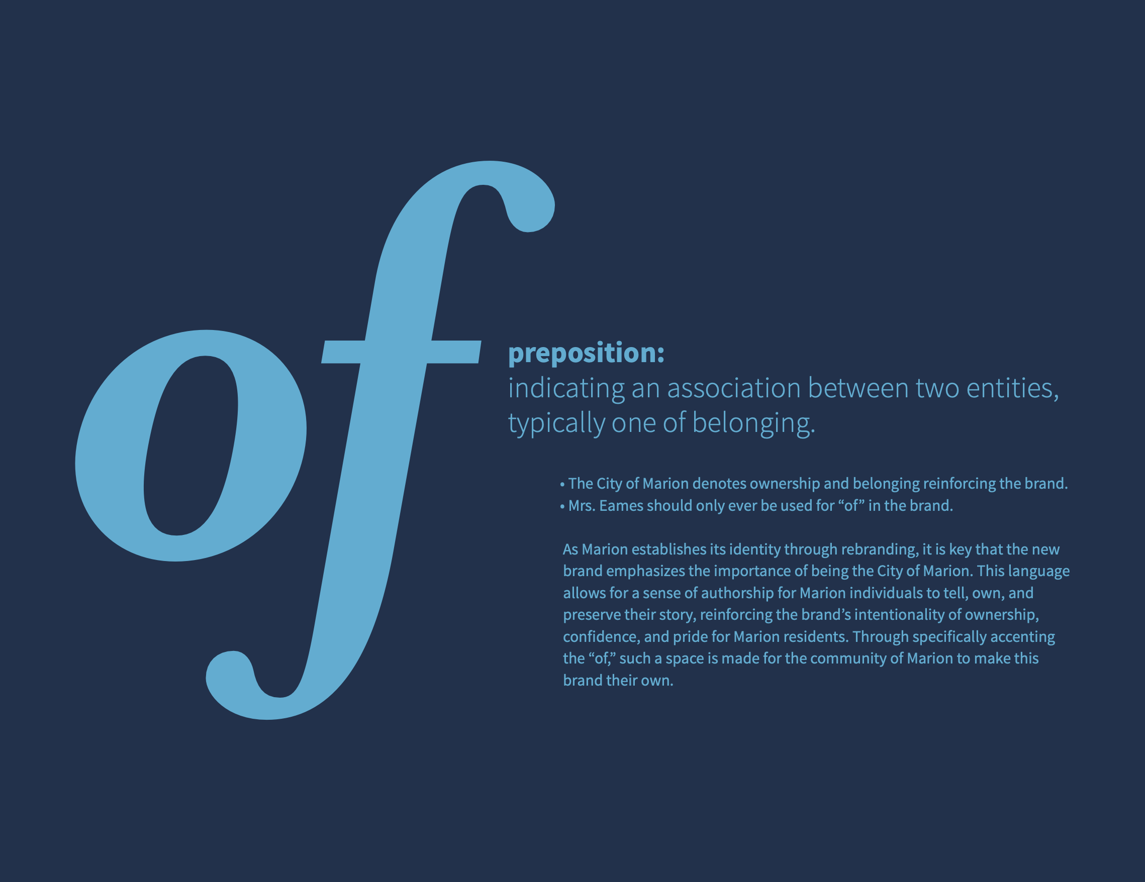
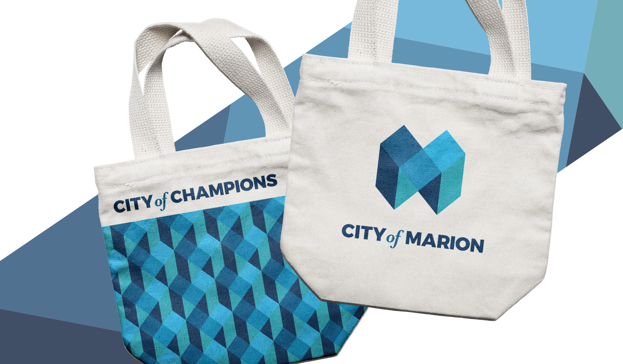
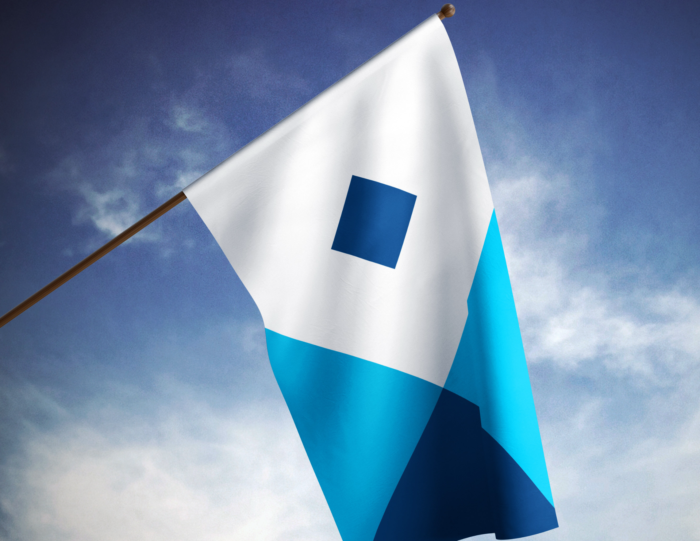
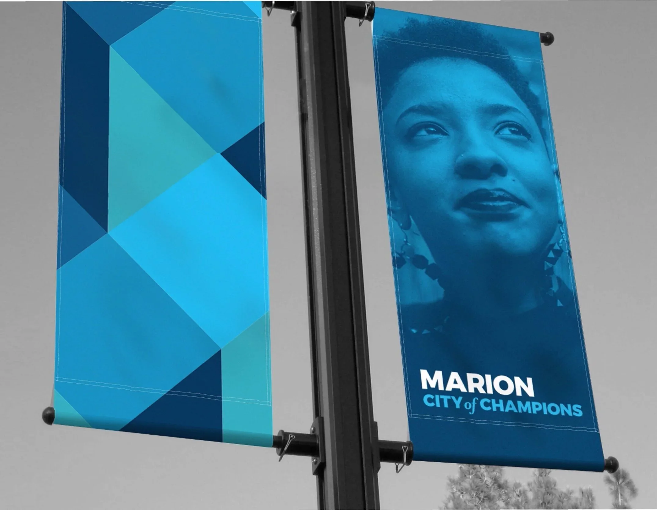
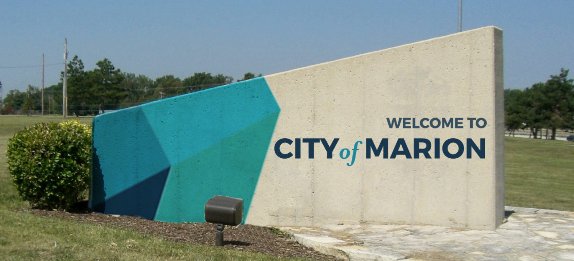
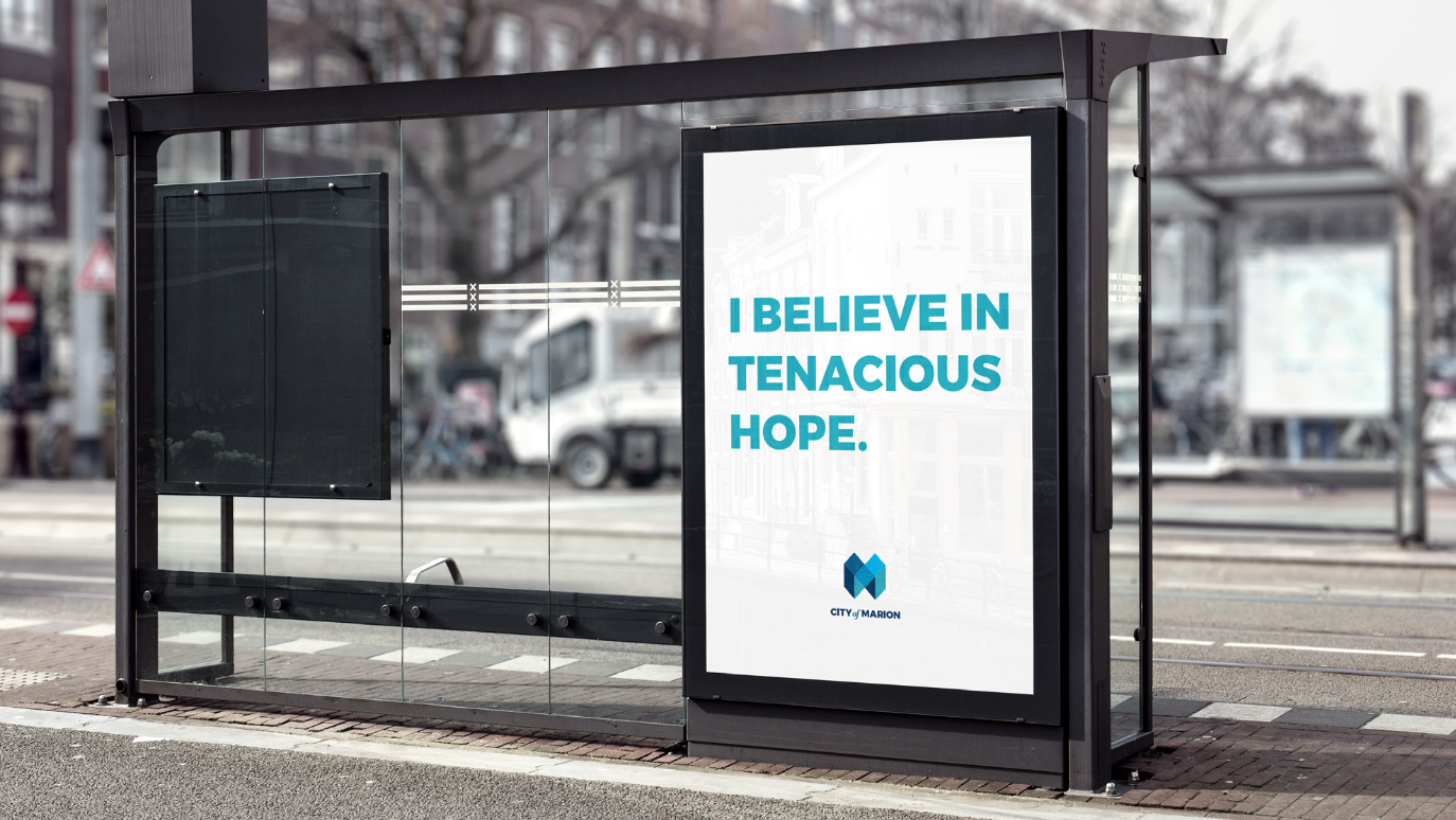
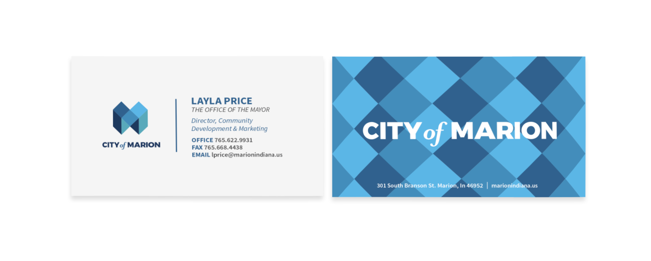
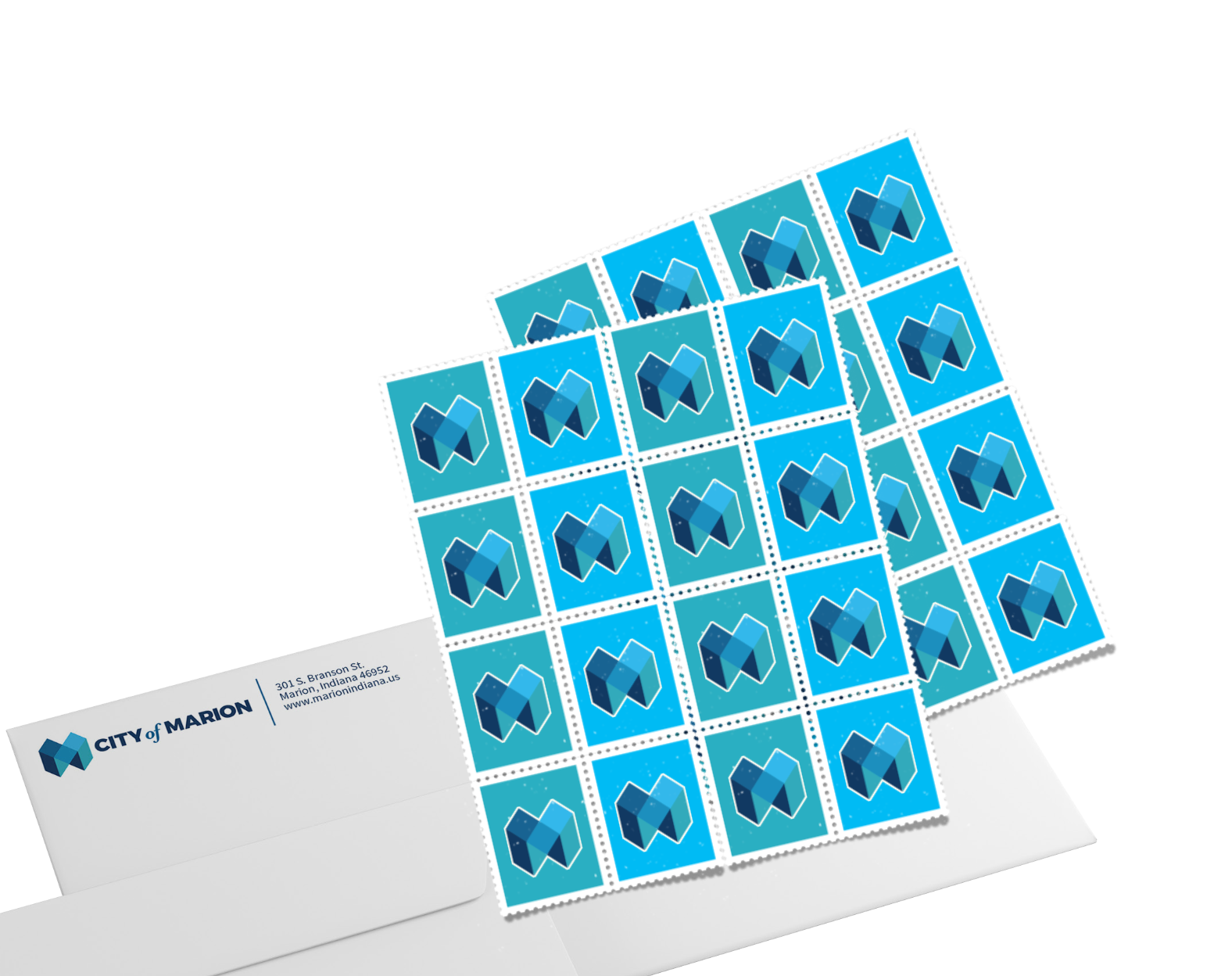
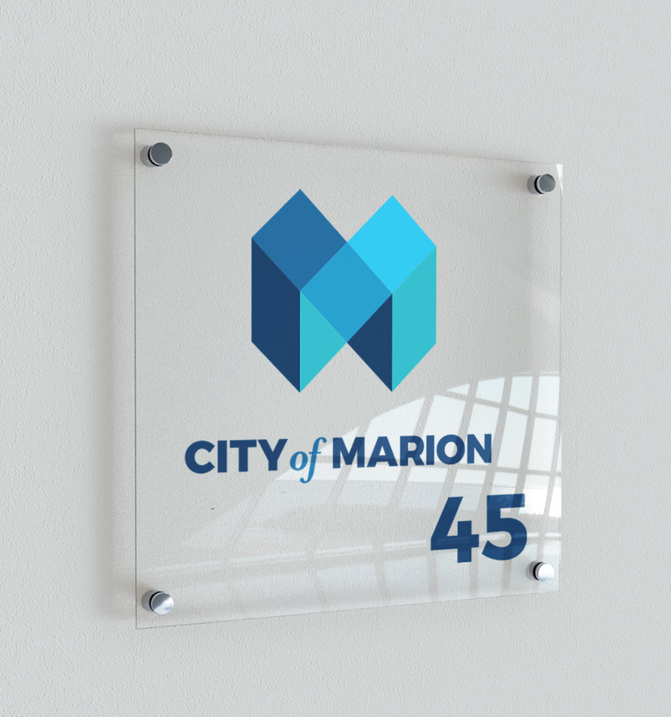
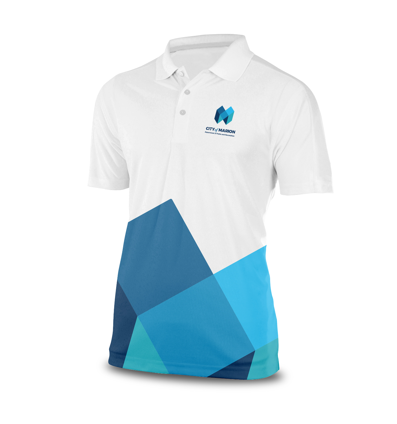
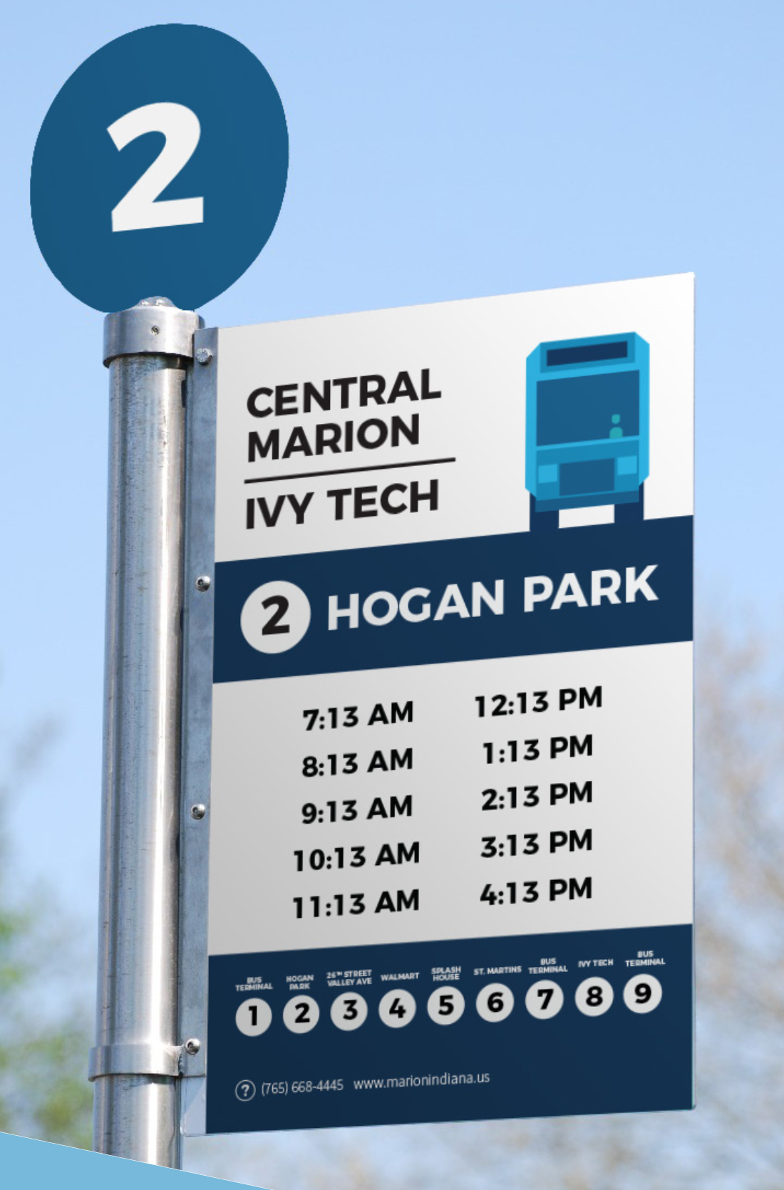
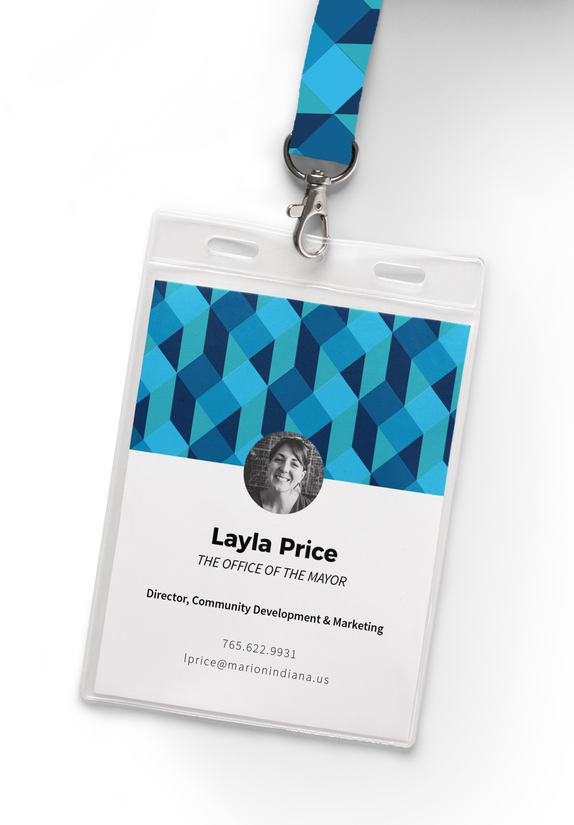
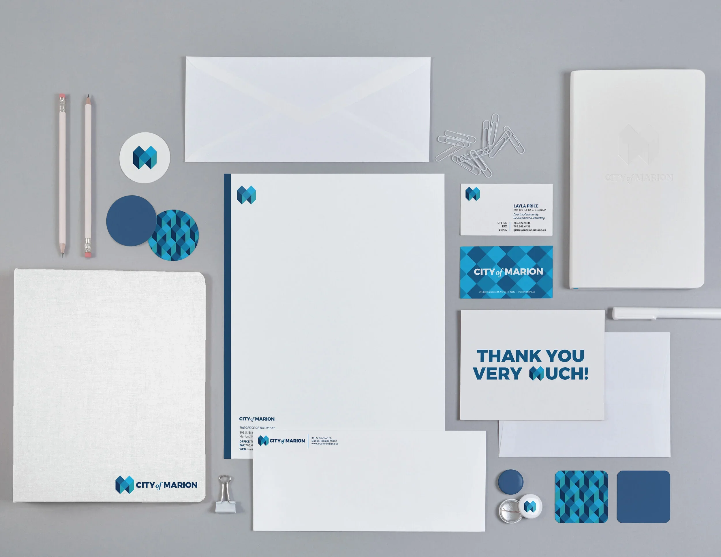
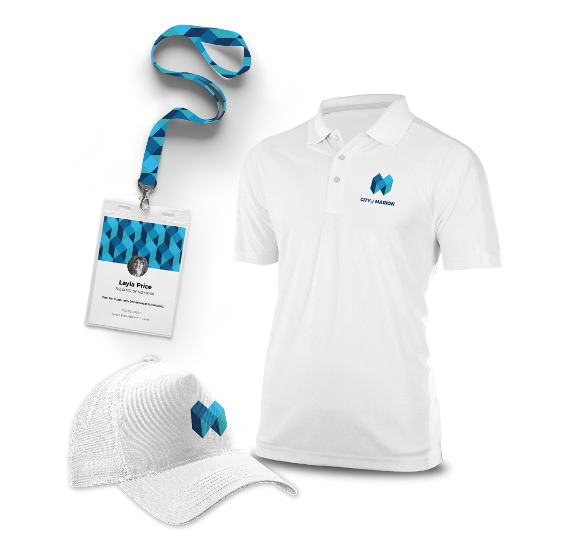
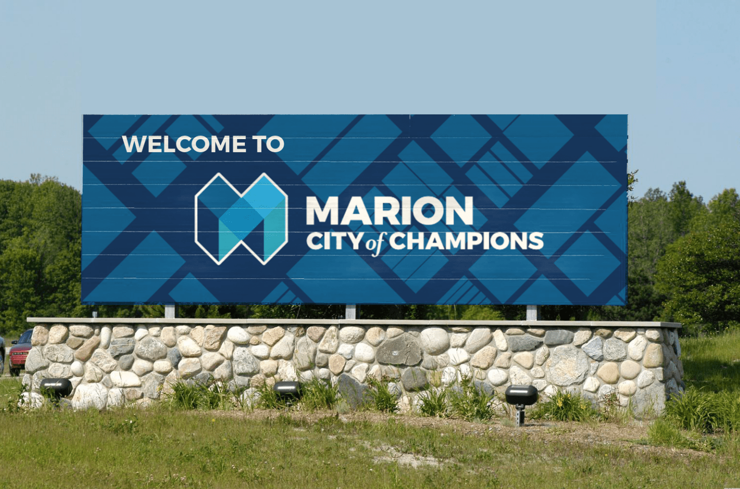
  • Marion Design Co. set out to help the community rediscover its identity and potential by creating a brand rooted in the people of Marion, designed to restore pride, hope, and momentum alongside the new vision of Mayor Jess Alumbaugh. The city was not broken, but fragmented—full of strong, diverse parts that needed a unifying framework to move forward together. Our role was to help the community see the bigger picture and recognize its collective strength. We developed a strategic brand campaign using refreshed colors, typography, logo development, and clear standards to tell a forward-looking story—the story of champions. Rather than masking the past, the brand emerged from Marion’s existing character and values. Built from within the community, it offered a tangible goal and a shared language—one that invited residents to see themselves not as disconnected pieces, but as contributors to Marion’s next chapter.

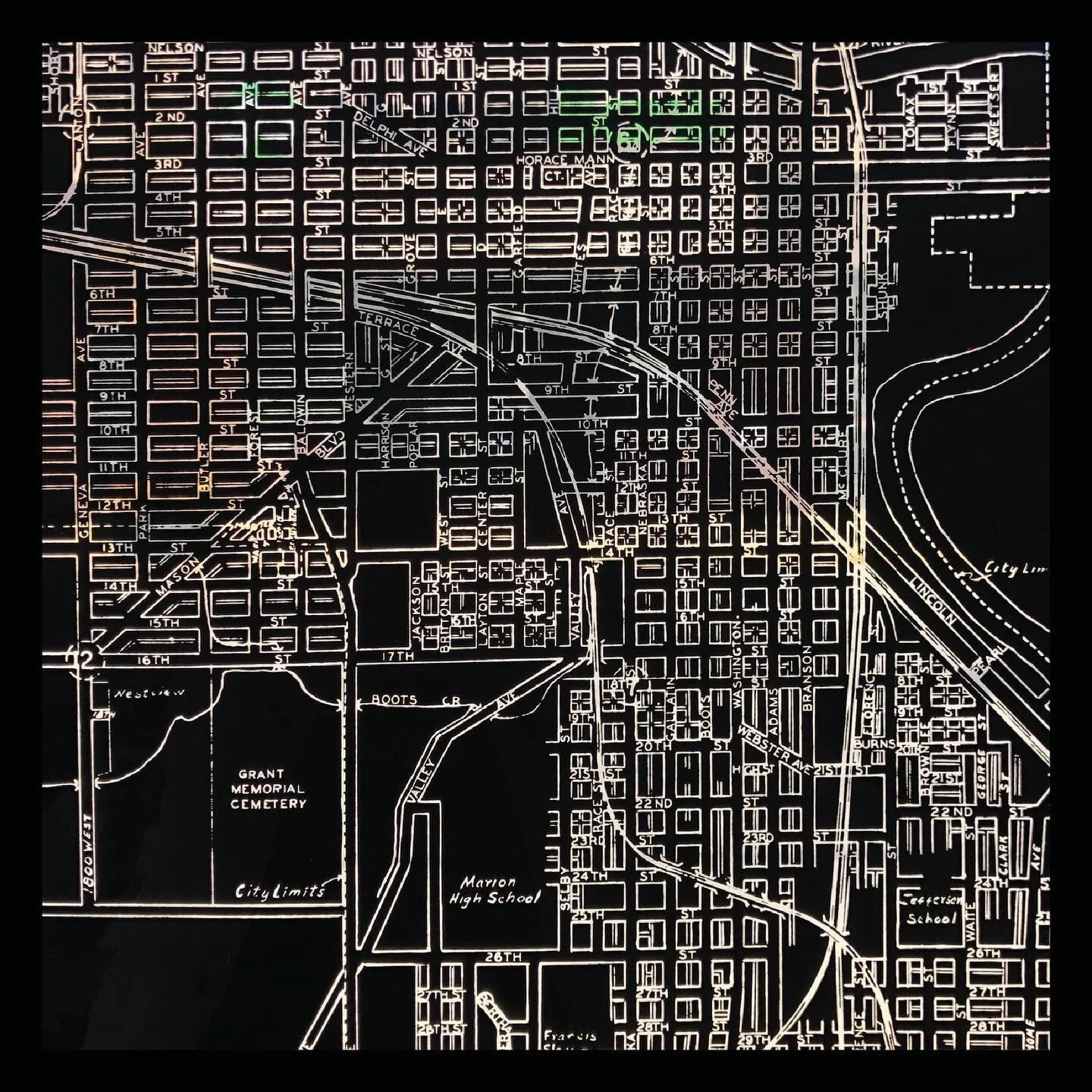
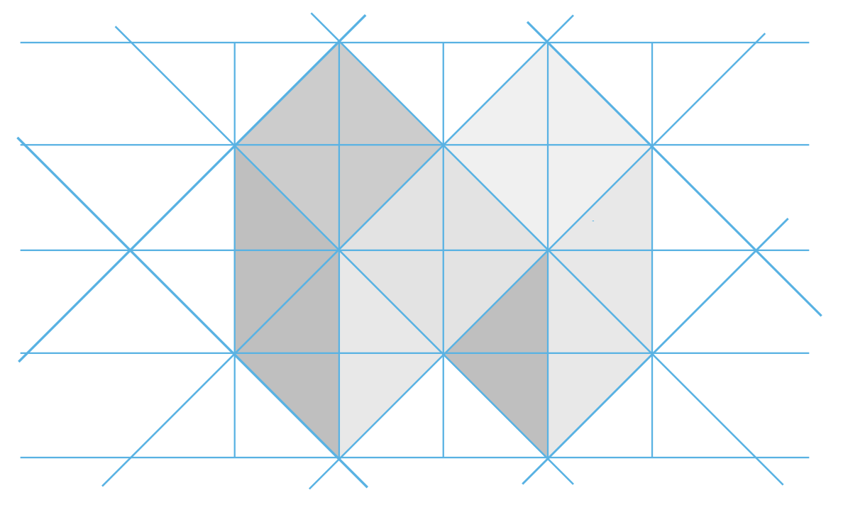
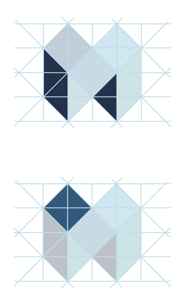
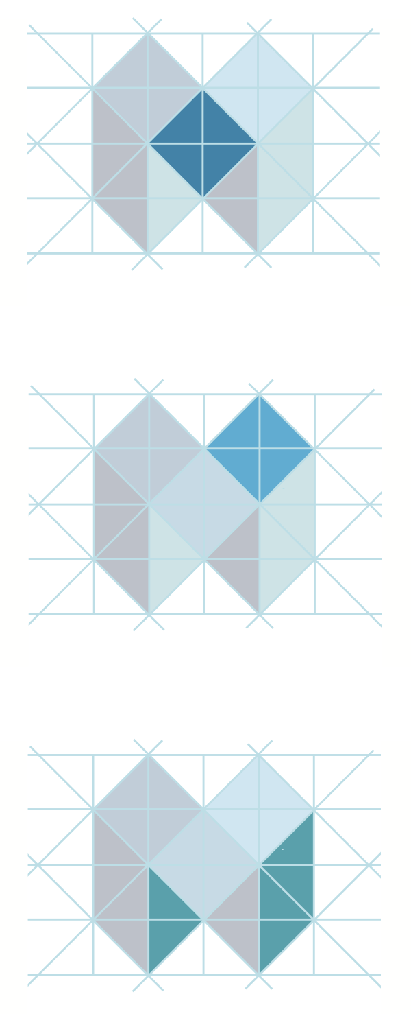
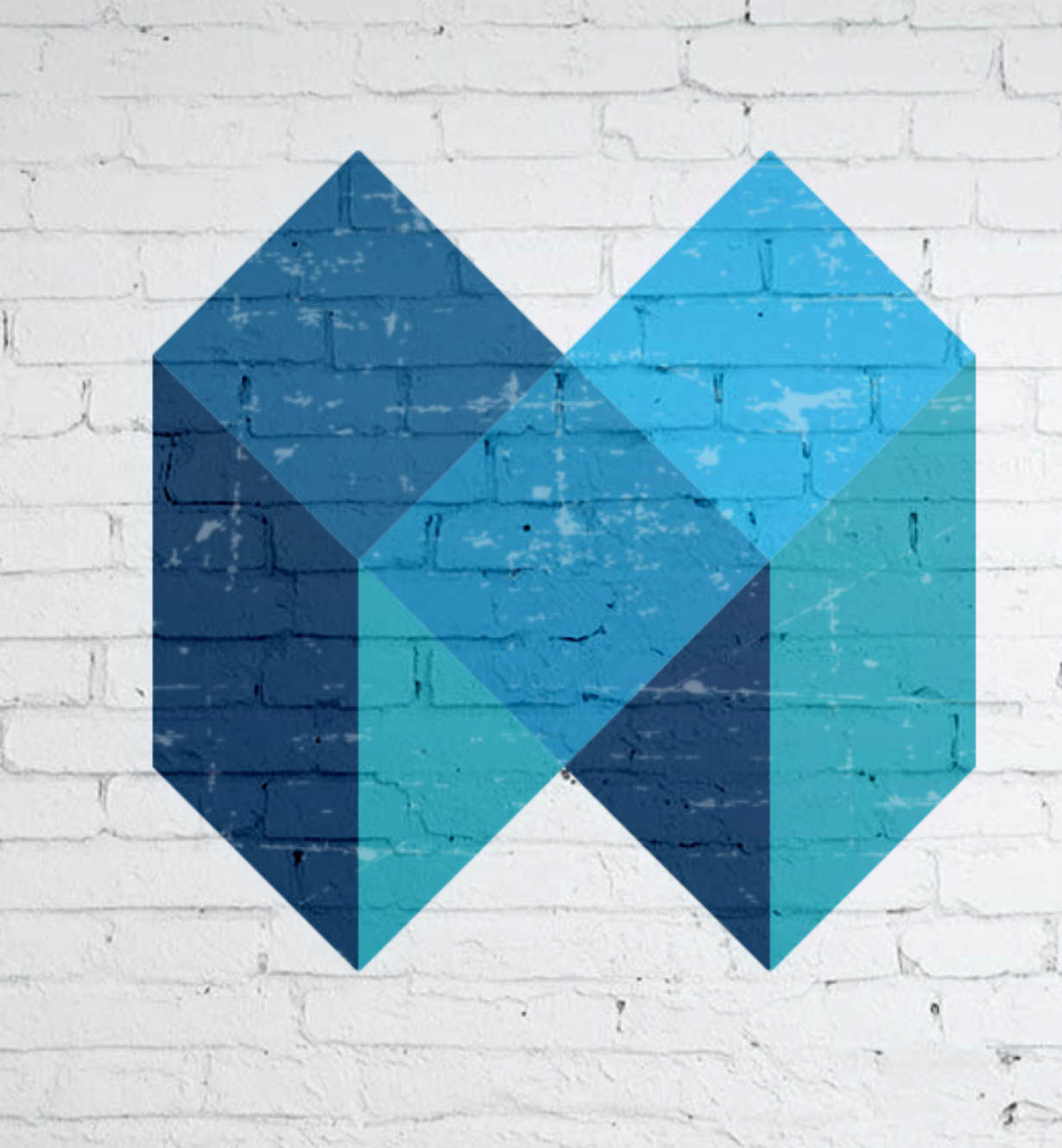
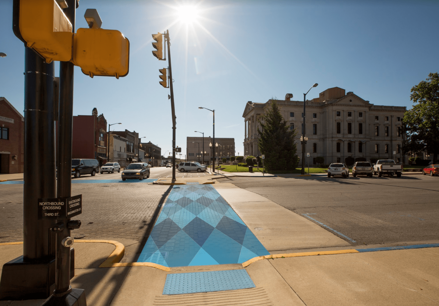
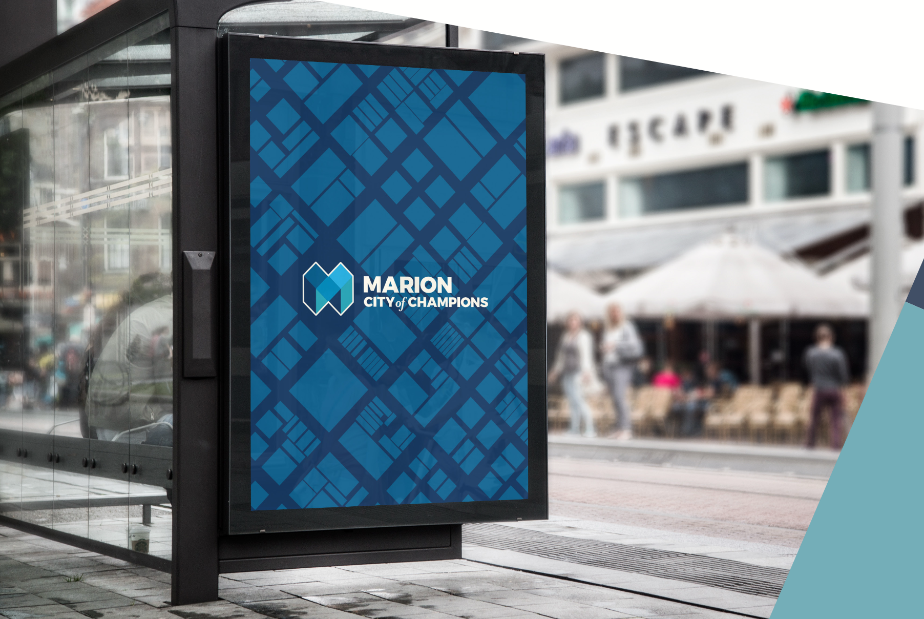
  • Because this brand needed to be built with the people of Marion, our process began by listening. Before any design work started, Marion Design Co. spent an entire summer engaging the community through conversations and surveys to understand how residents truly experienced their city. What emerged was not a broken community, but one that was misperceived, segmented, and under-realized—yet united by shared values of care, vitality, and tenacious hope. Our role was to help surface those values and create momentum through honesty, collaboration, and accountability. Central to this work was encouraging people to share their stories, recognizing that a thriving community is formed when individuals see how their unique contributions strengthen the whole. With this understanding, we turned to the city itself for visual inspiration. Studying Marion on foot and from above, we identified the Jeffersonian grid as a defining structure—distinct pieces forming a cohesive whole. Repeating patterns, textures, and spatial relationships informed the final mark, guided by principles of figure and ground, proximity, closure, containment, foundation, and harmony.

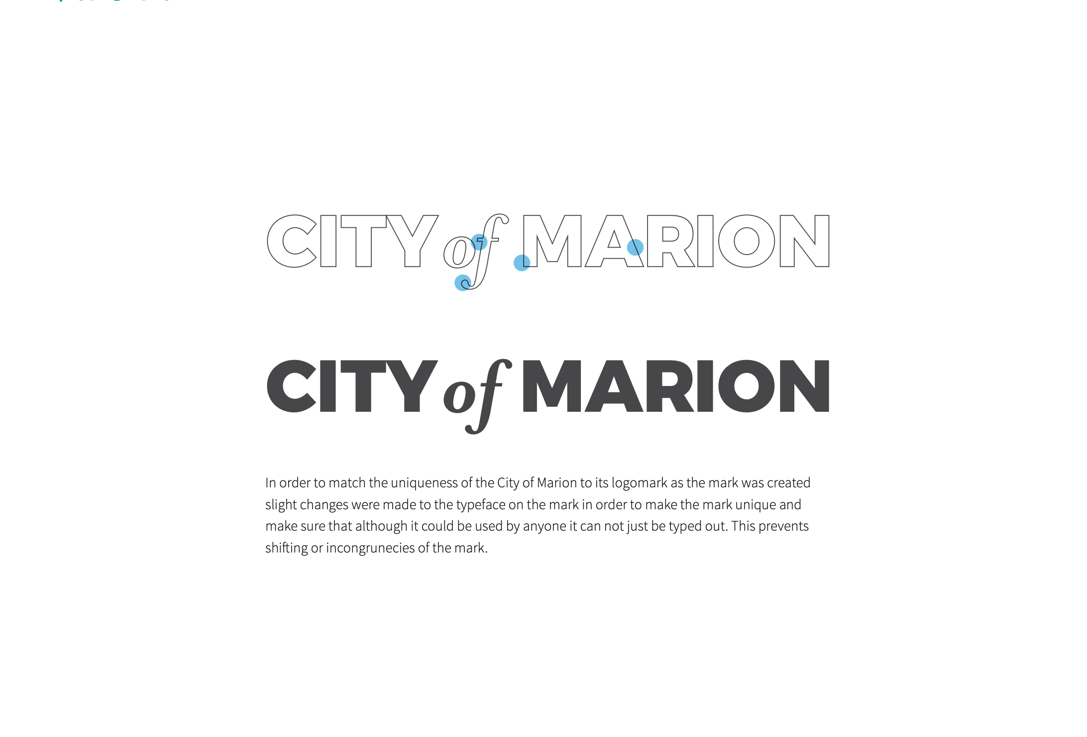
  • The final identity centers on a logo that combines a suspension bridge with a typographic emphasis on the “more” in Wymore—visually expressing the company’s role in helping leaders move from inspiration to transformation. The mark is layered with meaning: the bridge’s arch subtly forms a “W,” strengthening brand recognition when the icon stands alone, while the vertical lines reference the incremental steps required for meaningful change. The form also carries a quiet resemblance to a crown, reflecting the dignity and confidence found in pursuing one’s potential. Sleek, modern letterforms establish the professional and elite presence Josh Wymore envisioned, with “more” set in extra-bold to reinforce the brand’s mission and tagline. A refined color palette balances maturity and credibility with energy and momentum, anchored by a confident core orange. Supporting typography—Raleway and Open Sans—was selected for clarity, accessibility, and flexibility. Expanded brand guidelines provide room for growth and creative application, and the system was fully implemented across Wymore’s website, aligning the digital experience with the brand’s renewed clarity and purpose.

A detailed city street map with street names, a cemetery, and high school marked, using white lines on a black background.
A geometric construction with a grid of blue lines and two shaded gray diamonds.
Two abstract geometric drawings composed of triangles and squares in shades of blue, arranged on a grid with construction lines visible.
Four colorful geometric cube designs arranged in a 2x2 grid with blue, green, orange, and yellow colors.
Three abstract geometric designs featuring interconnected triangles and diamonds in shades of blue and gray on a white background.
Abstract geometric art with layered blue shapes on a white brick wall background.
Four variations of the CITY of MARION logo, featuring a geometric 'M' design in blue, black, gray, and white, with text indicating 'CITY of MARION' and 'MARION CITY of CHAMPIONS'.
Logo design comparison for the City of Marion, showing a faint outlined version of the logo with blue accents and a bold, black version of the logo below, followed by descriptive text about the logo's creation.
Definition of the preposition 'of' highlighting its association between entities, with text explaining ownership, belonging, and branding, including examples about the City of Marion and Mrs. Eames.
Two white tote bags with blue geometric designs and printed text, one says 'City of Champions' and the other 'City of Marion', placed in front of a blue and teal patterned background.
A white flag with a blue square and a blue triangle at the bottom, flying against a blue sky with some clouds.
Street banners featuring a close-up image of a woman with short hair and a necklace, with text that reads "Marion City of Champions".
Welcome sign with modern geometric design in teal and gray, reading 'Welcome to City of Marion' against a grassy background with trees and power lines.
Bus stop shelter with a digital sign displaying the message, 'I BELIEVE IN TENACIOUS HOPE,' and the logo of the City of Marion.
Business card and promotional card for City of Marion, Indiana, featuring blue and white color schemes, logo, and contact information including name, title, address, and website.
Sheet of postage stamps bearing the logo of the City of Marion, Indiana, featuring a geometric blue heart with a city skyline, and a partially visible mailing envelope.
A clear acrylic sign mounted on a wall with metal standoffs. The sign features a geometric blue logo and text reading "CITY of MARION" and the number "45".
White collared polo shirt with a blue geometric design on the lower right side. A logo on the upper left chest features an abstract blue shape with text 'CITY OF MARION' below it.
A city street intersection with a blue tactile paving path for visually impaired pedestrians, traffic lights, surrounded by buildings including a large historic courthouse, cars parked and driving, and trees under a sunny sky.
Bus schedule sign showing routes and times for bus number 2 at Hogan Park, including stops at Central Marion, Ivy Tech, and other locations, with times listed from 7:13 AM to 4:13 PM.
Business ID badge for Layla Price with a blue geometric patterned lanyard, black and white profile photo, and contact information
Flat lay of branded stationery and office supplies for City of Marion, including letterhead, business cards, envelopes, stickers, and pens, in shades of blue and white.
Promotional items including a white polo shirt, a white cap, an ID badge, and a lanyard with a blue geometric pattern. The polo shirt and cap feature a blue logo with the text "CITY OF MARION." The ID badge displays a photo and contact information for Layla Price.
Large outdoor billboard reading "Welcome to Marion City of Champions" with a blue geometric logo, set on a stone base, surrounded by greenery and trees.