MARION PHILHARMONIC
ORCHESTRA
< Back to Work
Brand Identity
2023
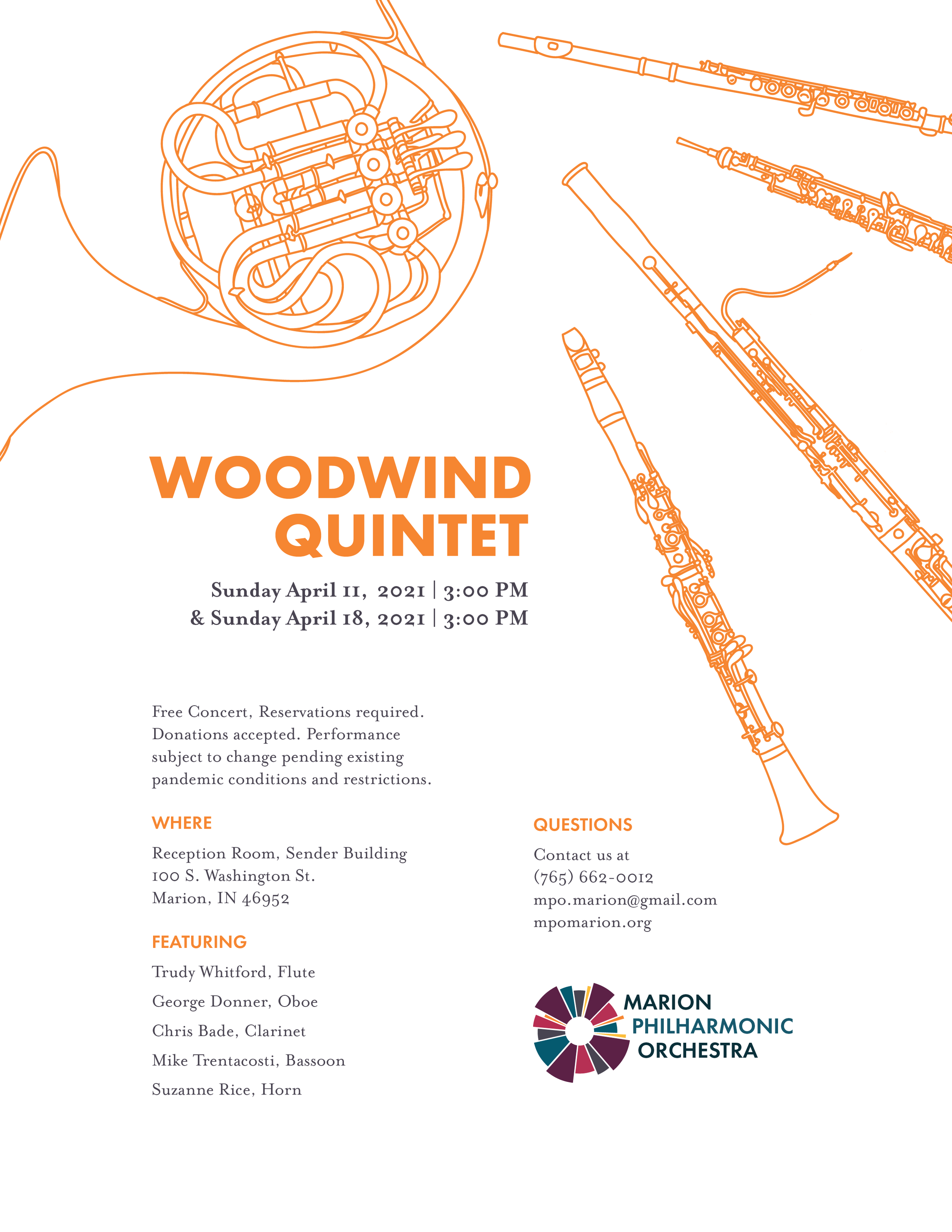
In 2019, Marion Design Co. began rebranding Marion Philharmonic Orchestra, a Grant County-based orchestra. Since then, we have not only designed a new brand identity for the orchestra, but we have also continued to work with them in maintaining their brand identity throughout seasonal promotional materials and their online presence.
FROM PROBLEM
TO DESIGN
Our Process
-
Marion Philharmonic Orchestra began in 1969, and since then it has grown under several different leaders to bring live music to Grant County. Traditionally, Marion community members composed MPO’s audience at each performance. In 2019, MPO decided to rebrand with the hope that the process of visually reinventing their company identity would allow them to develop a stronger presence within their immediate Marion community and throughout Grant County. They also realized that orchestras may carry the connotation of being elitist, and they hoped for a brand that could give them a professional yet approachable reputation in the eyes of the community.
We sought to achieve the following ideals in Marion Philharmonic's new brand:Approachability
Orchestras often carry the connotation of being elite or reserved for wealthy or educated individuals. We wanted to create a brand that would reach beyond these stereotypes and establish MPO as approachable and accessible.
Sophistication
While we sought to portray MPO as approachable, we also wanted to maintain an element of sophistication within the brand. We wanted to balance accessibility with elevation and professionalism.
Sound and Movement
Because music exists as the foundation for and passion behind MPO, involving music in the mark was imperative. Accordingly, we worked to incorporate the rhythm and energy of live music into the brand.
Multigenerational Appeal
MPO’s brand needed to appeal to both current audience members as well as younger generations, in reflection of their mission to establish the symphony as a multigenerational experience.
-
We began our design process with research. First, we interviewed Joy Frecker, the orchestra’s executive director, and Maestro Matthew Kraemer, the orchestra’s current conductor. Through this interview, we gained a better understanding of the orchestra itself, as well as its leadership’s hopes and goals for the brand moving forward.
Next, we continued our research by performing a competitor audit of similar orchestras and businesses. We also surveyed MPO’s leadership board, which revealed the orchestra’s self-perception and goals. The survey also informed us of the board’s likes and dislikes about MPO’s original brand. We then explored brands that share missions similar to MPO for inspiration.
Once our research was complete, we began moodboarding with recurring keywords from our research, as well as words we associated with orchestras, music, and performance.
As we began sketching various iterations of a potential logo, we quickly covered the walls with pages filled with ideas and opportunities for what the brand could be. We eventually narrowed down the many sketches to one mark, and continued our creative process by fine-tuning and expanding the idea. We played with various sizes, angles, and shapes before solidifying the design.
After fully developing the mark, we moved on to form a color palette and typeface to complete the brand.
-
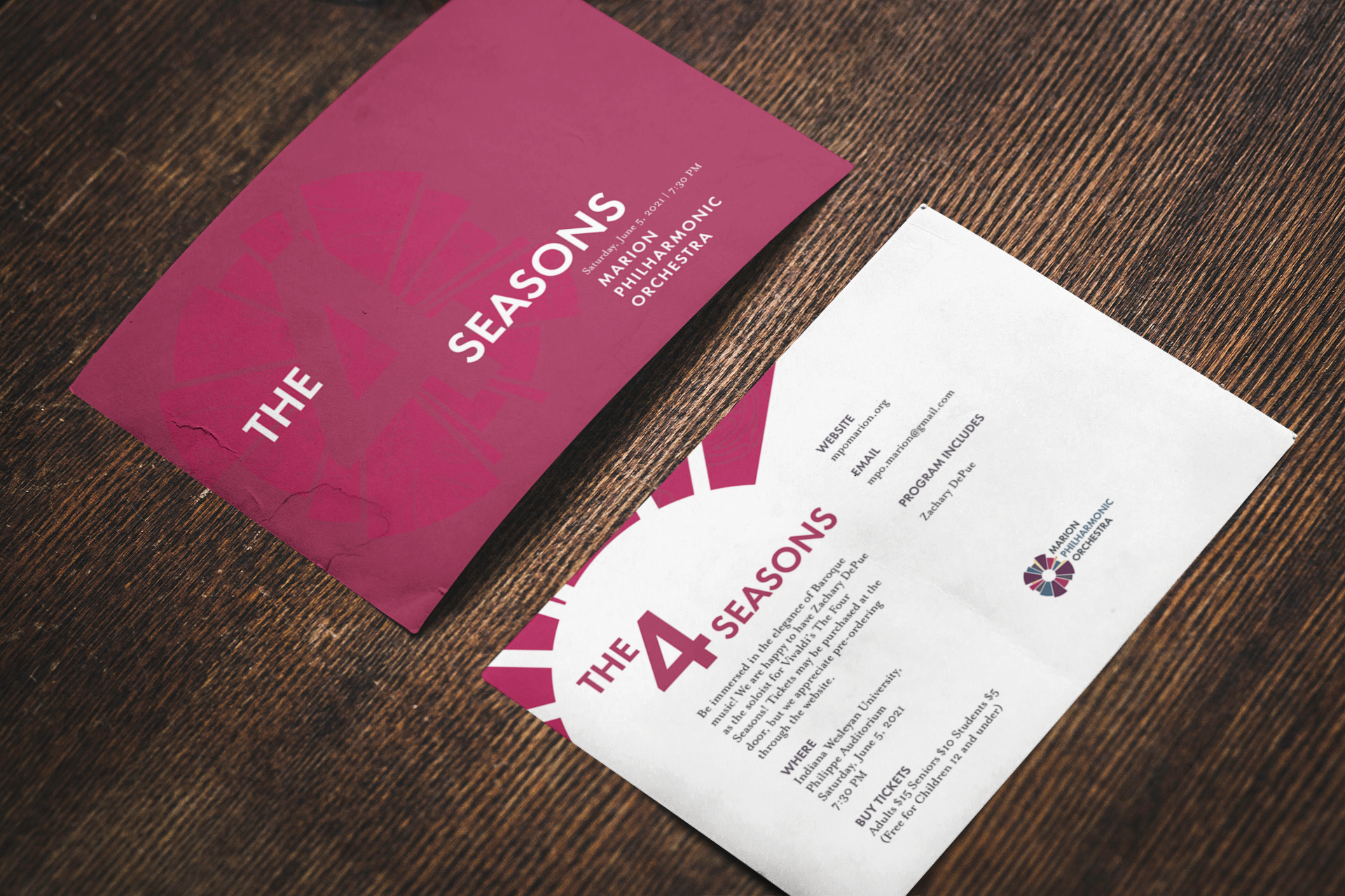
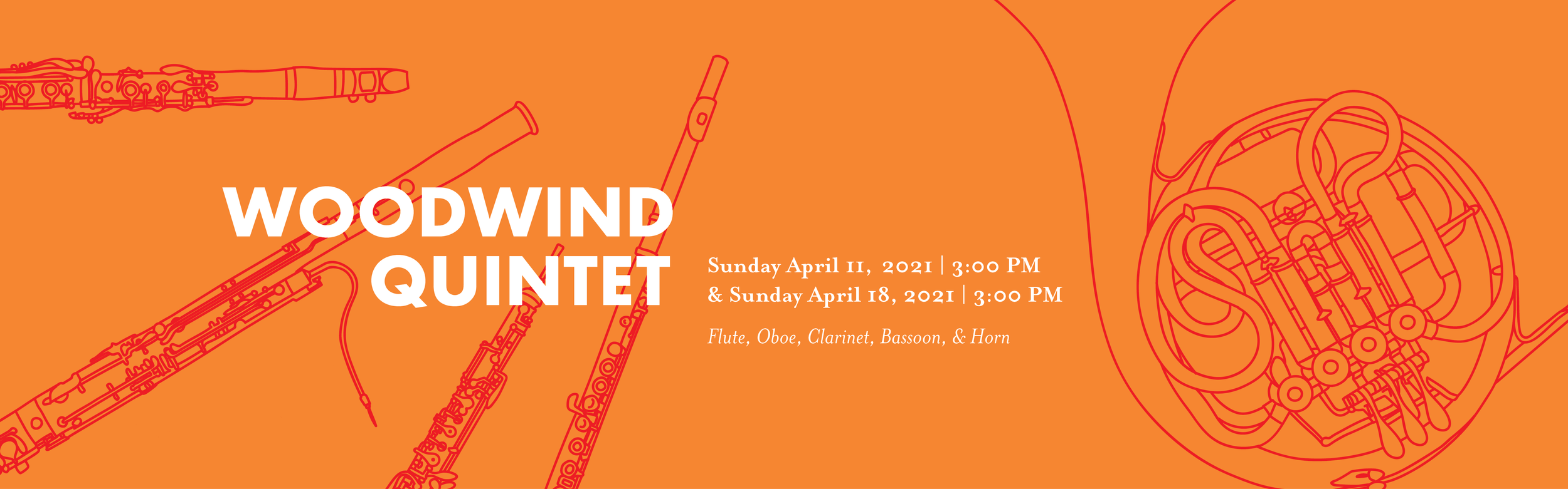
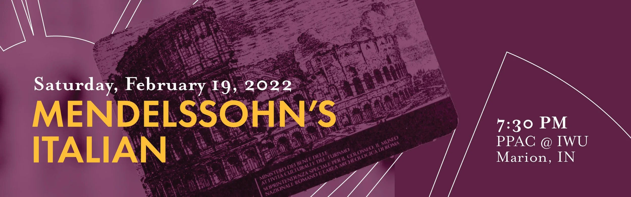
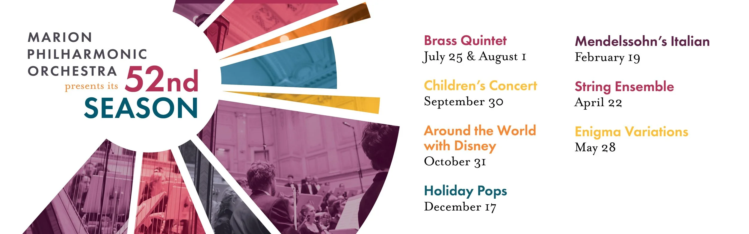
The final mark is classy yet playful, encapsulating the goals of Marion Philharmonic. The mark also invokes unity, with the various elements coming together to create a dynamic mark. Just as many instruments come together to create the symphonic melody at an MPO concert, community members from all over Grant County may come together to experience a live musical moment, as represented by the mark.
The final color palette is grounded by purple, playing off of purple’s historical association with sophistication and royalty. While it maintains this sleek, professional tone, it is still warm and approachable. We also added teal, orange, yellow, and gray to instill a sense of playfulness to balance out the sophisticated purple in the eyes of community members. The final type is bold yet graceful, again referencing the elegance and movement of orchestral music.