OPTIN BRAND
< Back to Work

Graphic Design
& Brand
2025

FROM PROBLEM
TO DESIGN
Our Process
OptIN partnered with Marion Design Co. to reimagine its brand in preparation for future growth, new products, and an expanding audience. The goal was to create an identity that captured the heart of OptIN's mission—equipping families to practice faith together—while establishing a flexible visual system that could support new audiences, initiatives, and resources. The result was a strategic brand identity that empowers families to actively build lifelong habits of Christian faith.
-
OptIN had built a strong reputation through thoughtful discipleship resources, but its visual identity no longer reflected the clarity, confidence, or scalability of the organization. As the ministry expanded into new products, digital experiences, and future initiatives, the brand needed to grow with it.
OptIN had built a strong reputation through thoughtful discipleship resources, but its visual identity no longer reflected the clarity, confidence, or scalability of the organization. As the ministry expanded into new products and future initiatives, the brand needed to grow with it. The name OptIN communicates an intentional decision to participate in spiritual formation, so the identity needed to reinforce that faith is an active process—one requiring agency, practice, vulnerability, and growth.
At the same time, the brand had to engage a broad audience, from children and parents to church leaders and ministry organizations. It needed to feel playful and approachable for younger audiences while maintaining the credibility and maturity expected by adult learners, avoiding an aesthetic that felt either childish or traditionally institutional.
More than a logo, the project required a scalable brand system capable of supporting sub-brands, educational resources, digital media, events, apparel, and future initiatives while maintaining a unified visual language. Our challenge was to distill the organization's meaningful ideas into a memorable, printer-friendly identity that clearly communicates OptIN's mission across every touchpoint.
-
We began by listening closely to understand OptIN's mission, values, audiences, and long-term vision. Together, we explored the defining idea behind the name OptIN—that meaningful faith begins with an intentional choice.
Research into audience behaviors, faith-based organizations, nonprofit brands, and educational experiences helped us identify how authenticity, simplicity, and action could be communicated without relying on traditional religious symbolism.
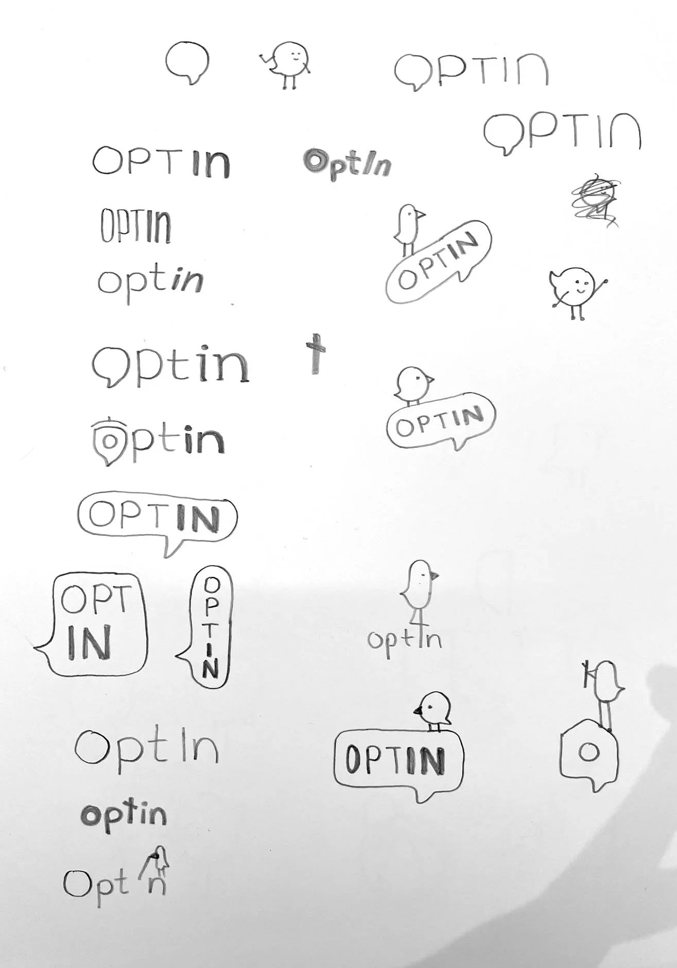
As the project progressed, it became clear that OptIN's existing birdhouse logo already embodied many of the organization's core values. Rather than replacing it, we expanded its story of foundational skills, safe spaces for families, and lifelong growth, allowing those ideas to shape the new identity.
Concepts were refined collaboratively through presentations and strategic feedback. Every decision—from typography and color to supporting graphics and illustrations—was evaluated for its ability to communicate OptIN's philosophy in a clear, memorable, and scalable way.
-
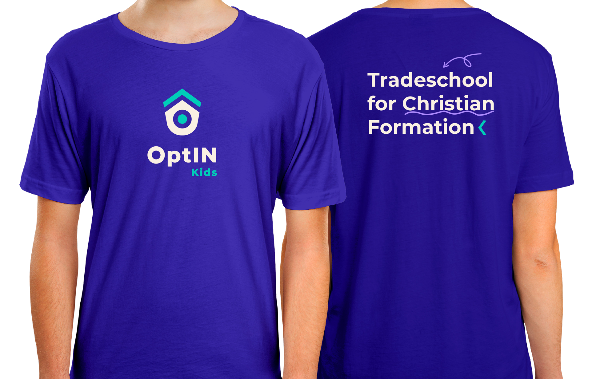
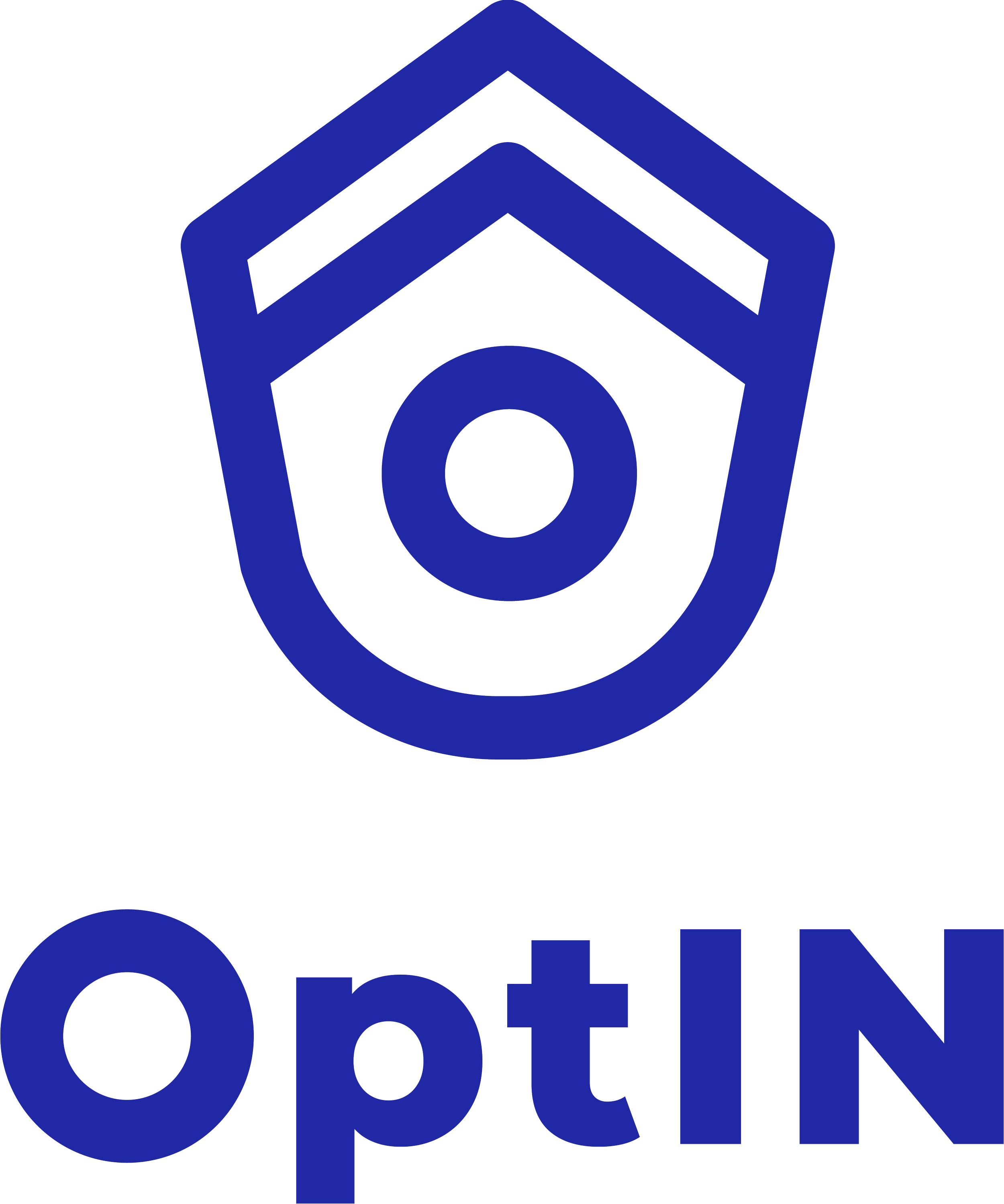
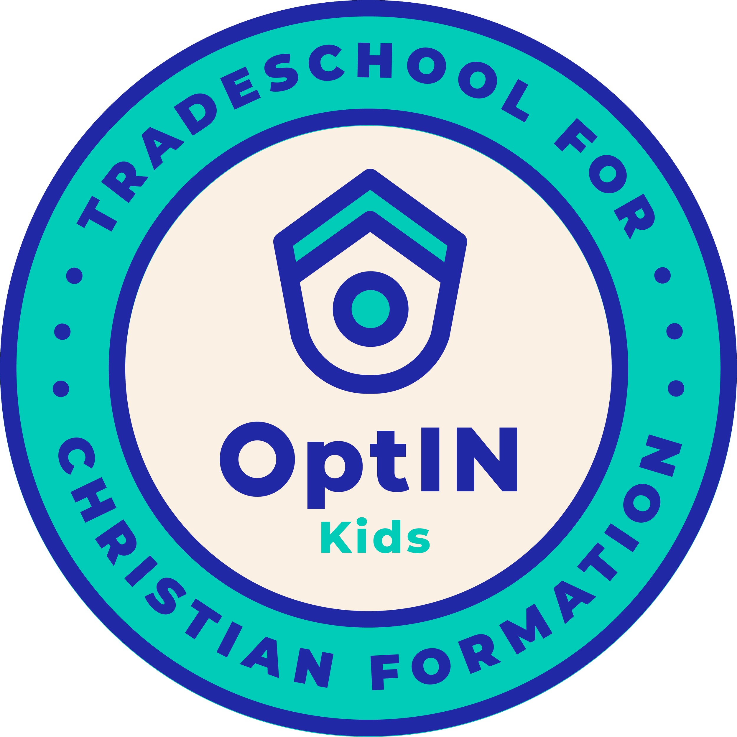
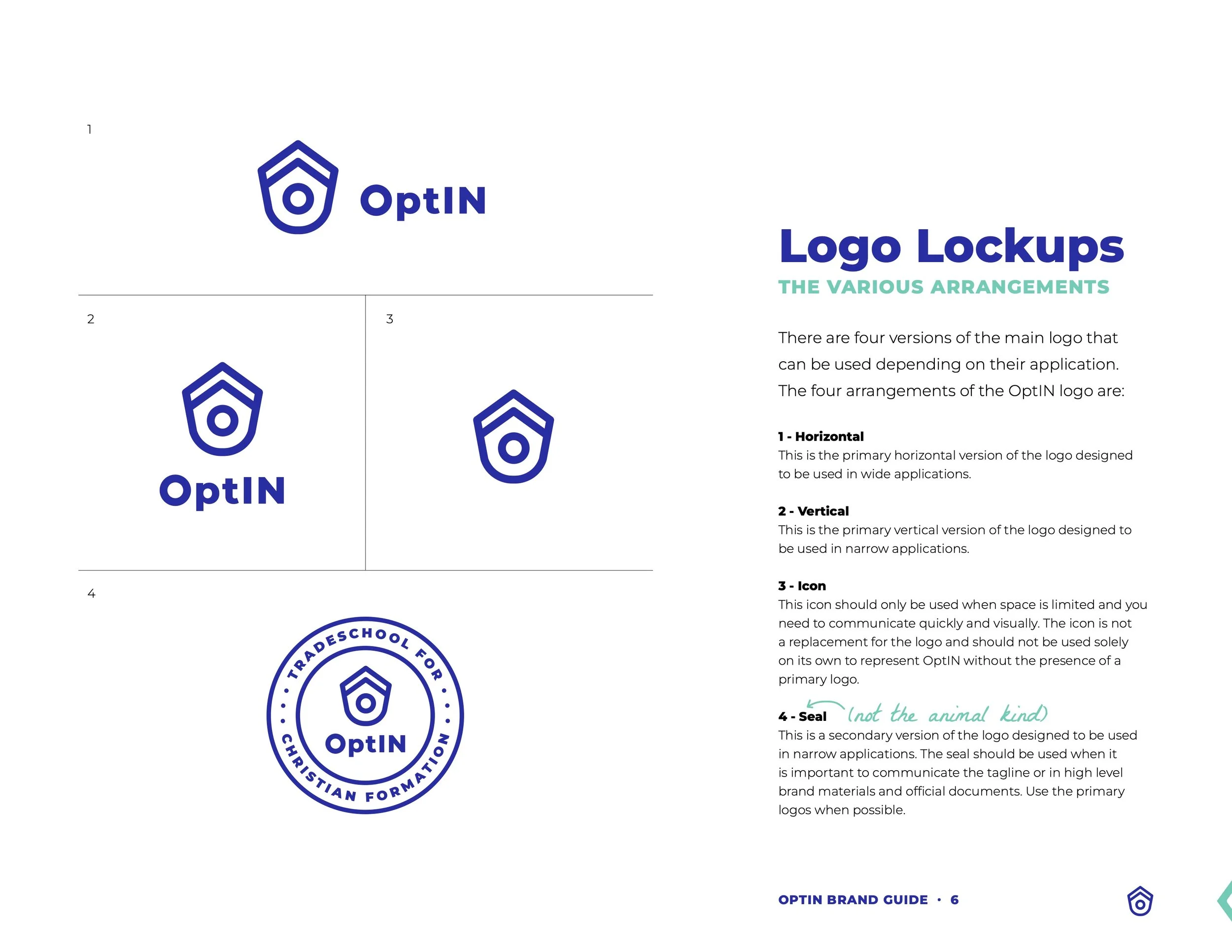
The final identity transforms OptIN into a cohesive brand system centered on intentionally building lifelong faith. At its core is a simplified birdhouse mark representing family, belonging, vulnerability, and spiritual growth. The open doorway invites participants to "step in," while the upward-pointing roofline symbolizes continual growth.
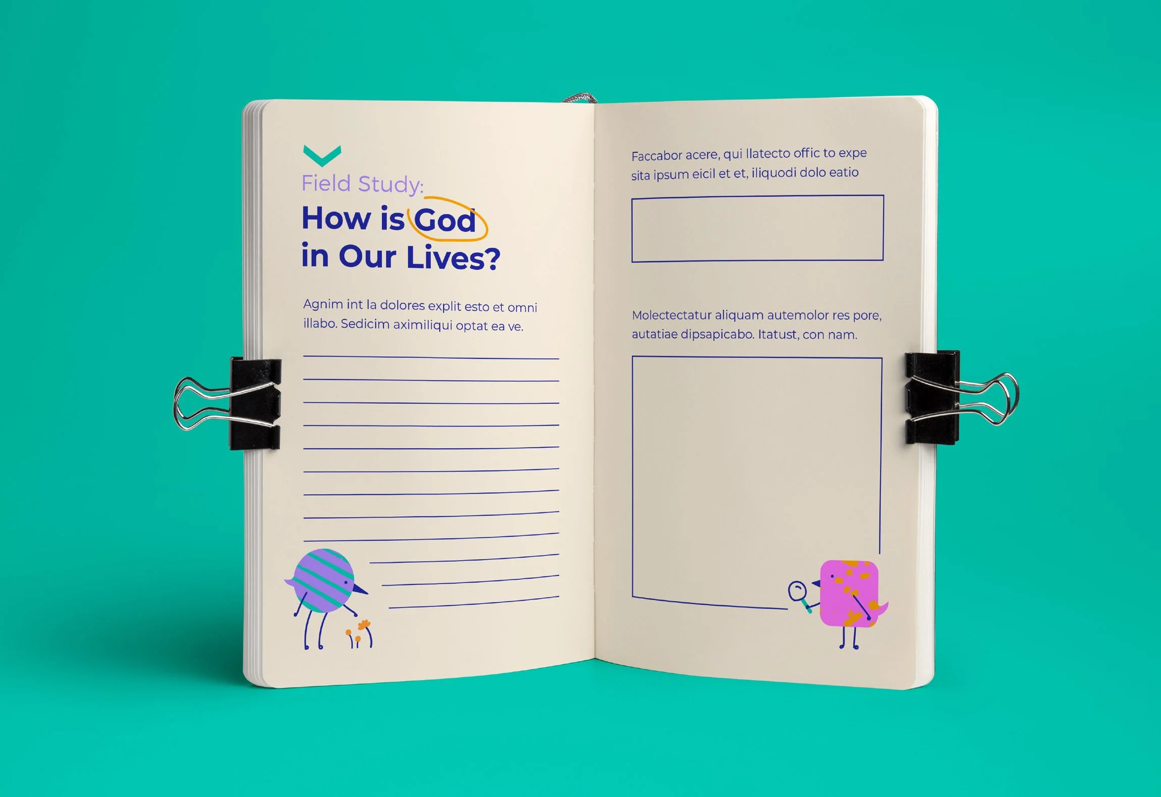
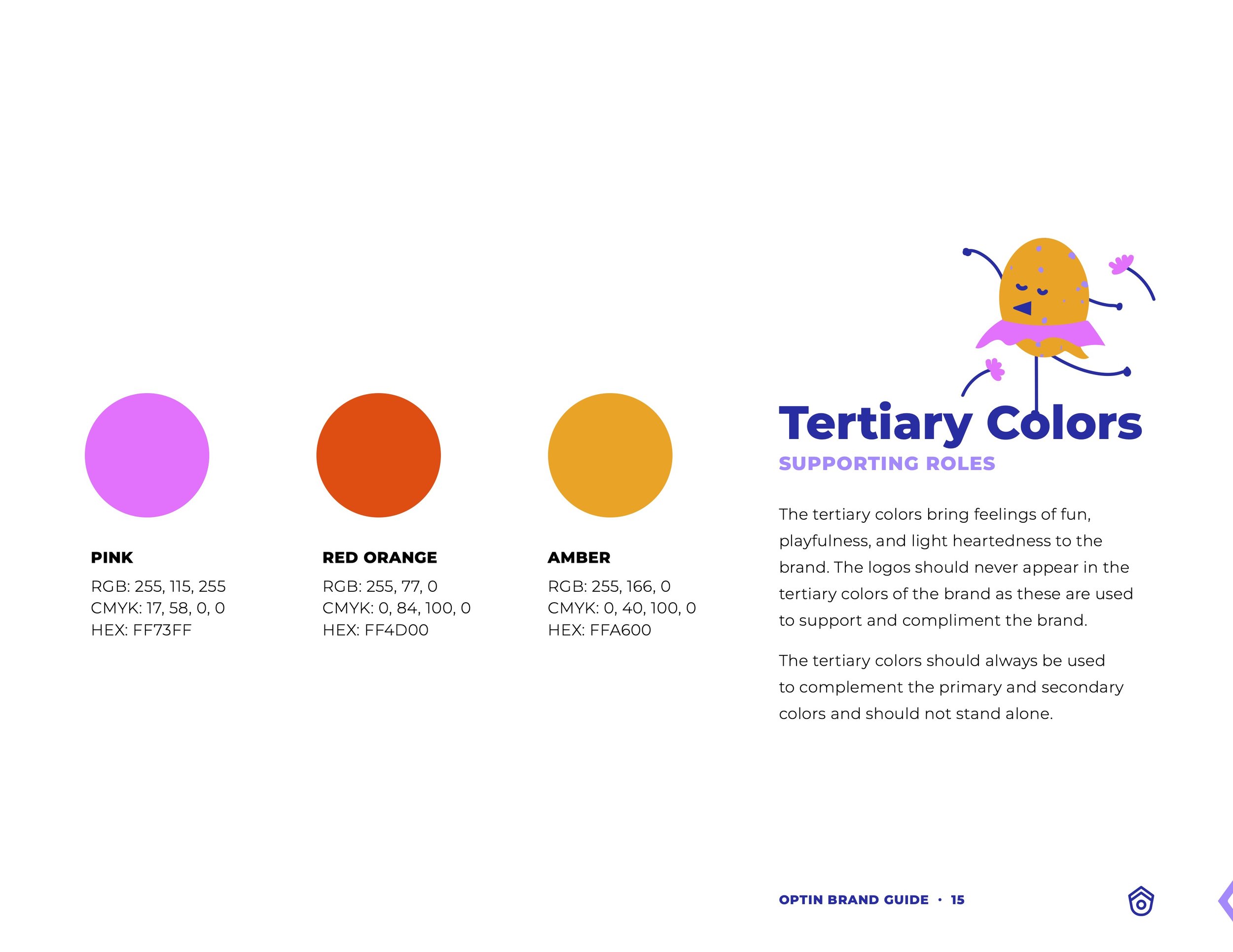
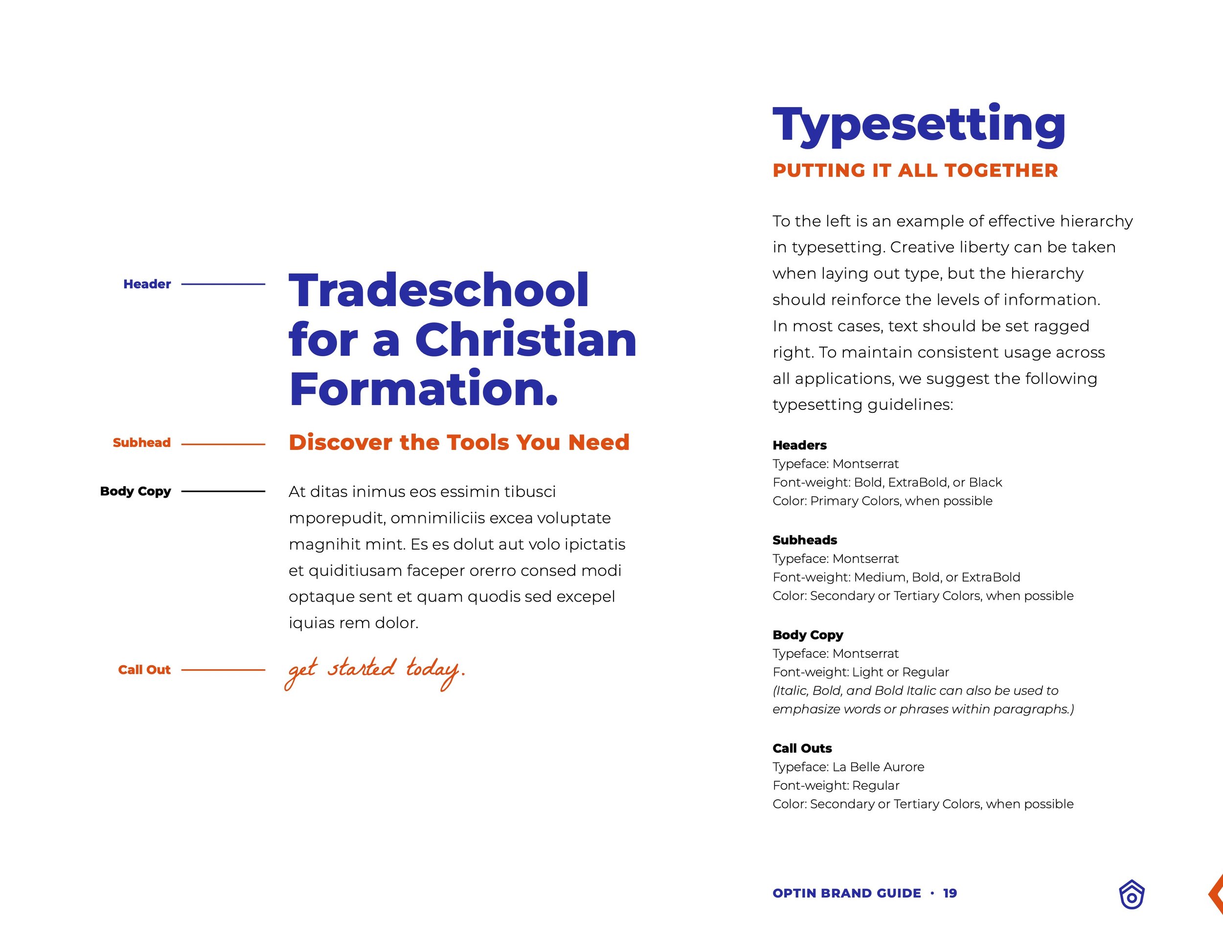
Supporting the identity is a visual language system built around a bold color hierarchy, hand-drawn editing marks, and playful patterns that celebrate faith formation as an active, ongoing process.
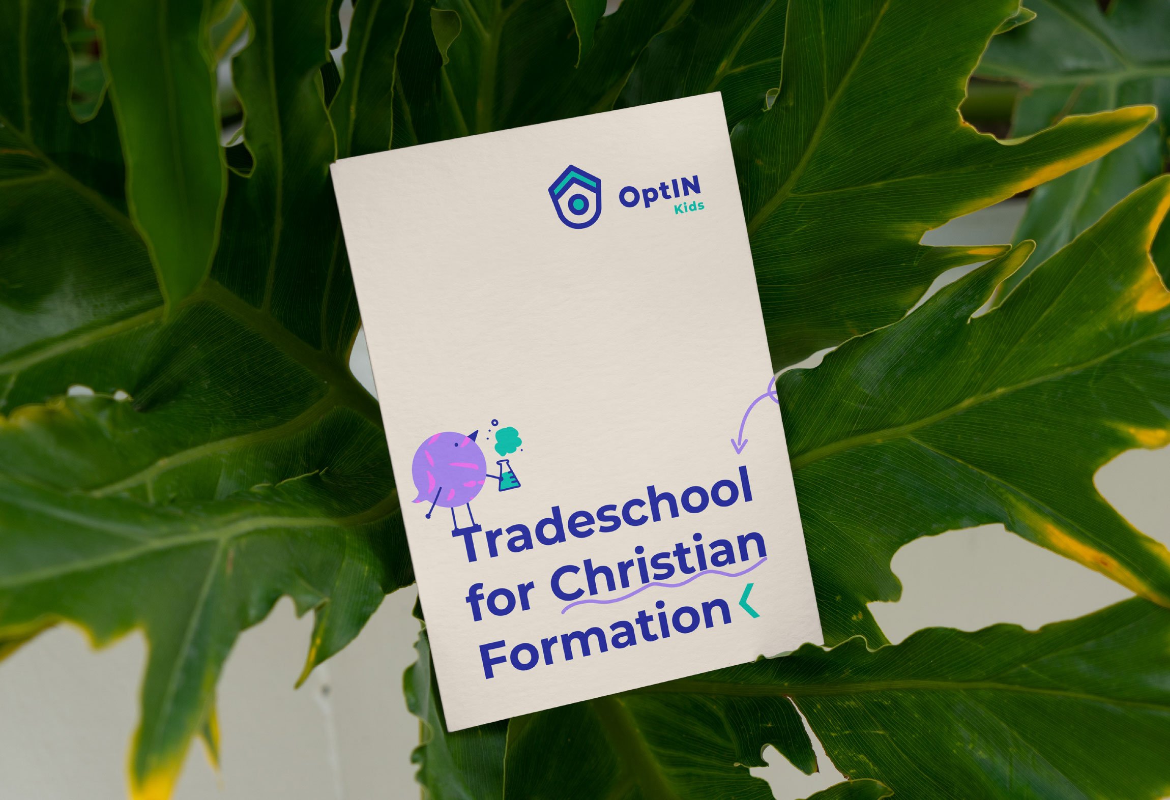
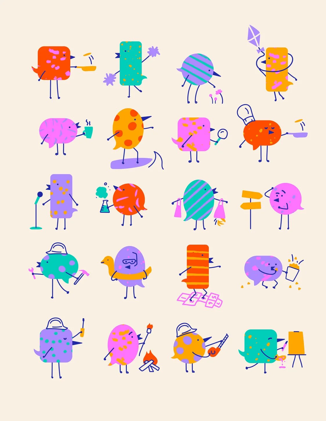
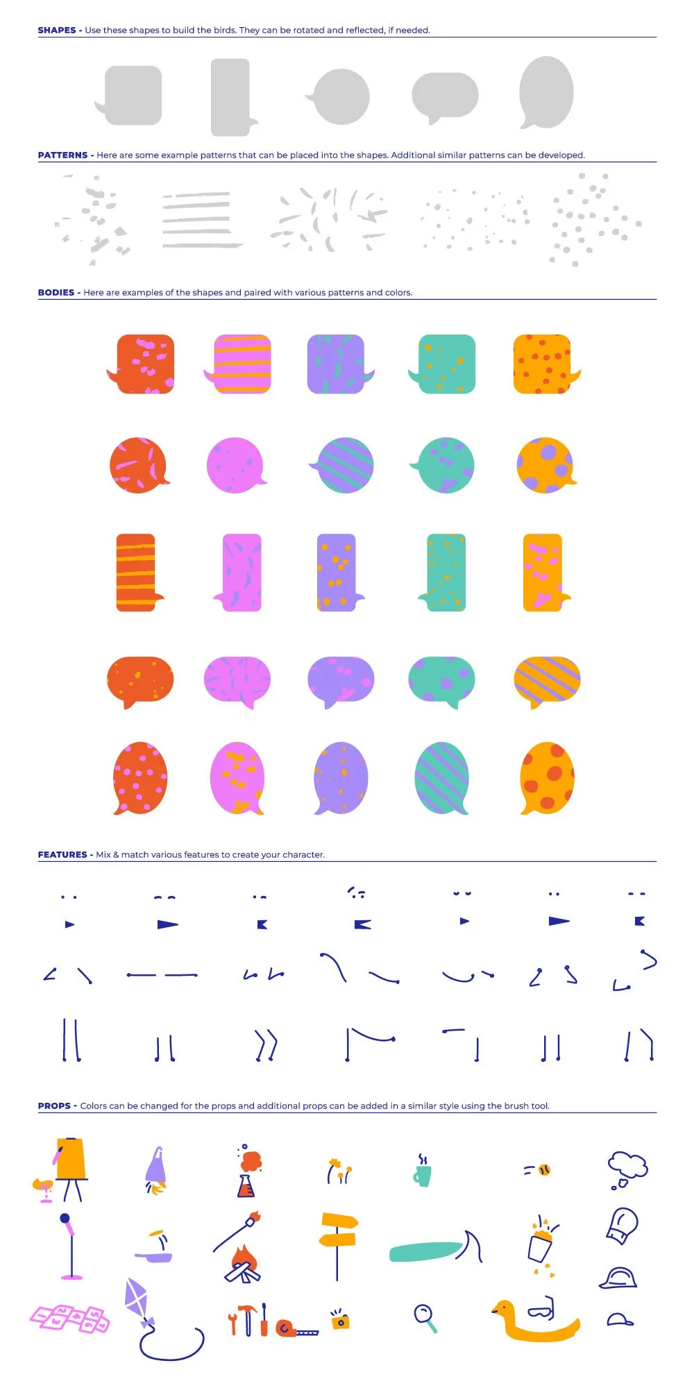
A flexible set of custom bird characters adds warmth and personality while representing the diversity of people OptIN serves. Their speech-bubble-shaped tail feathers reinforce meaningful conversations, and their clean geometric forms paired with hand-drawn textures reflect the imperfect, in-process nature of faith formation.
More than a logo, the resulting system provides a scalable visual foundation for future brand applications while remaining unmistakably OptIN. It equips the organization with a cohesive identity that reflects its mission to help families intentionally practice faith together through action, conversation, and everyday life.
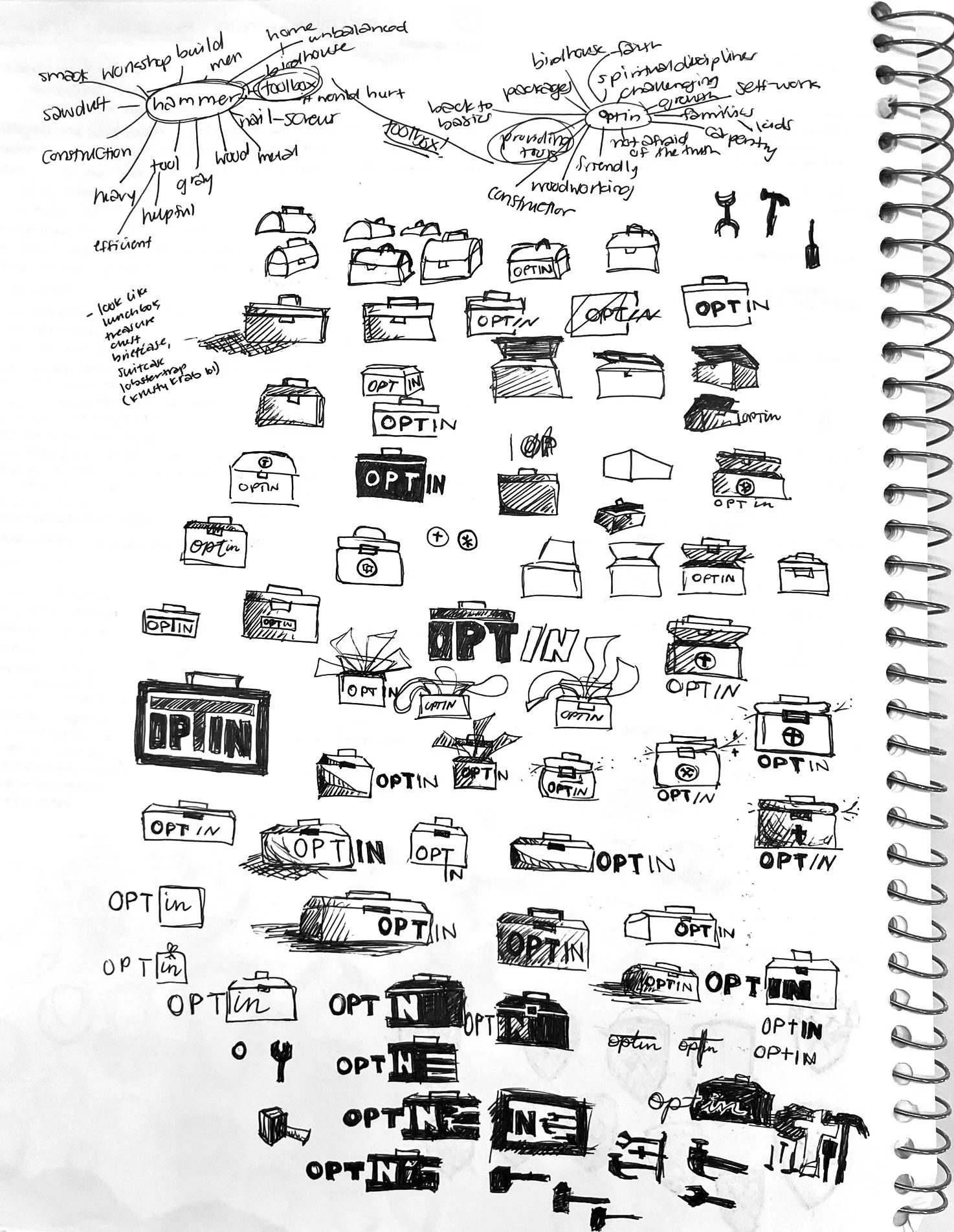
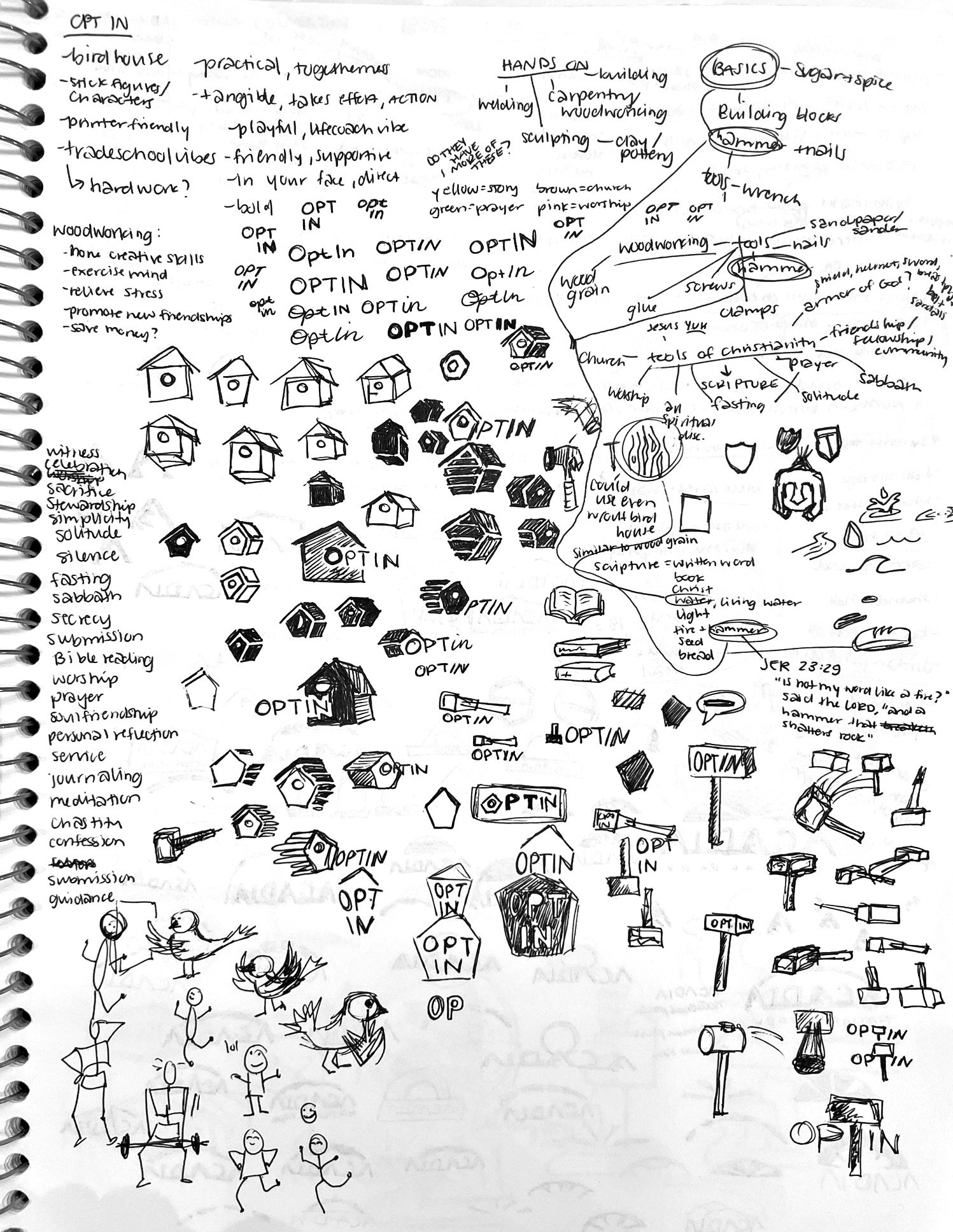
Sketch Ideation
Master and Sub Brand Marks

The Birds

Style Guide
Application