SMALL BUSINESS SOLUTIONS
< Back to Work

Graphic Design & Brand
2026

FROM PROBLEM
TO DESIGN
Our Process
JoAnn Adams has spent twenty years keeping other people's books straight and has a big vision for growing her business. She's built Small Business Solutions while running her own coffee house, but the brand wasn't telling the whole story. Its safe blues and greens looked like every other bookkeeping firm. The relationship she's built with her clients was the real story. Every time she posted a photo of herself instead of a stock graphic, her engagement increased.
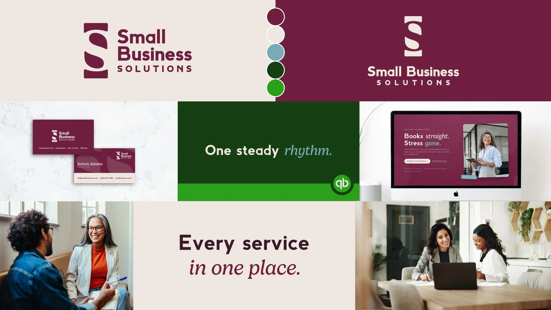
When she hired us to rebrand her business, we started by listening and auditing the brand, communications, and website to see what was working before deciding what to build. From there, we developed four logo directions and let each one carry a different piece of who SBS is: professional, approachable, structured, bold. It was also important that the brand colors play well with QuickBooks' brand. What came out the other side was a brand that hints at the dollar symbol while leveraging the letterforms in their names. Moving to an elevated professional visual presence in their brand and on their new website looks and sounds like the person who built this business so nobody else would have to tackle their books alone.
Old logo:

-
When JoAnn came to us, her brand presence used a consistent color, font, and image treatment. However, there was not a clear organization to differentiate the services she provided. While her brand had similar elements to many other financial and bookkeeping businesses, it did not stand out, it was not memorable, and it lacked the sense of trusted professionalism she possessed. The first step was to refresh the brand. This would be followed by a website redesign and then downstream changes to email and social media presence.
-
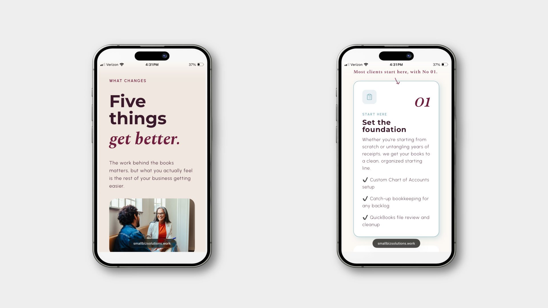
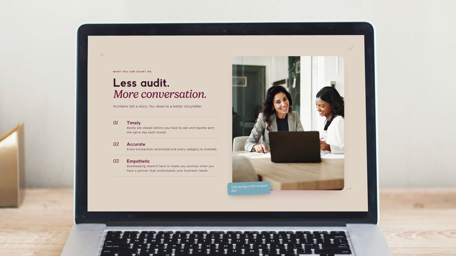
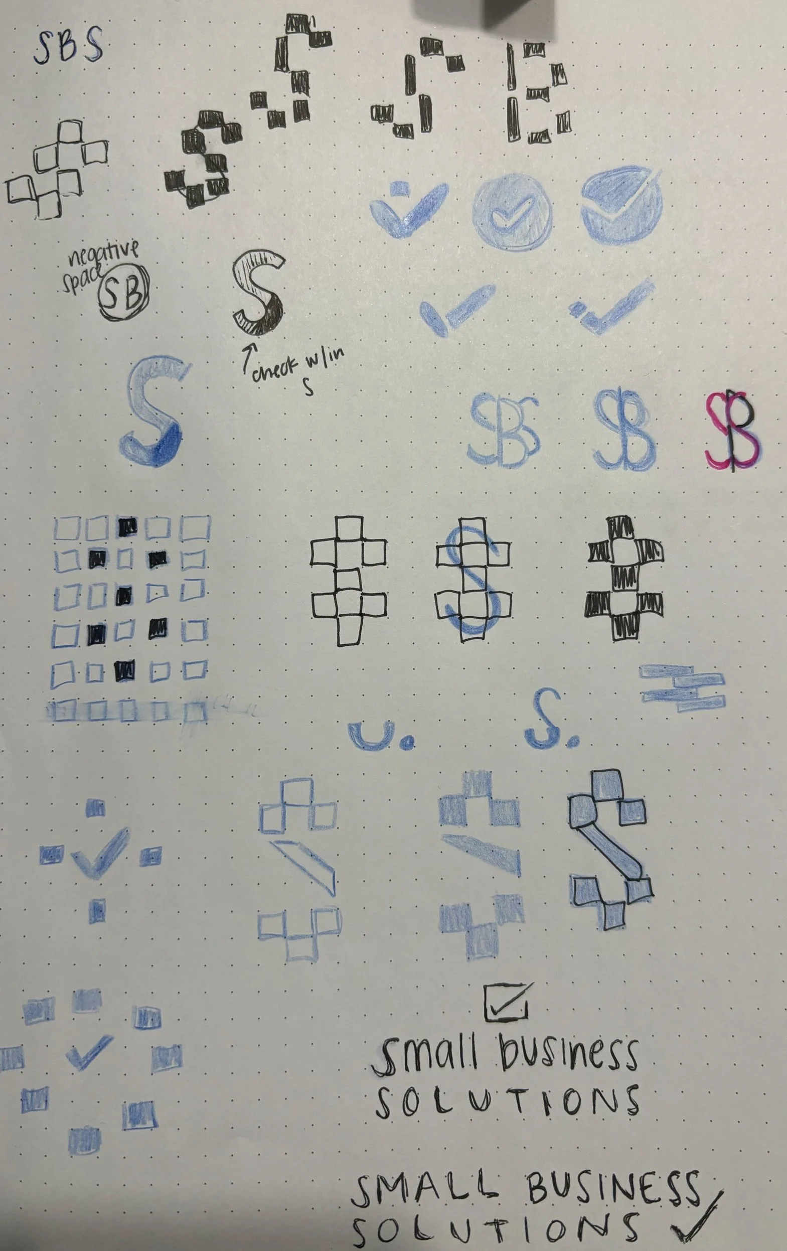
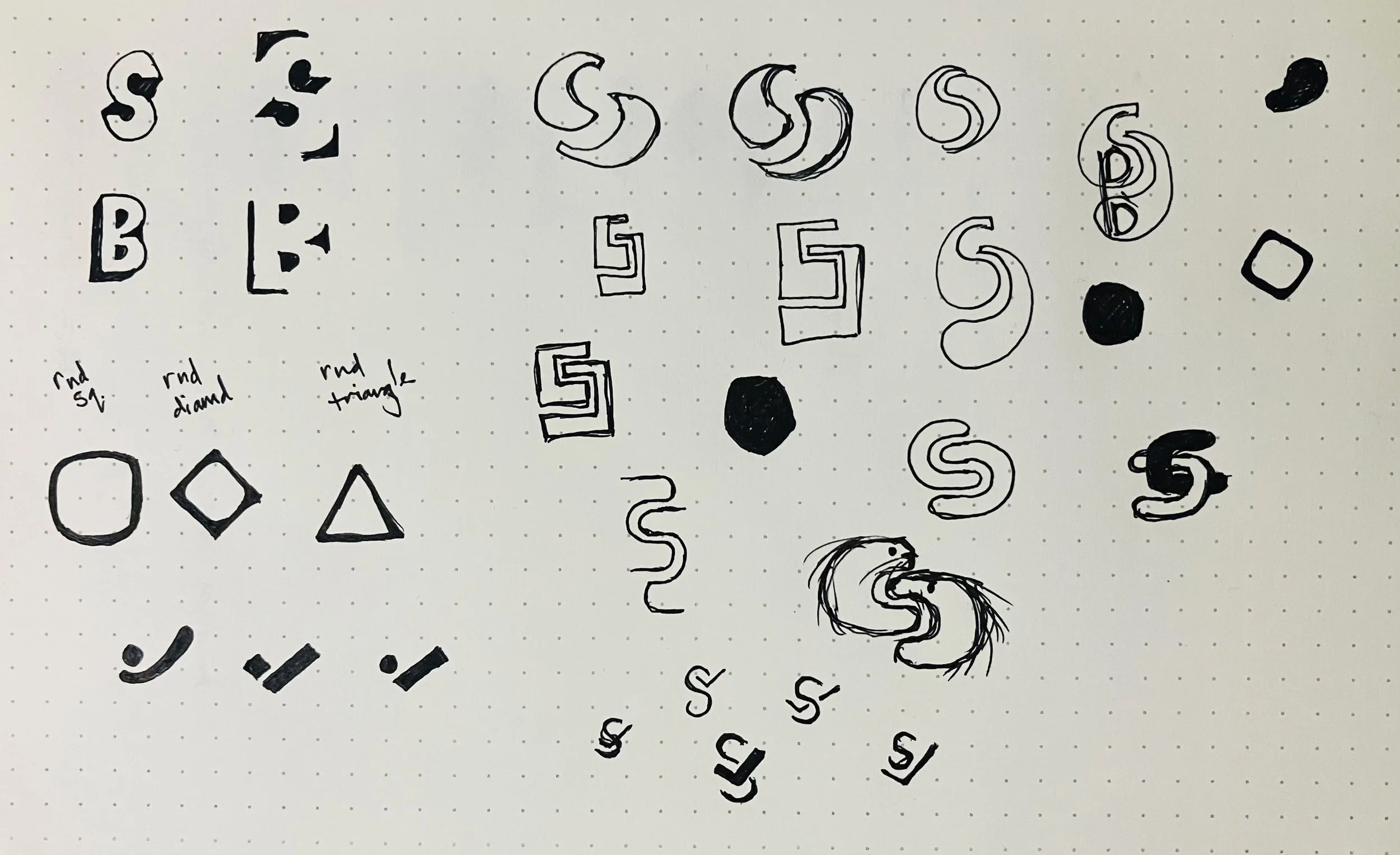
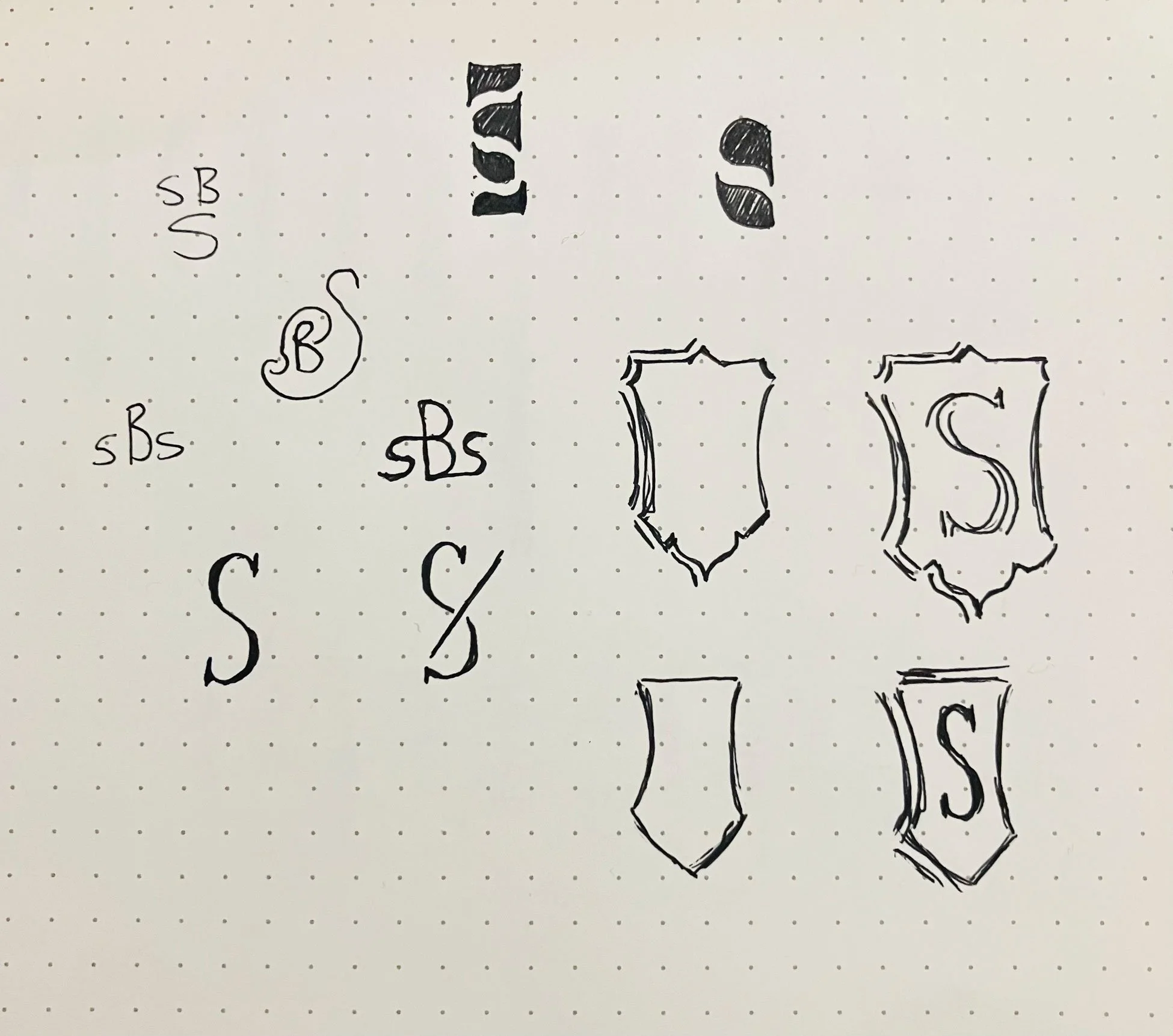
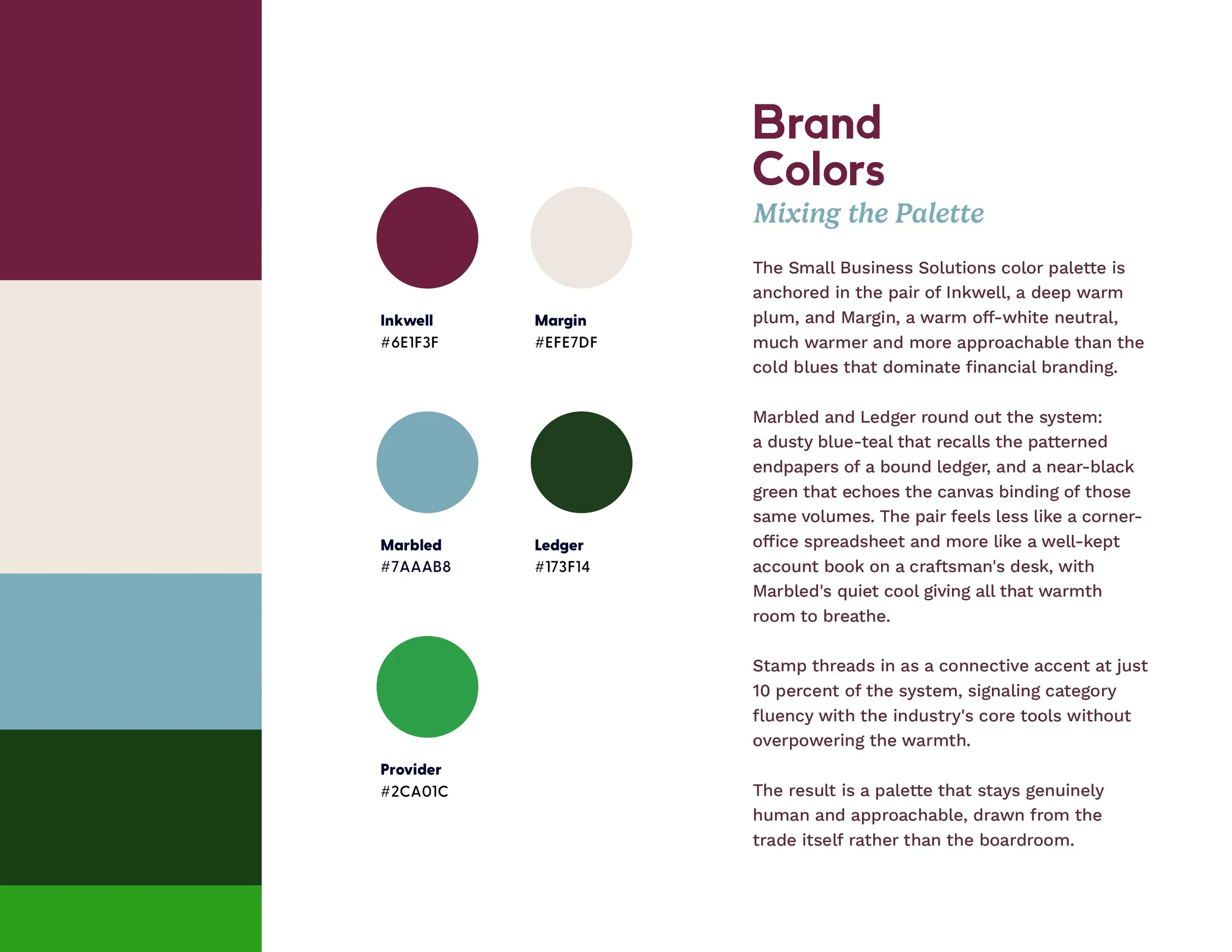
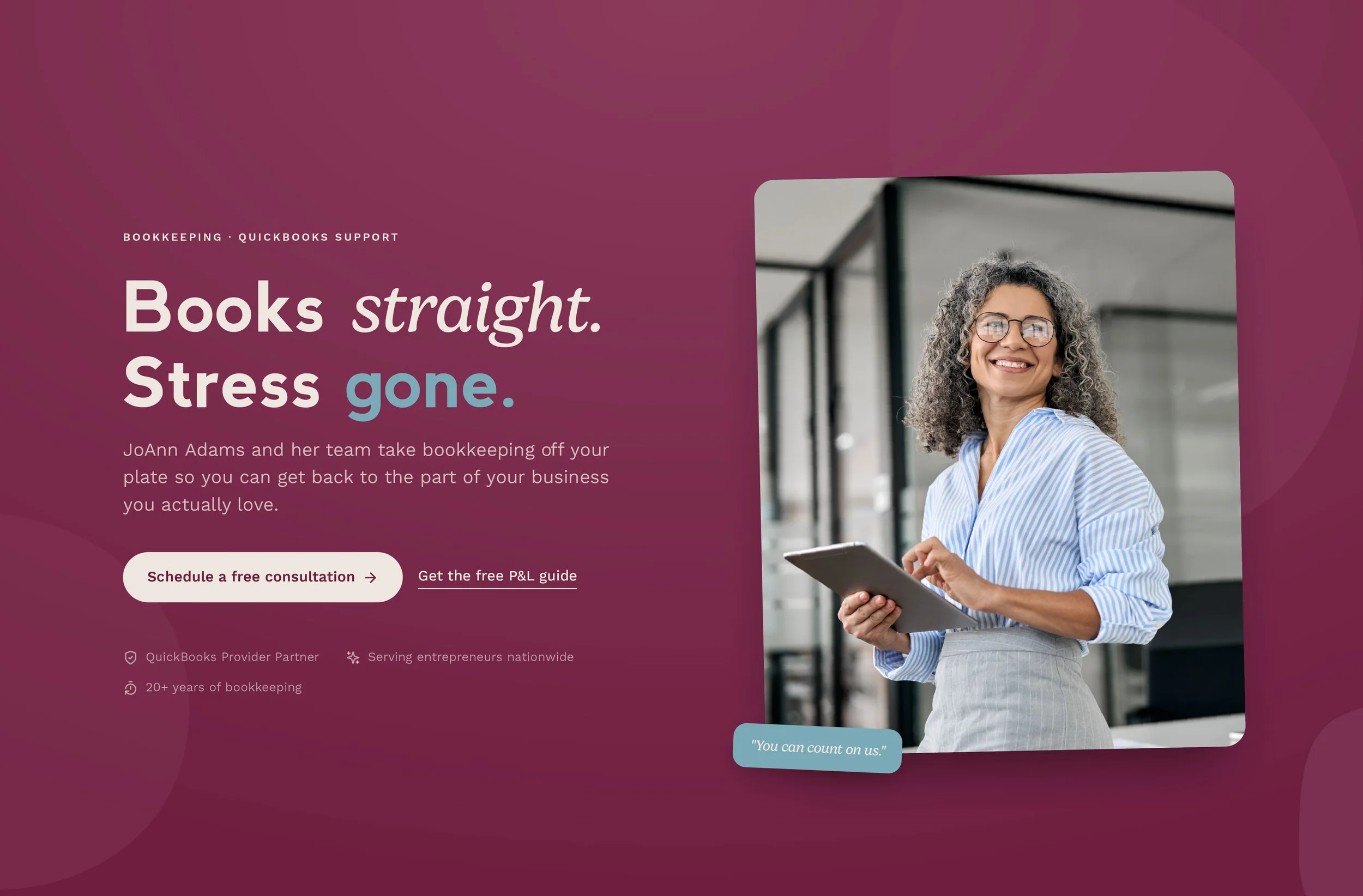
We began by researching the field of bookkeeping with a broader inclusion of tax and financial service institutions. Once we had a clear idea of the colors and iconography associated with the landscape, we began ideation on the brand refresh. JoAnn knew she wanted to keep the name, but was open to going in a new direction with the logo and wordmark. After several rounds of sketch and digital ideation, we had a concept that honored the relational and human aspects of JoAnn’s business while not compromising the professionalism and industry standards she possessed. This brand refresh included a full type and color treatment and a new direction for photos and illustration assets. Once this direction was approved by the client, we moved forward with a complete website redesign.
-
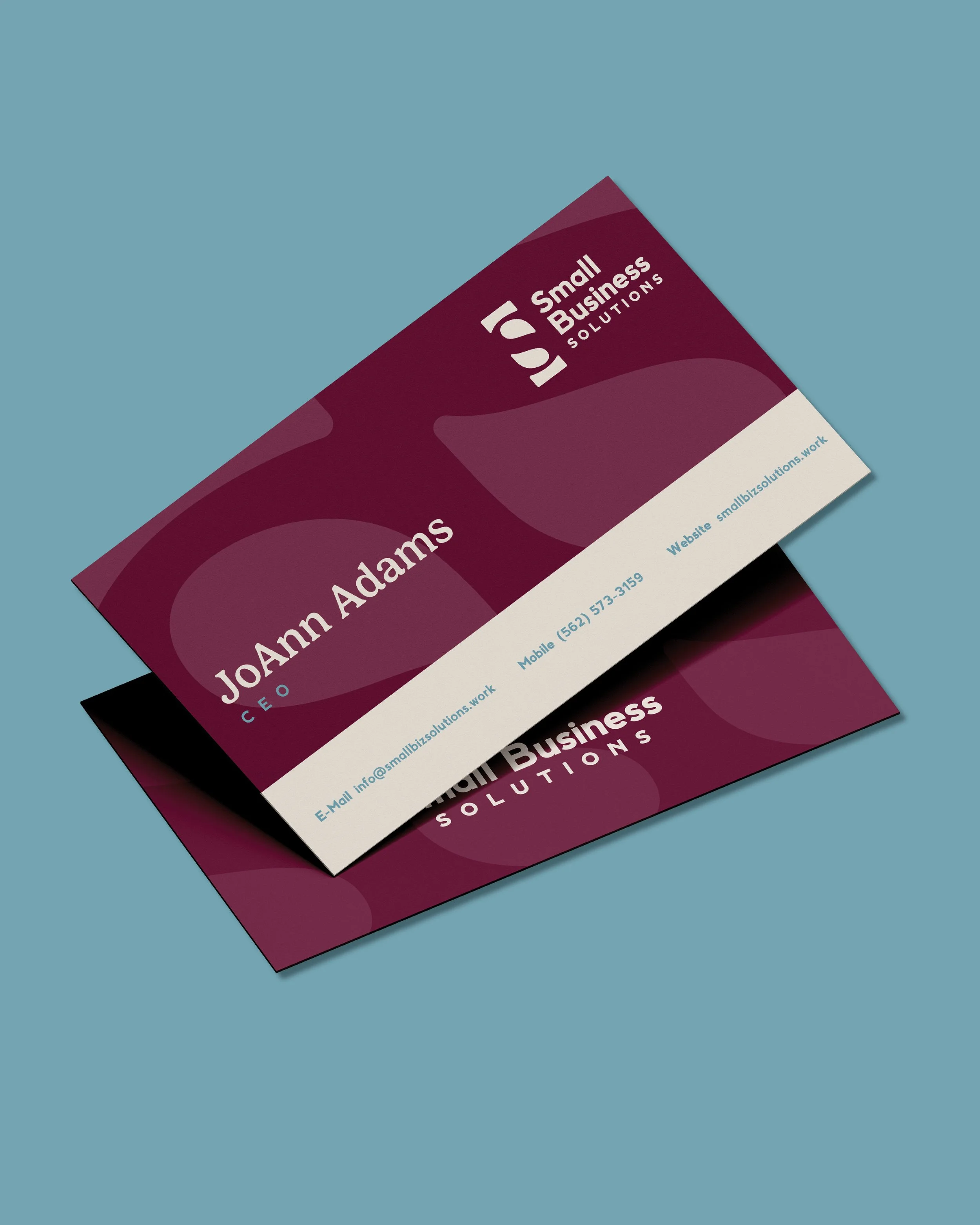
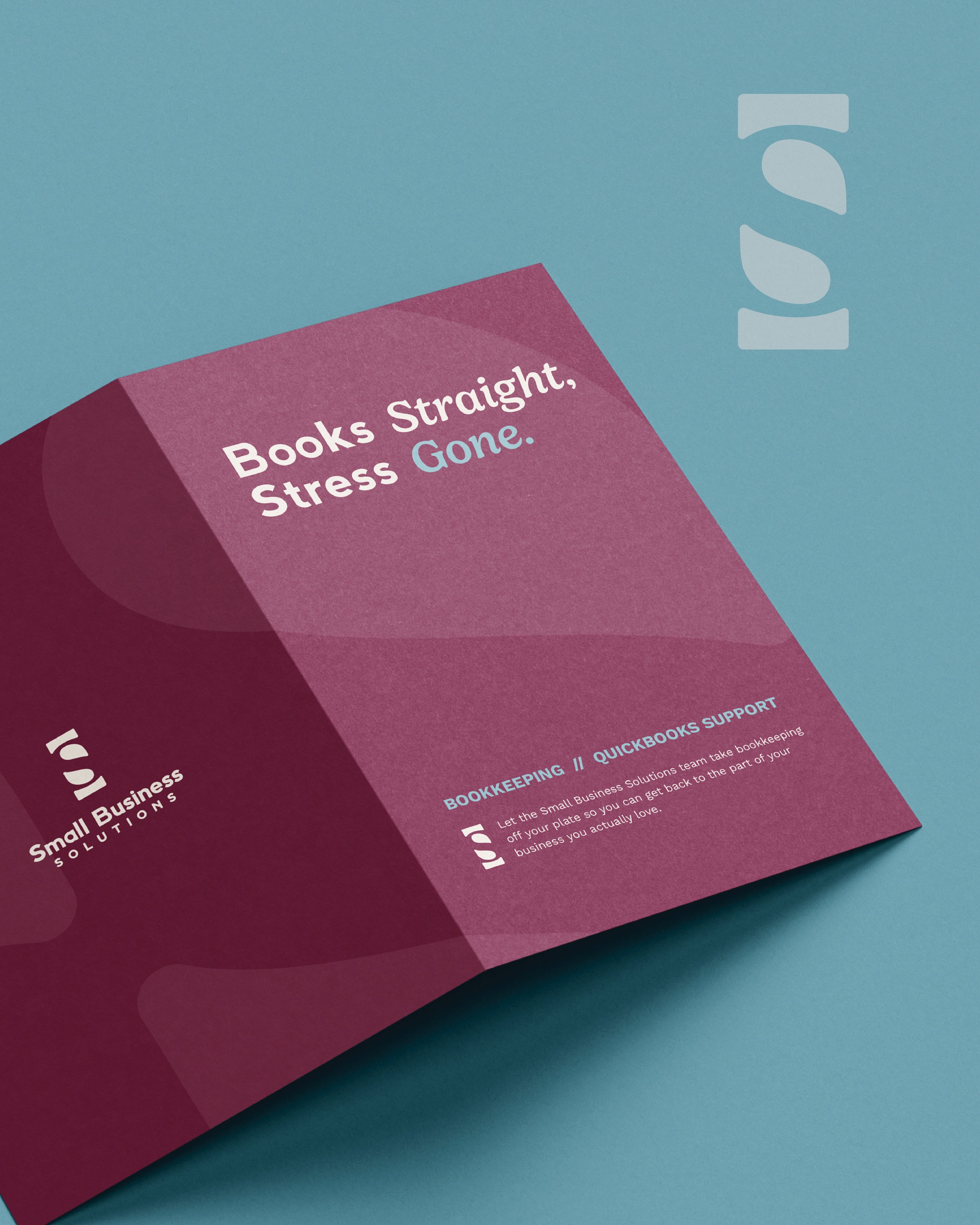
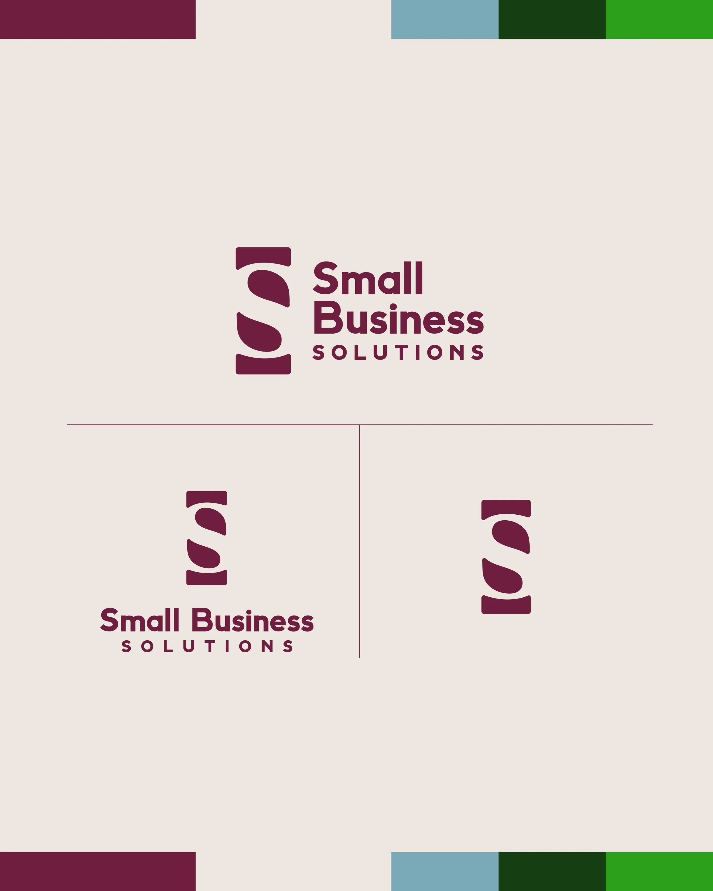
The logomark features the letter “S” as white space. This “S” represents the business title, Small Business Solutions. In conjunction with the caps on either end, it also functions as a subtle nod to the dollar sign symbol. The edges of the logo are slightly rounded to make it softer and more approachable. The rounded serif letterform of the “S” provides elegance and visual interest. Taken together, the logomark is elegant and striking, balancing both welcoming humanity and trusted solidity. The wordmark is set in a soft serif and the color palette is warm and expansive. The tonal shift of the brand presence went from stark, raw, and minimal to resonant, relational, and generous. Through this brand refresh and subsequent website redesign, we were able to provide JoAnn with a brand presence that better represents her company’s strengths and the unique space it occupies in the bookkeeping field.
Sketch Ideation
Before & After

Application