PLAYFUL BRAND SYSTEM
< Back to Work

Graphic Design
& Brand
2025

FROM PROBLEM
TO DESIGN
Our Process
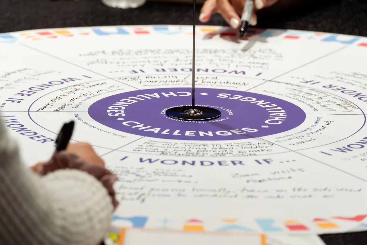
Strengthening Ministry with Children Coordination Program partnered with Marion Design Co. to create a distinct and scalable brand identity that could support a growing network of organizations focused on children’s faith formation. The challenge was to develop a visual system that felt playful and child-centered while maintaining credibility, clarity, and flexibility across multiple initiatives, audiences, and future program growth.
-
The Strengthening Ministry with Children Coordination Program oversees a wide network of organizations dedicated to helping children develop lifelong faith practices. While the program had a strong mission and research-backed purpose, it lacked a cohesive visual identity that clearly communicated its role, values, and long-term vision. The organization needed a brand system that could stand independently while remaining adaptable enough to grow alongside future initiatives.
The program served a diverse audience—from churches and ministries to academic institutions and nonprofit organizations. The identity needed to communicate professionalism and trust while still feeling approachable, child-focused, and rooted in faith formation.
As the organization expanded, multiple initiatives emerged under the larger program umbrella. Two primary initiatives—Christian Parenting & Caregiving and Nurturing Children Through Worship & Prayer—required distinct recognition while remaining visually connected to the parent organization. The challenge was creating a hierarchy that clarified relationships without fragmenting the brand.
The client wanted an identity that felt clean, modern, and intuitive without relying on overly symbolic religious imagery. The brand needed to feel welcoming and memorable while reflecting the central role children play in faith formation.
-
We began with discovery conversations focused on the organization’s mission, audience, and long-term vision. Through initial meetings, we explored how the program functioned, the relationships between initiatives, and how the brand needed to support both current and future growth. Research revealed that parents and congregations play distinct yet interconnected roles in children’s faith development, which became a foundational concept for the identity system.
Our exploration included reviewing comparable faith-based organizations, children’s ministry programs, educational nonprofits, and institutional initiatives. We analyzed how other systems communicated hierarchy, scalability, and audience clarity while maintaining a recognizable visual thread.
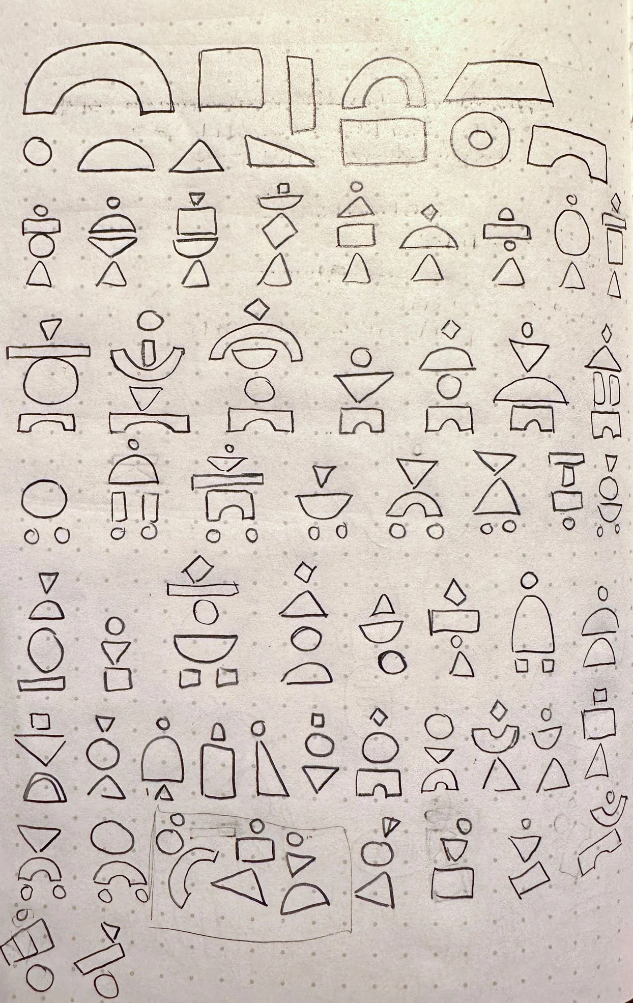
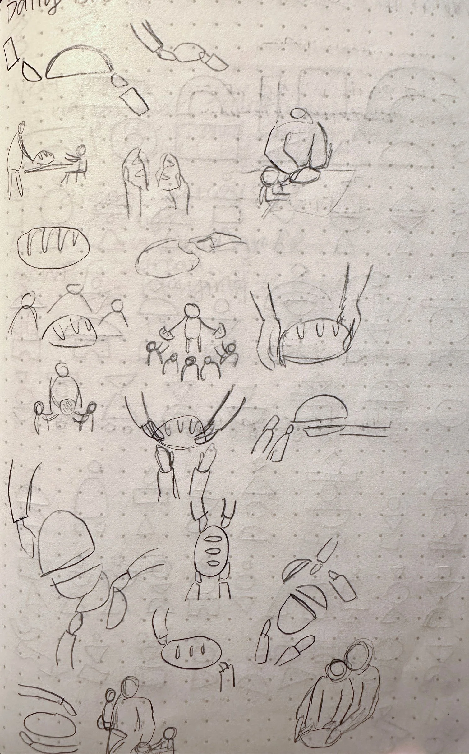
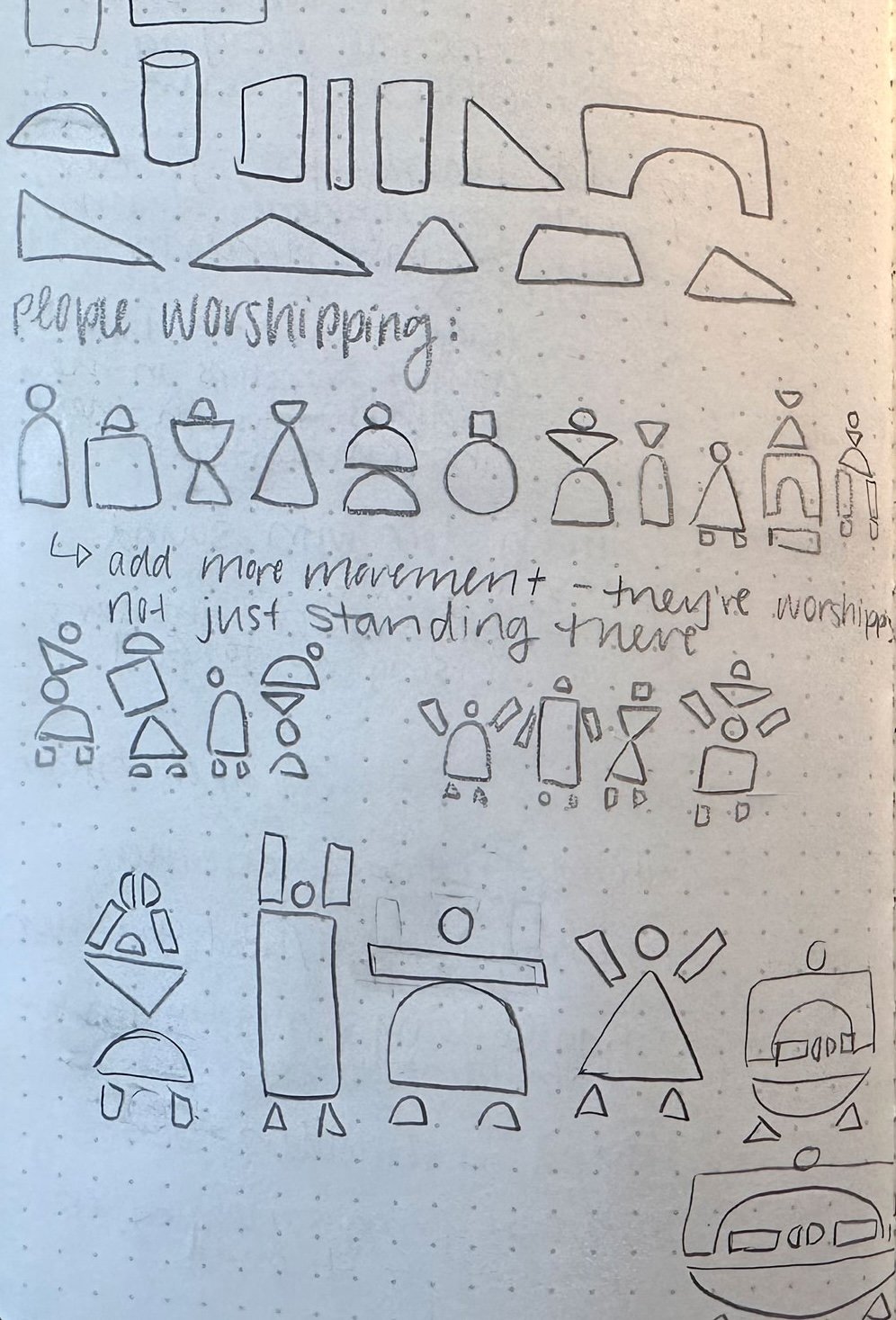
Throughout concept development, we worked collaboratively with the client to refine visual direction. Early logo explorations tested symbolism, color systems, iconography, and ways to represent ministry to children without becoming overly literal or overly institutional. We explored how shapes, structure, and composition could visually communicate themes of building, growth, curiosity, and support.
As the brand evolved, we identified the opportunity to create a modular system rather than a single standalone logo. This allowed us to design a parent identity alongside sub-brand marks that could live independently while remaining connected through shared visual language.
-
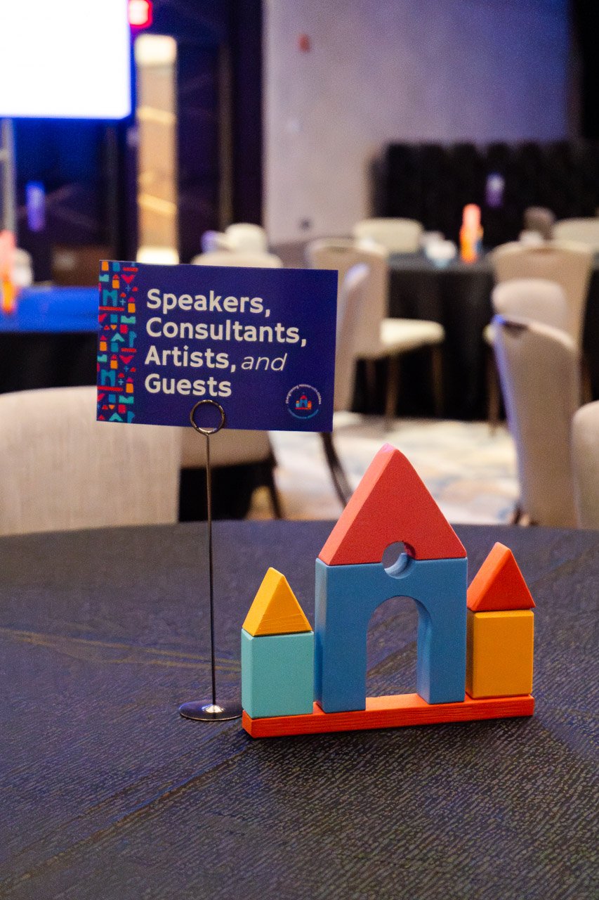
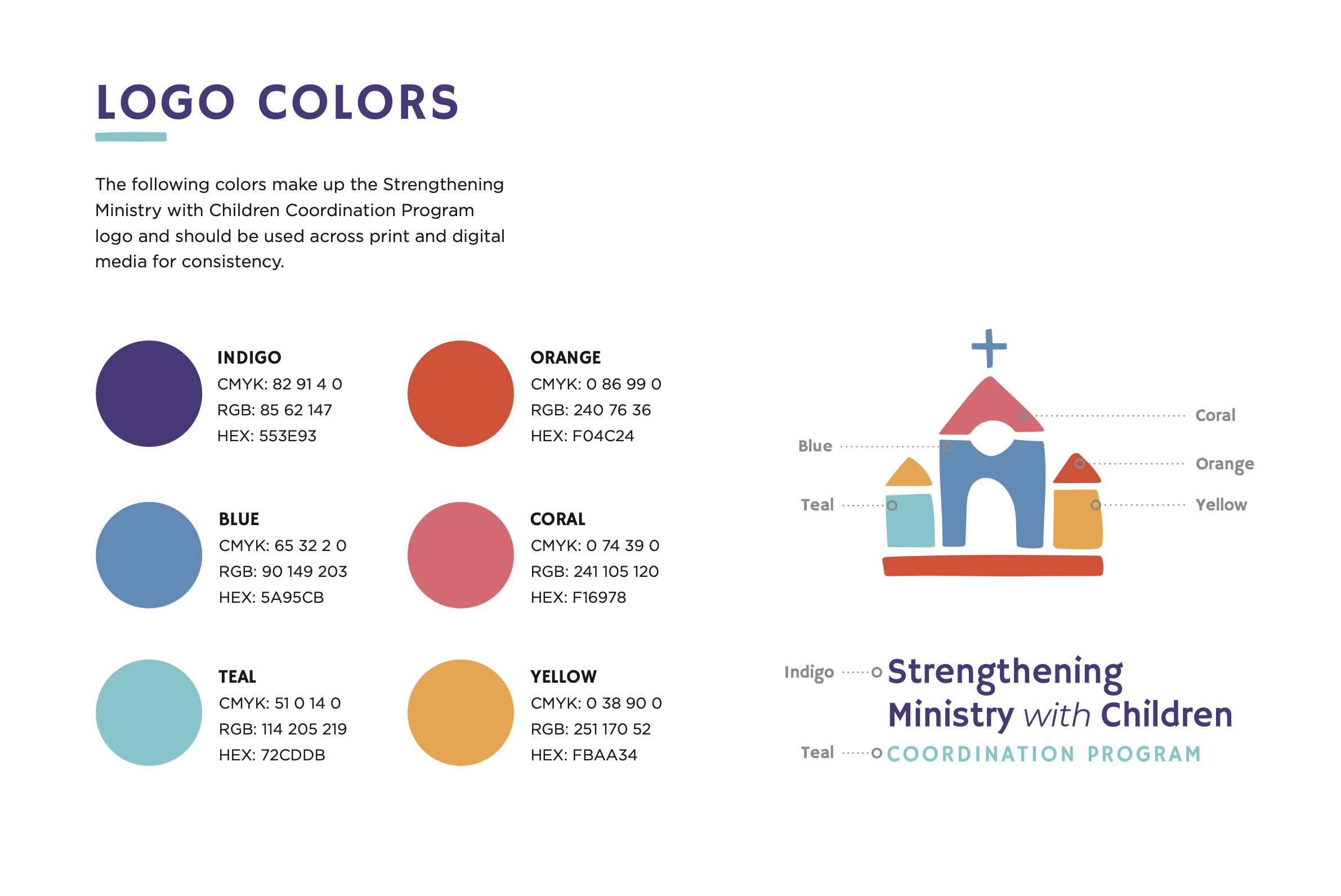
The final design solution is a playful yet strategic brand system centered around the idea of building faith foundations for children. The primary logo features a church constructed from toy building blocks—visually representing ministry through a child-centered lens. Bright colors create warmth and curiosity, while imperfect shapes introduce a handmade, approachable quality that reflects the realities of growth, learning, and faith development.
At the center of the mark is a subtle human figure, reinforcing that children remain the focus of the program. A grounded horizontal block anchors the composition, symbolizing stability and the strong foundation upon which lifelong faith can be built. Custom typography complements the icon through playful tilted details that mirror the geometry of toy blocks.
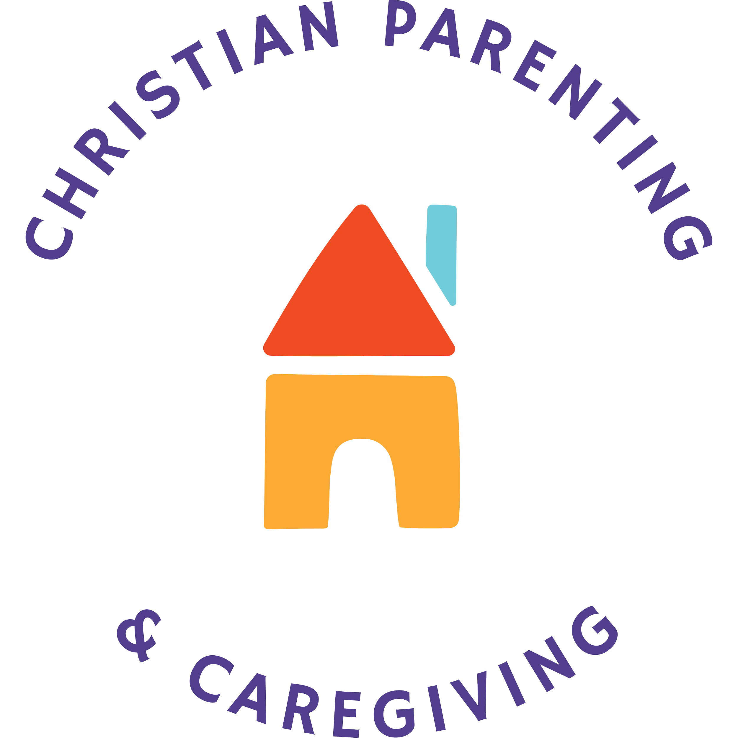
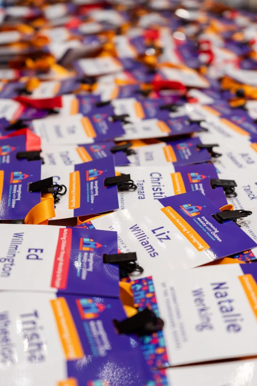
To support organizational growth, we developed a cohesive sub-brand system for the program’s two initiatives. Each sub-logo visually connects to the parent identity through shared colors, shapes, and structural language while communicating a unique focus. Christian Parenting & Caregiving emphasizes the home environment and parent relationships, while Nurturing Children Through Worship & Prayer highlights congregational engagement within church spaces.
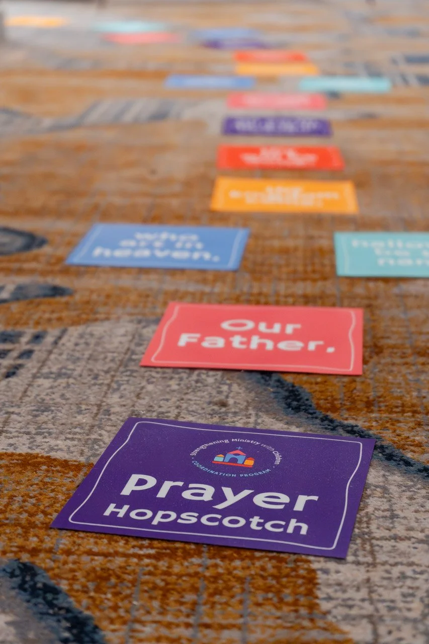
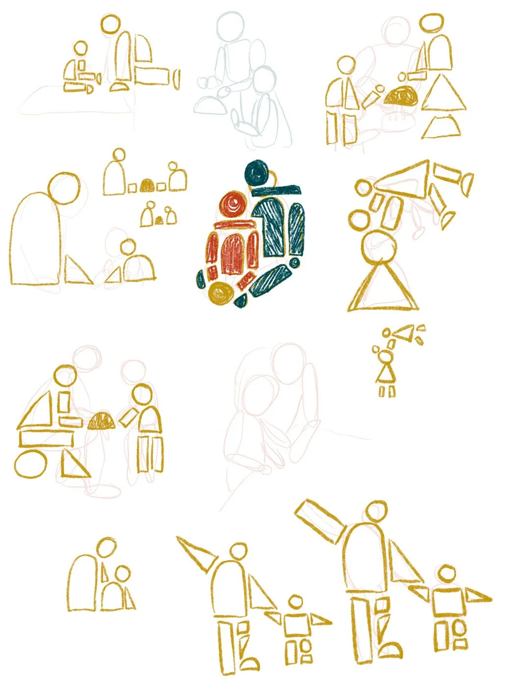
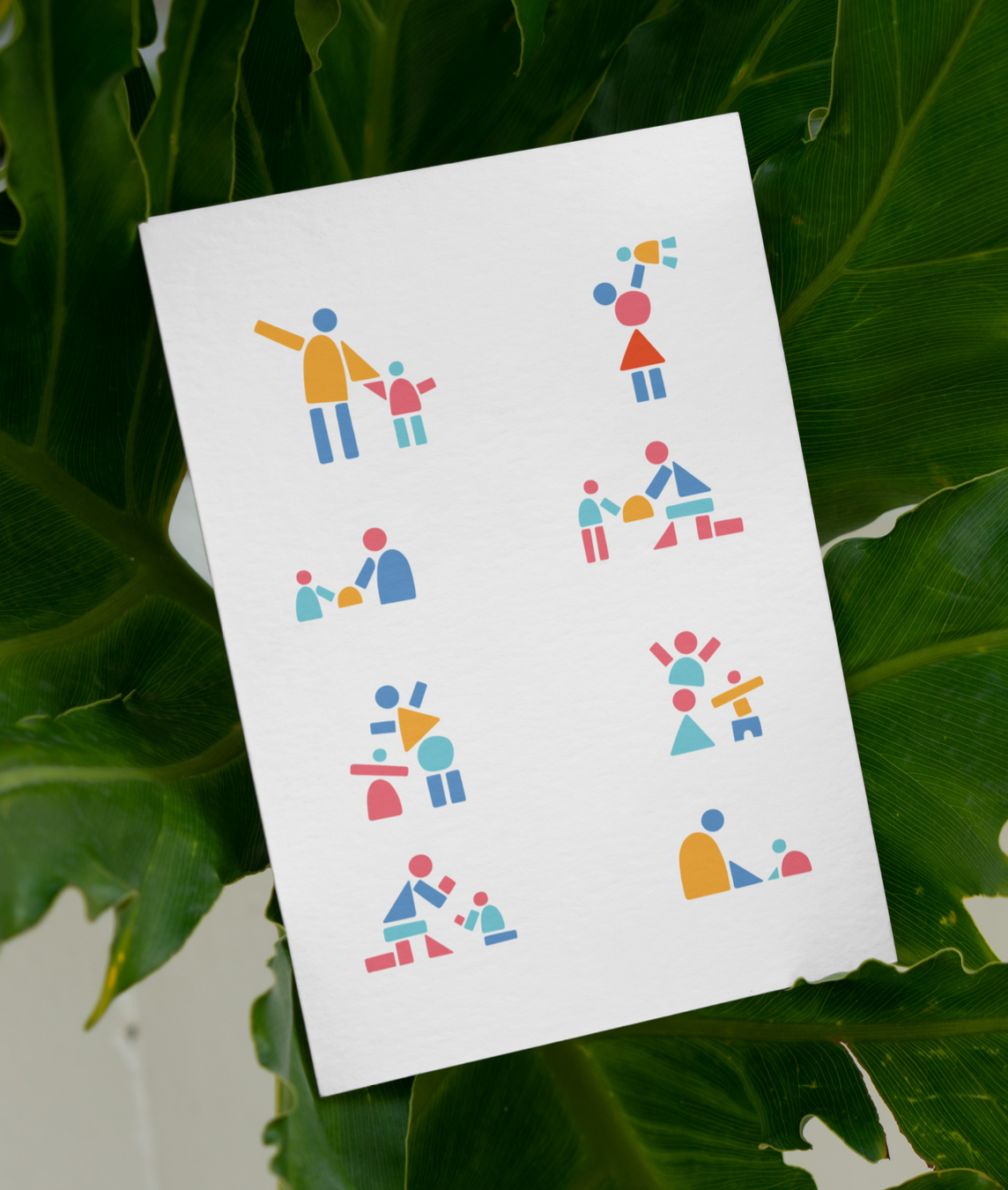
We also developed a custom illustration system built from the same modular, colorful, imperfect block language used throughout the identity. These illustrations depict small moments of caregivers and children engaging through worship, prayer, storytelling, and relationship-building. The simplified, abstract nature of the shapes allows the illustrations to feel inclusive across ages, cultures, and demographics, while the playful building-block aesthetic reinforces the brand’s visual identity and sense of curiosity.
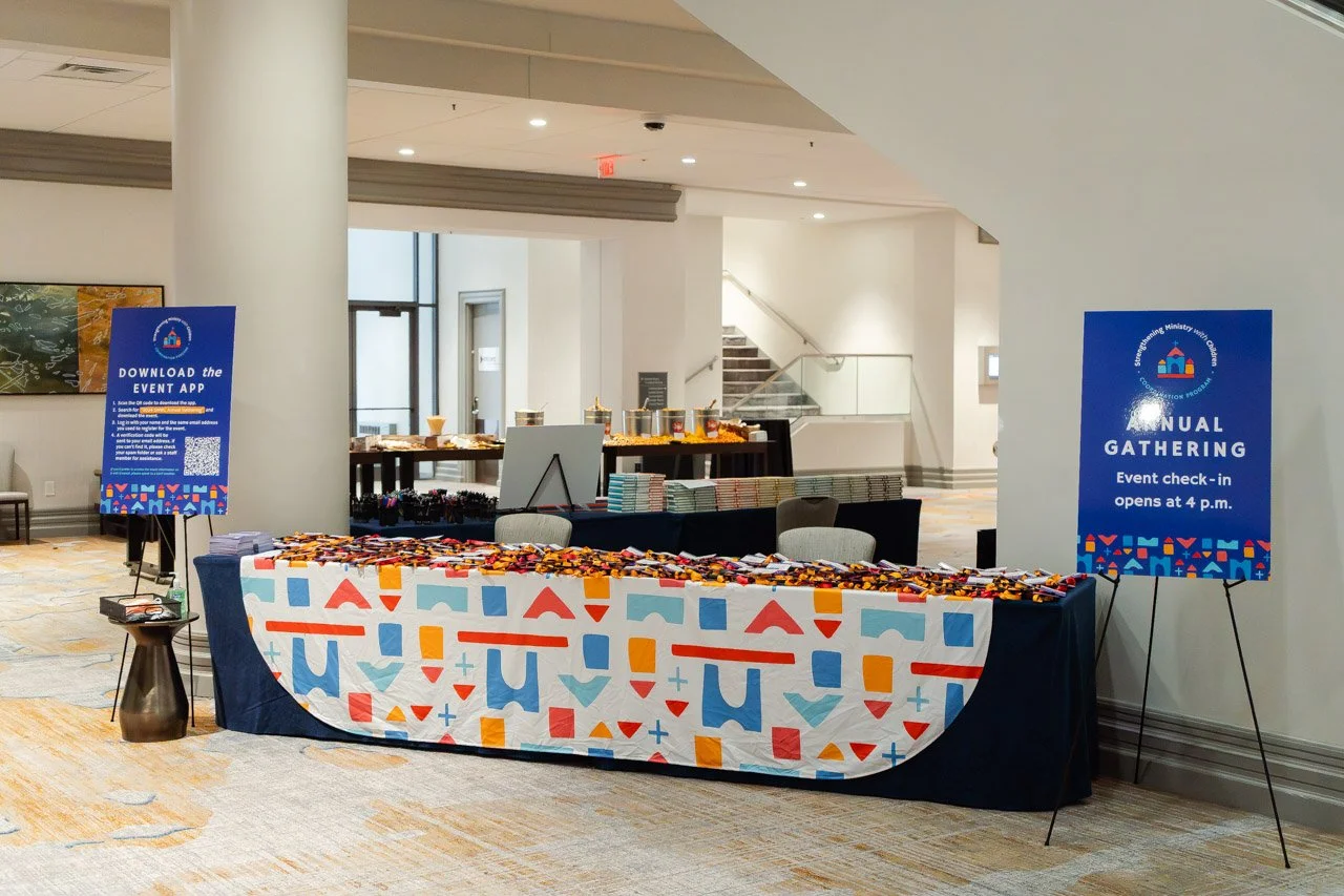
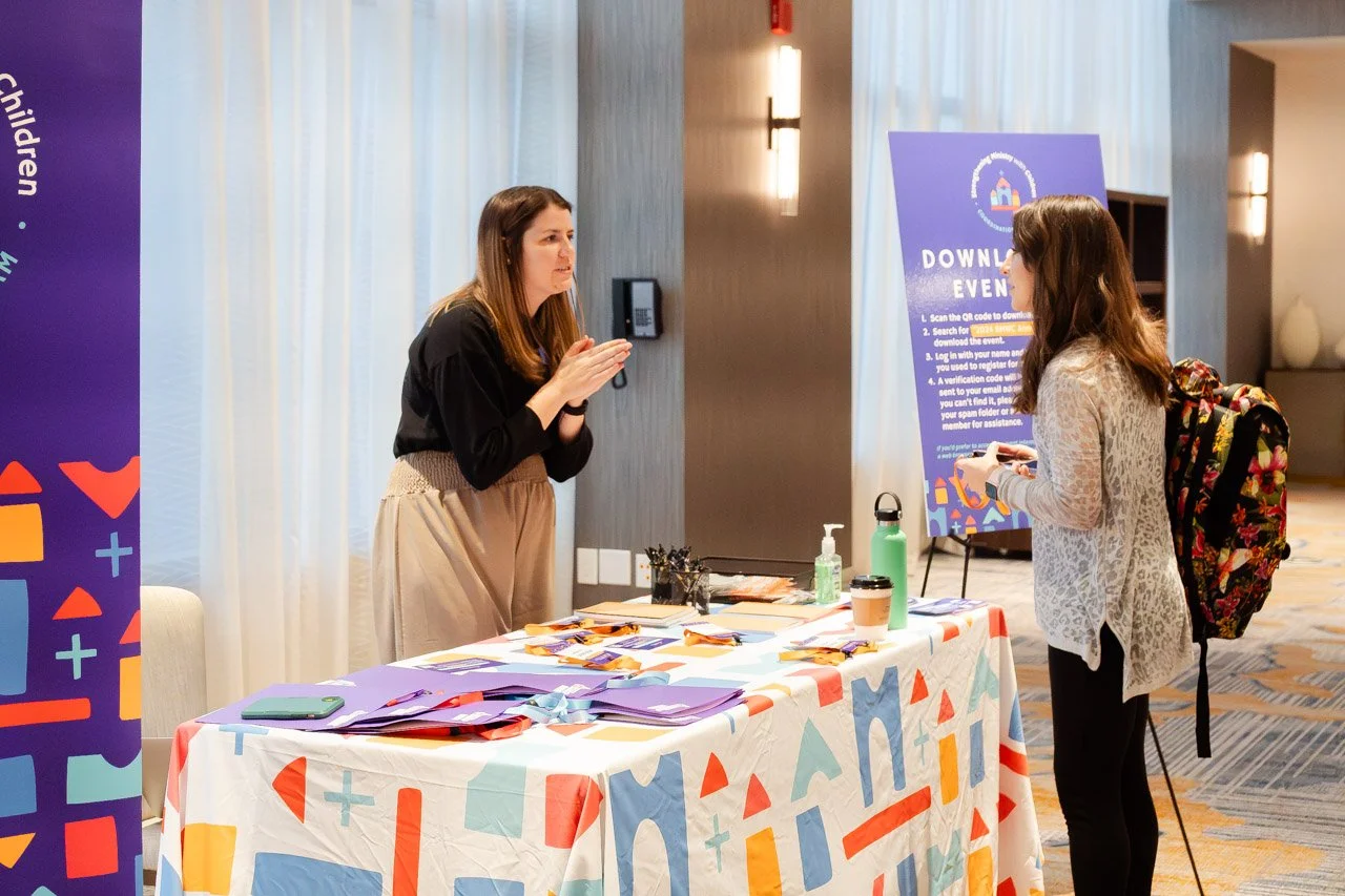
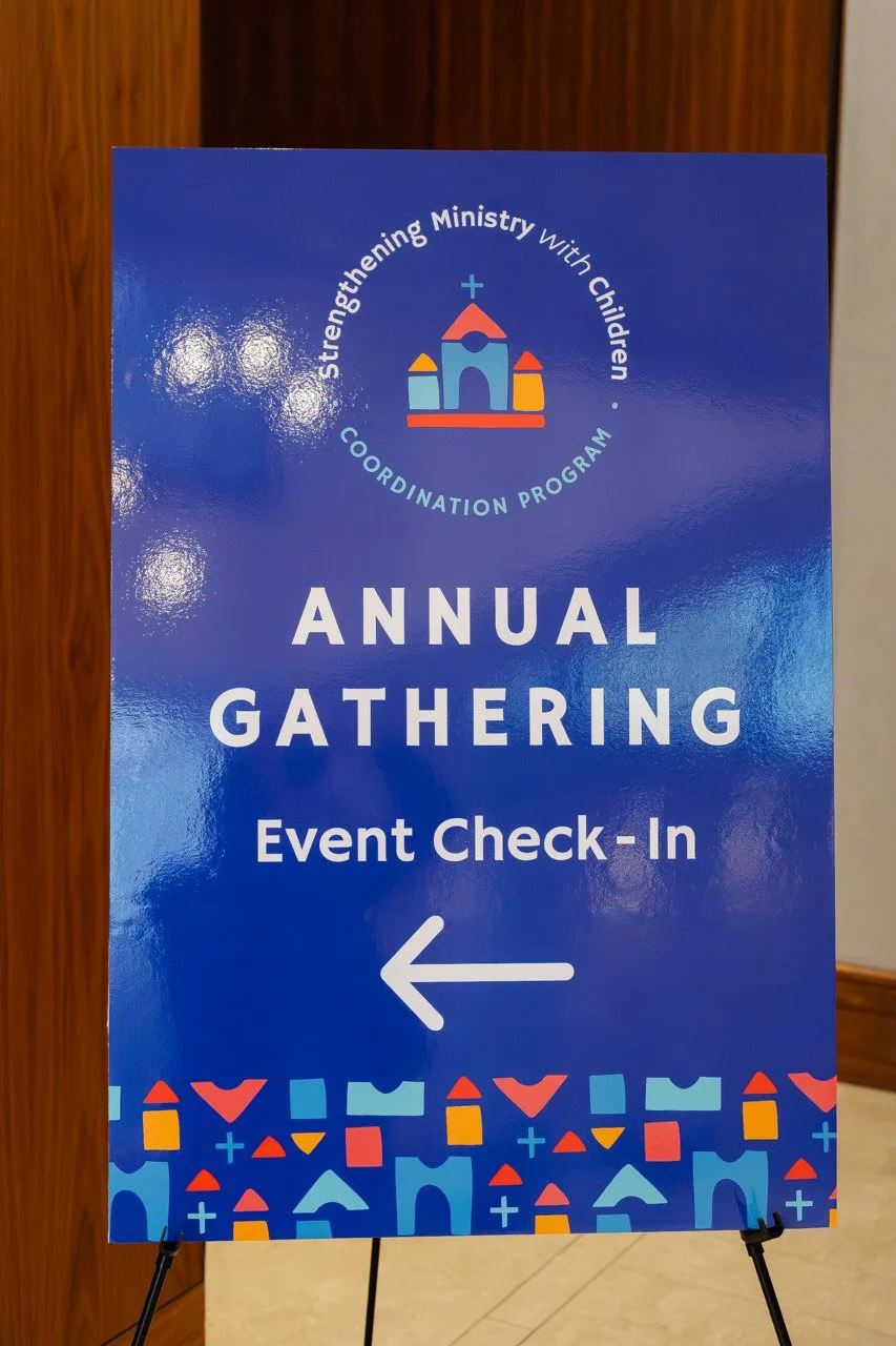
The final identity system was designed to function seamlessly across websites, events, newsletters, presentations, and future branded materials. By creating a scalable family of marks and supporting visuals rather than a single logo, the brand positions the organization for long-term clarity, recognition, and growth.
Sketch Ideation
Logo Design
Character Library








Character Library

Character Library